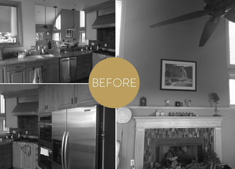
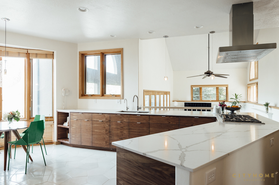
Not all design jobs call for a full-on remodel. In fact, some spaces just need a little spruce to get them looking spectacularly livened-up (and, in some cases, refreshingly modern). These particular clients were looking to freshen up their home, which was built in the '90s. We chose to focus this design project on modernizing the kitchen space, and creating a fluid unity with the nearby sitting and eating areas. Our clients wanted the cookery to be updated, more functional, and to have a more open feeling with a lot of natural light. And, since the home is in Olympus Cove, we wanted to capitalize on the amazing views, too.
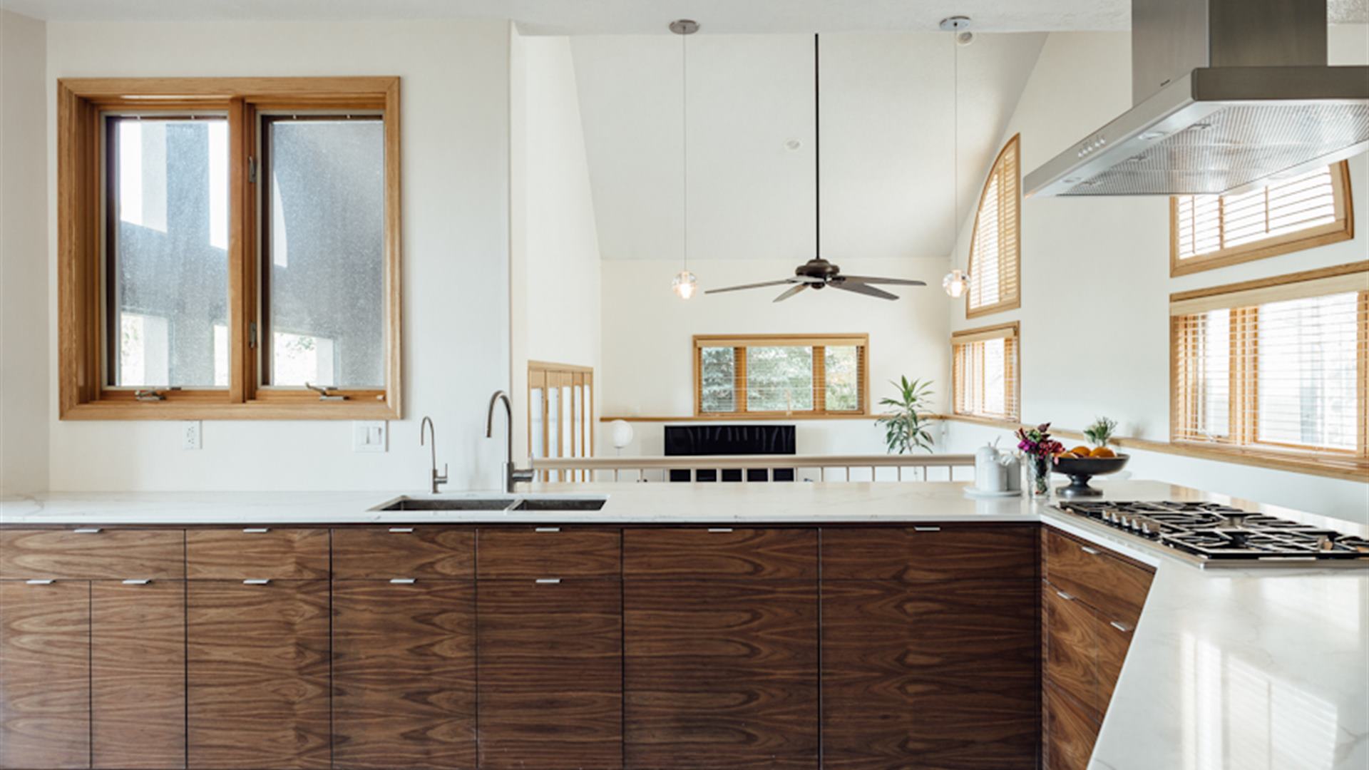
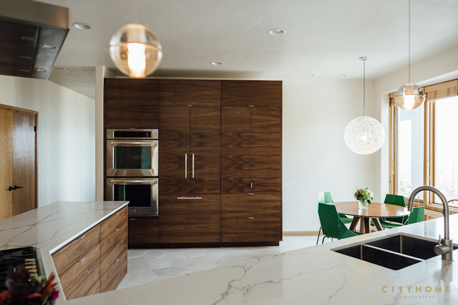
The result is a clean, minimal kitchen, with subtle textures that pack a punch.
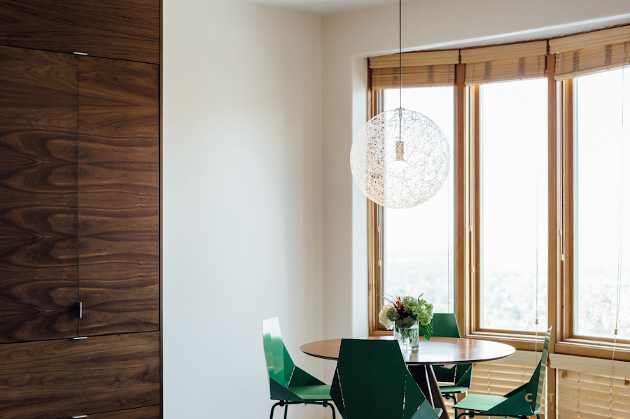
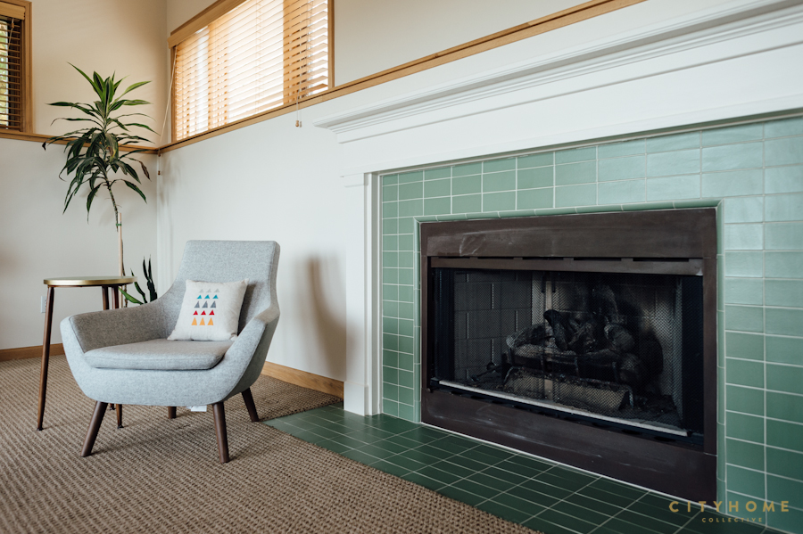
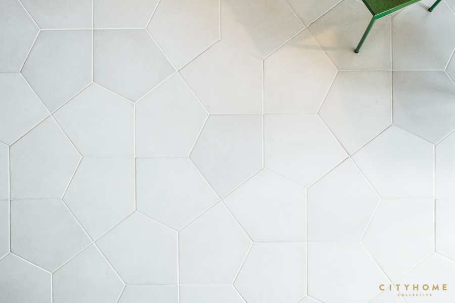
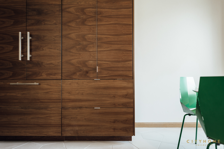
The existing kitchen was on the small side for the size of the home, and the layout was, shall we say, not conducive to a happy chef. We expanded the floor plan and took down a wall to create more space, a better flow for cooking and entertaining, and added a touch of storage (functionality = covered). We also made some matching updates to the adjacent living room in terms of furnishings, paint, and the fire place surround, in order to a make the whole space more cohesive. A few of our favorite touches: the continuous wood grain on the cabinetry, and the irregular hexagonal floor tile (and we love that our clients let us push the design to a more modern, clean palate). The result is a clean, minimal kitchen, with subtle textures that pack a punch.


.jpg)

