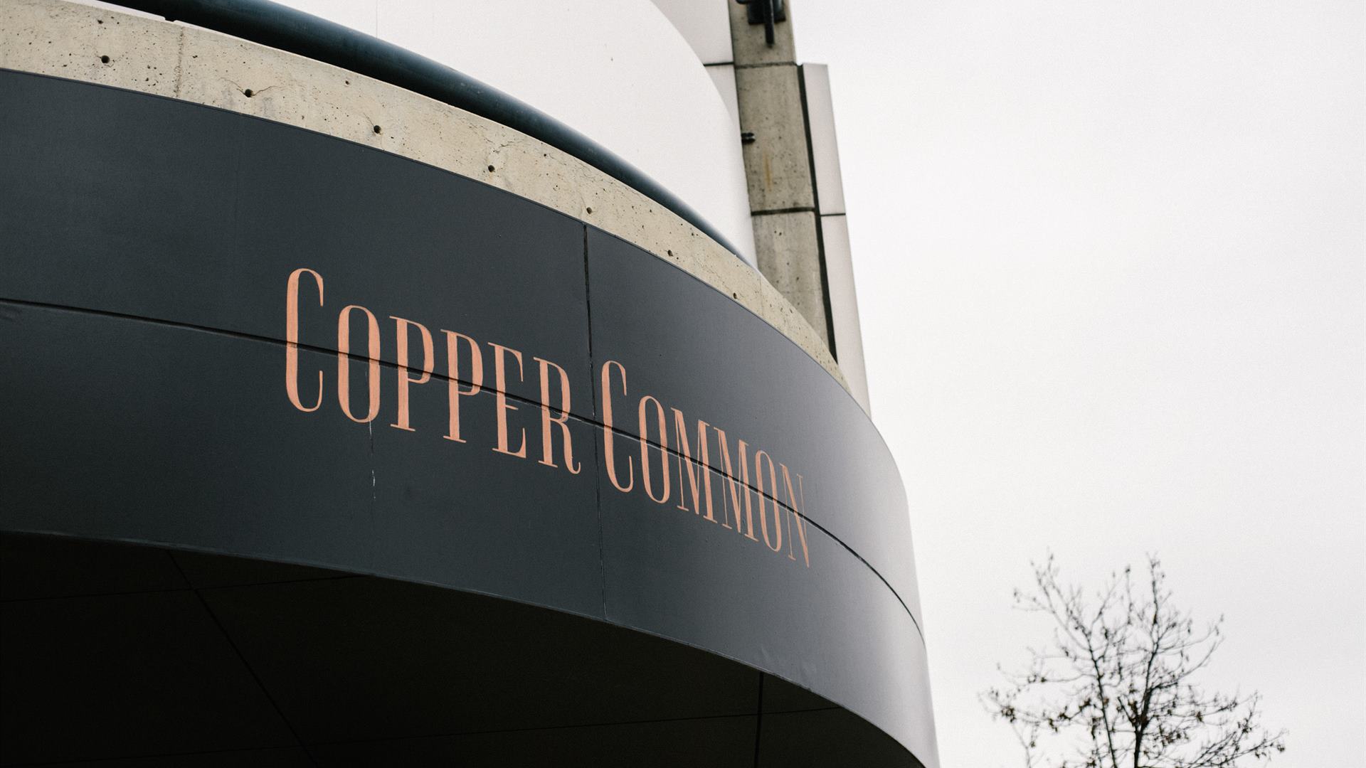
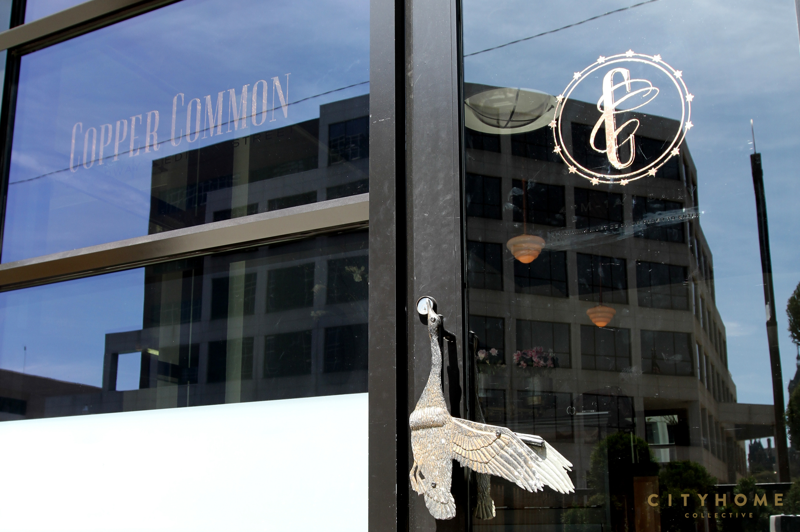
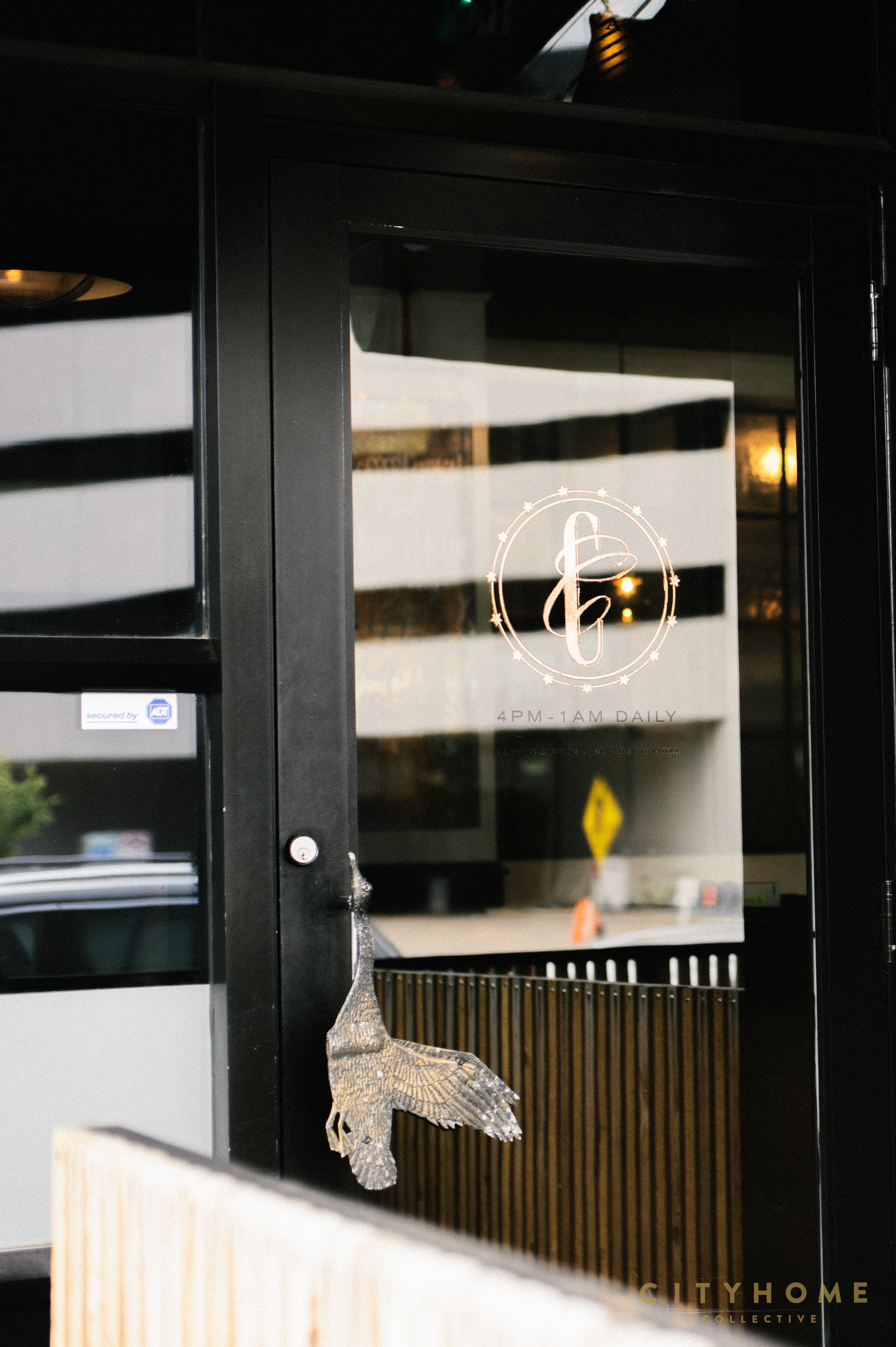
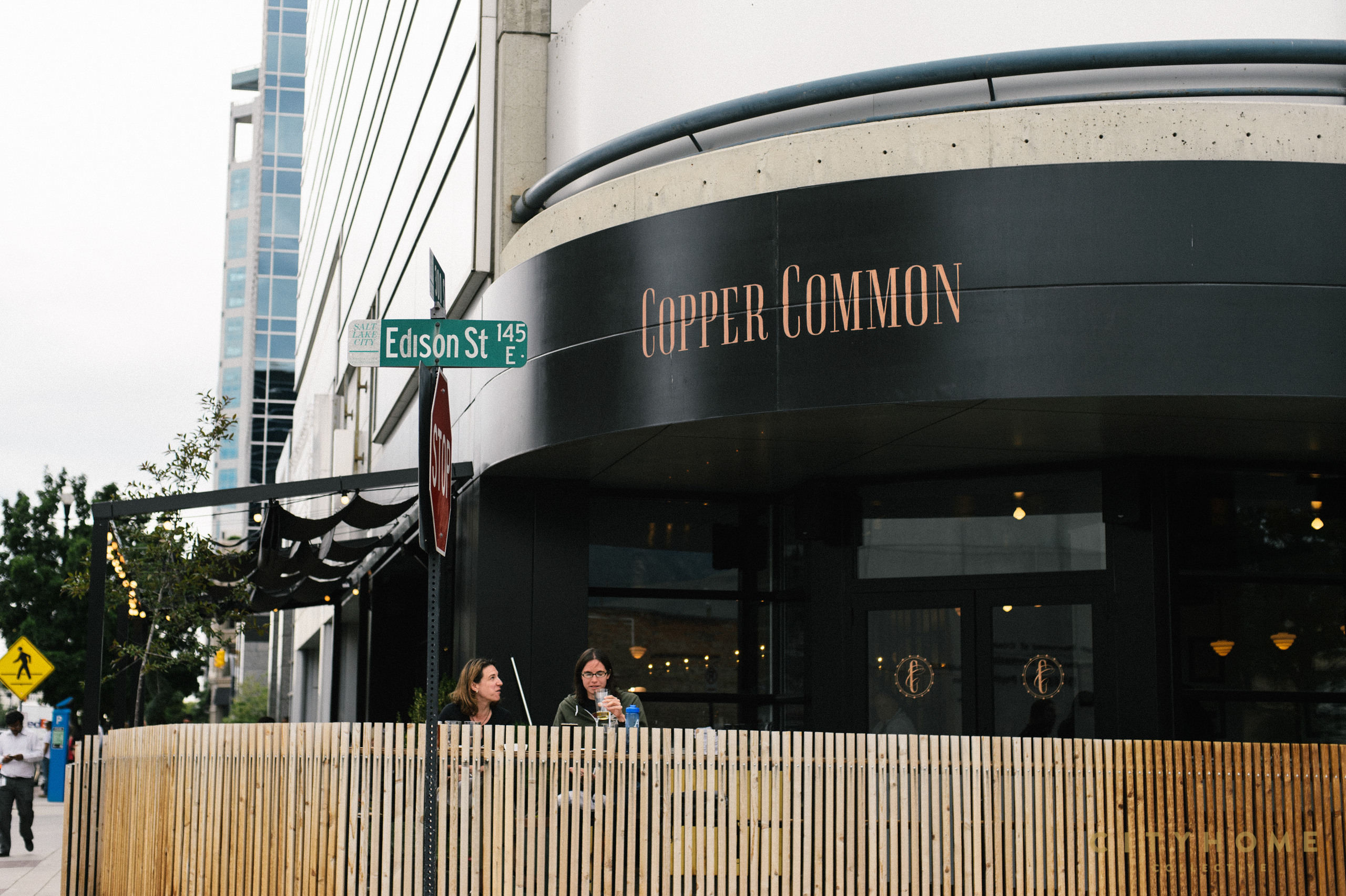
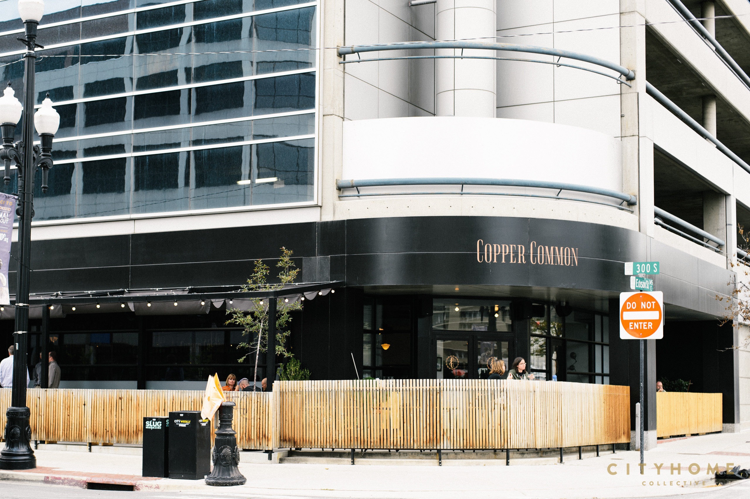
Imagine our utter surprise and joy at seeing the facade of the fairly-recently refreshed Plum Alley space. Black. Delicious, dark black. Ballsy, for sure...and the best possible decision if Copper Common was to make its mark--immediately--in the 3rd & 3rd area of downtown. No surprises here: it worked. The change obviously isn't brand new; her beautiful doors were opened at the start of March, but we had to put a pin in it for a minute. We talked a little to CC chef, Gabe Llanos, a short time ago, but we also knew we needed to talk to someone else there. Rachel Hodson, all. She's the lady that fashioned this magical watering hole to look precisely like our new favorite land of delicious boozes and bites.
Dreamweaver, Rachel. Dream. Weaver.
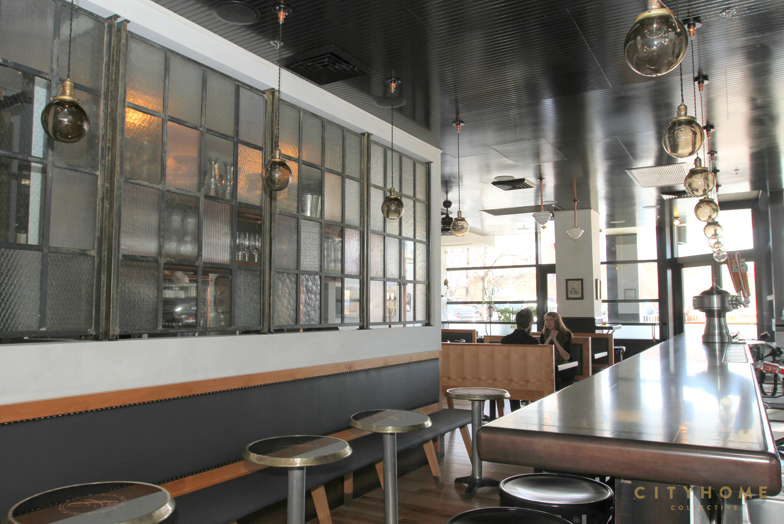
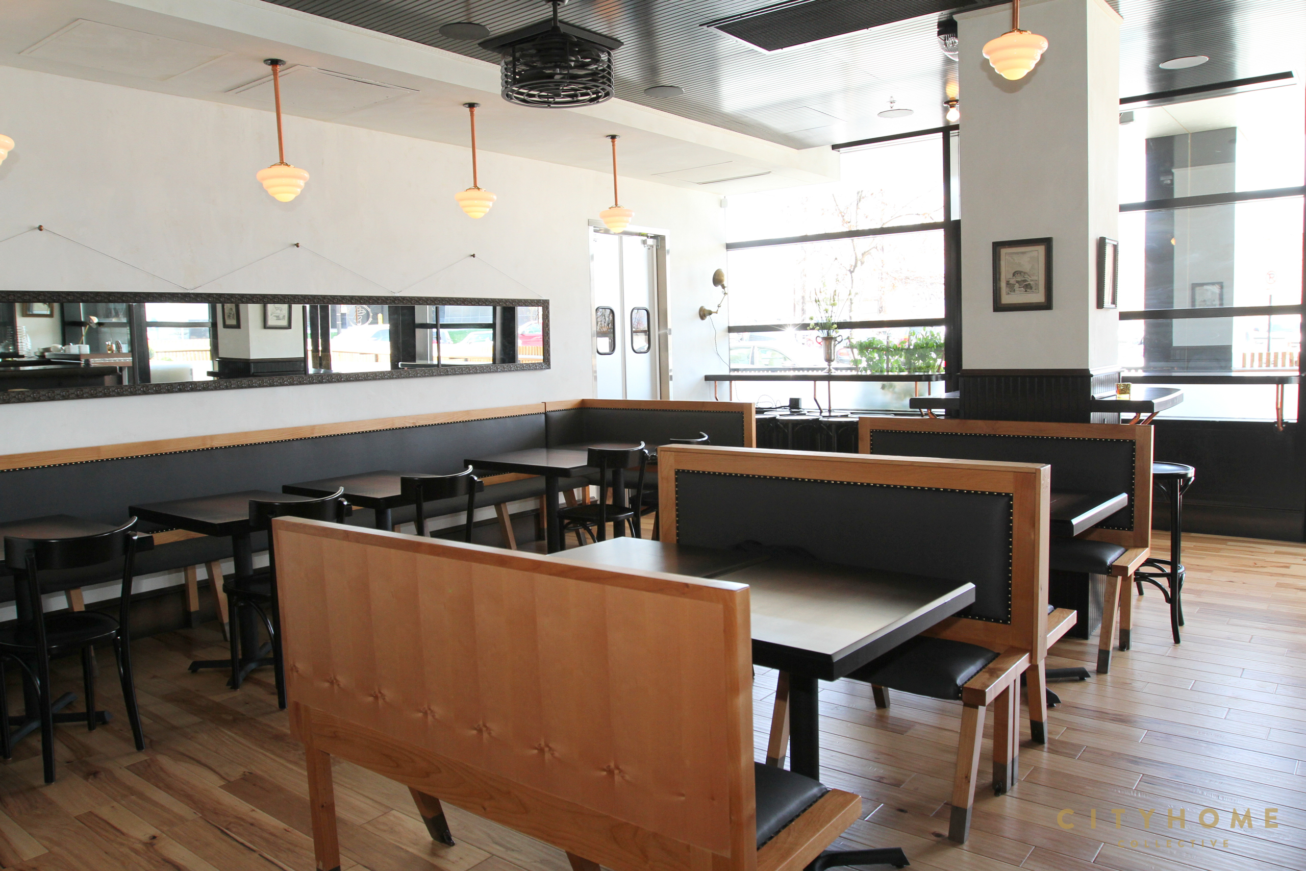
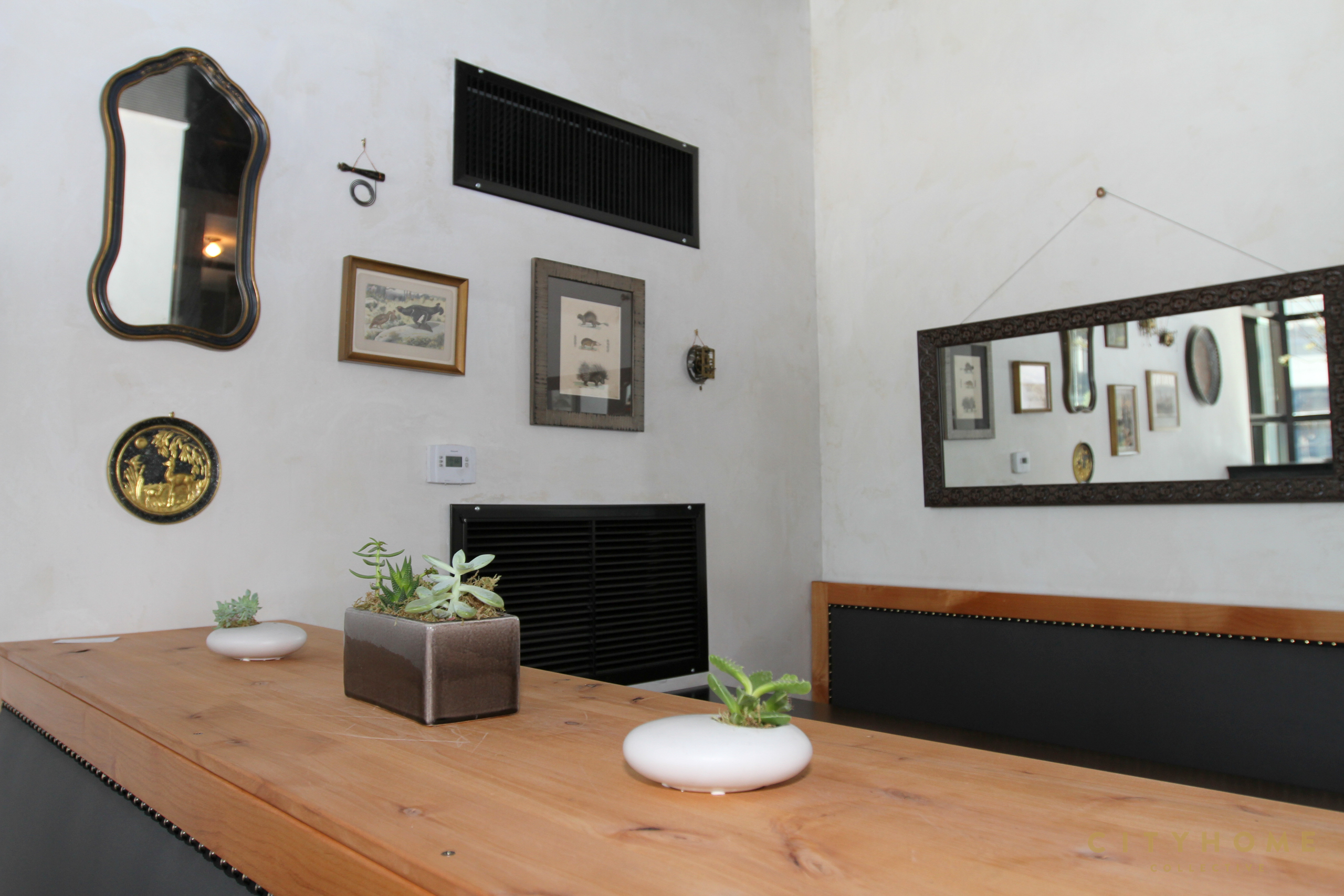
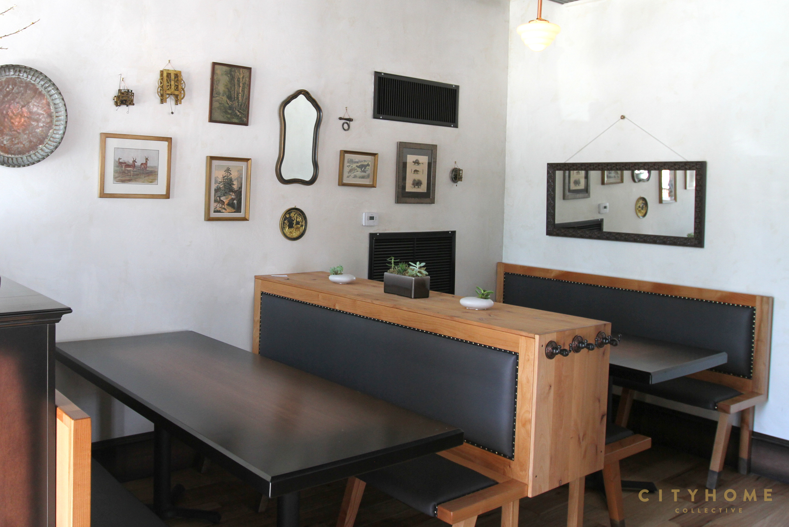
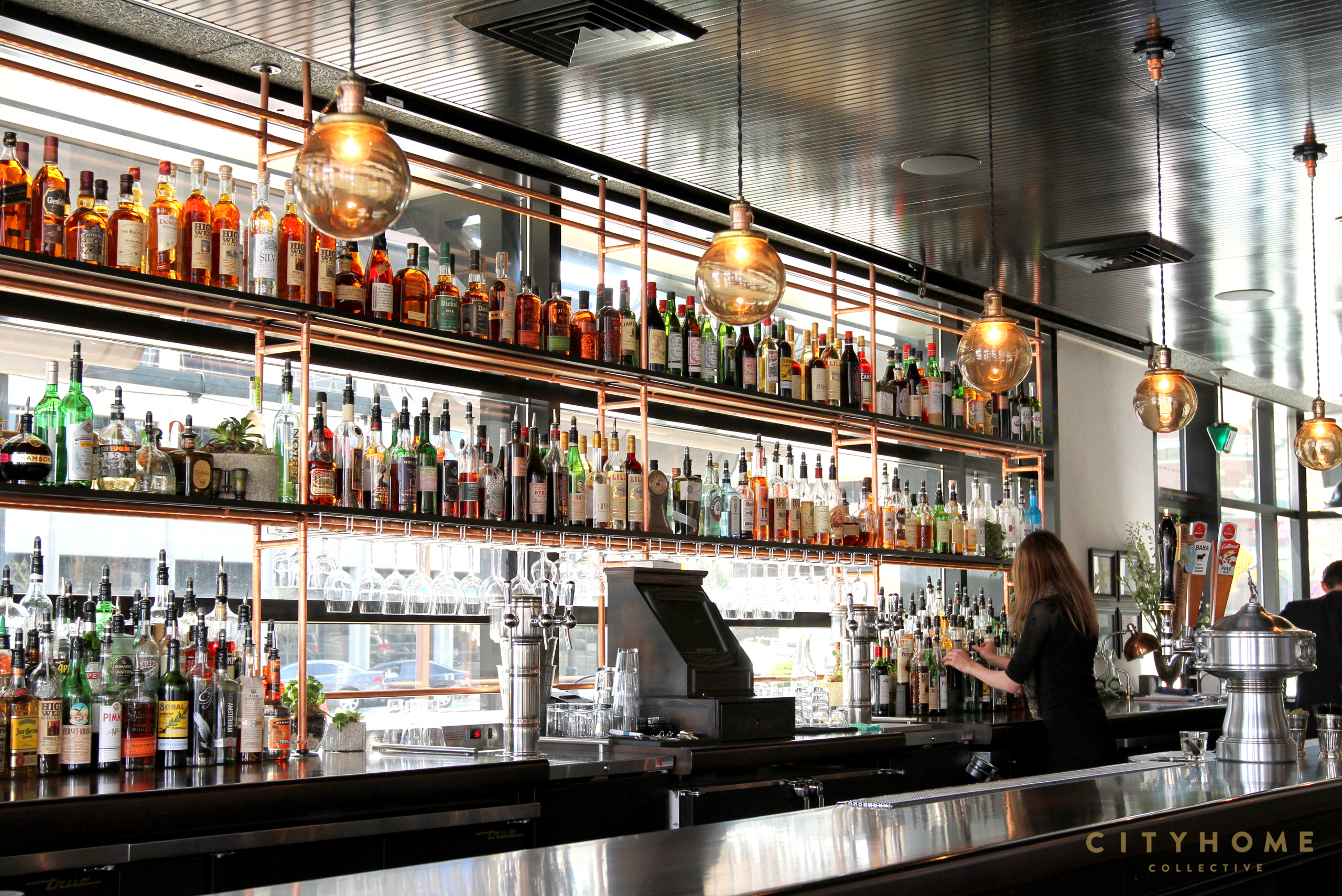
Obviously, her hands weren't the only to touch the project. We know it takes a village, and every member of said good-guy gang is mentioned below [applause all around]. But when Ryan Lowder [COLLECTIVELY known 'round these parts as "Handsome Midas"] decided to take Plum Alley from very-successful-Asian-influenced delight to entirely-different-space-with-official-bar status, it's Rachel he enlisted for help. And if we were all atingle at the sight of the exterior, hear now our high-pitched squeals of delight upon seeing the interior of the space. Good decisions as far as the eye can see. So much inappropriate screaming. From the bar to the finishes, the lighting to patio to music, it's all been perfectly slayed.
Much of the place was sketched and schemed with a solid nod to the area's historical roots.
Edison Street being SLC's first with power and our original house of ill repute and all, steps were taken to ensure that the juicy details of its yore were not lost.
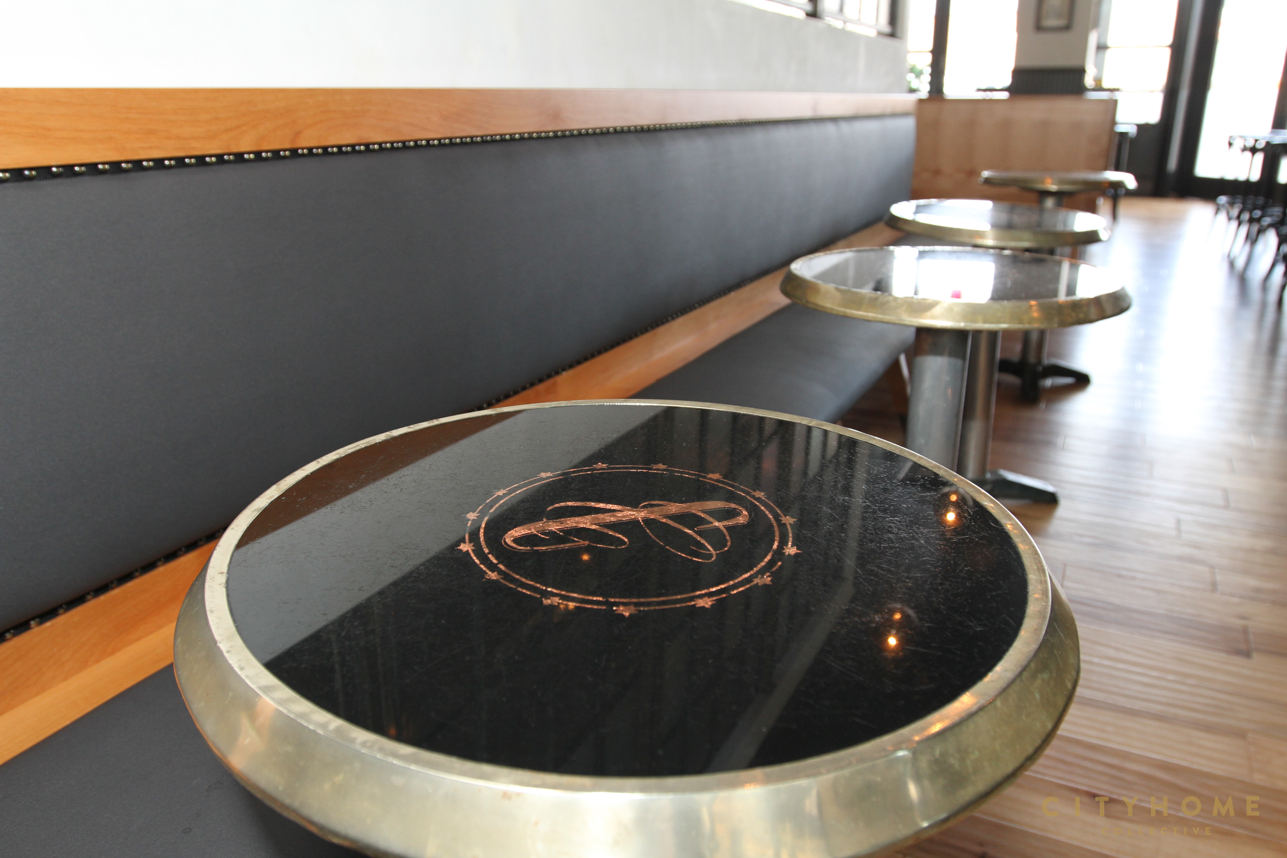
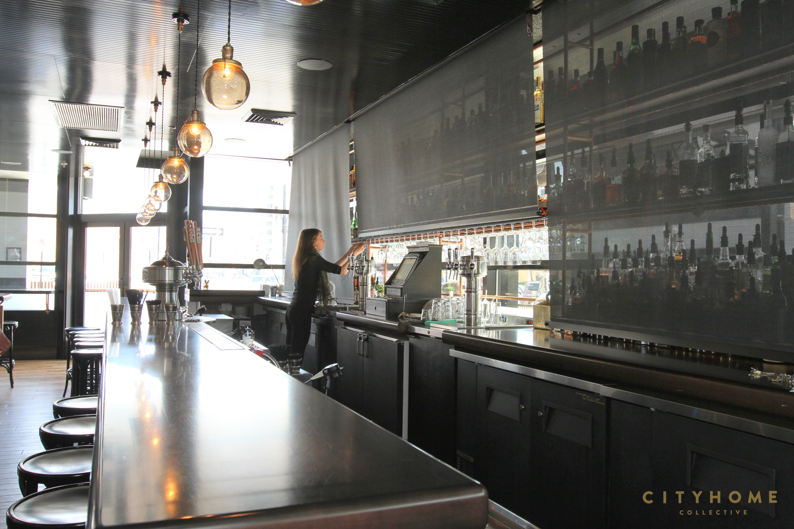
Those wise enough to read Edible Wasatch probably know Rachel as the co-owner of the magazine, a fact that worked idyllically to the favor of the space in question. Rachel's a big proponent of high-quality food choices, and that good sense worked its way into the design, which is a fabulous accouterment to the menu. How apropos -- you can seat yourself at a stunning bar, then sip on an equally thoughtful cocktail [say, the Blonde Negroni or the Bourbon Sidecar].Park yourself at one of those small, high-gloss tables with the copper CC inlay and order up a small plate that will induce a similar amount of drool [this Editor's weakness: Deviled Eggs, Deviled Eggs, Deviled Eggs].
We had a chat with Rachel recently and picked her brain, so you can read on below to get details on the start-to-finish-to-happy ending for the project. Sum and substance, we're big believers that a well-designed space is wholly dependent on good practices in polyamory -- balance in design is only found when every last detail comes together in a happy, multi-party marriage. That's precisely what's happening in Copper Common. Balance lives here. Every aspect of the design is lined up just so, holding hands with one another and swaying gently as they belt out "We Are the World".
Cue a single, streaming tear of joy. Half smile. Nod of approval. Fade to delicious, dark black.
You're the super-duper mind behind the design of the new Copper Common space. Do tell how this all came about for you: Awe, shucks. I got really lucky! I studied industrial design in college, but for most of my adult life I’ve worked helping other people bring their ideas to fruition, mostly as producer for commercial photo shoots. I never stopped loving design and the thinking and process of design have been real assets even when I wasn’t actively working as a designer -- but I sort of thought that ship had sailed for me career wise. Then Ryan Lowder (Chef/Owner of Copper Onion & Copper Common) who has become a friend, asked me to come down and take a look at Plum Alley before it opened. I threw some ideas out there and he liked them and it snowballed. I will be forever grateful to Ryan for giving me the opportunity and helping me restore my creative confidence. He’s demanding and fun to work with. We fire each other up.
It would seem to us that in designing a restaurant, you want the space and the food to kinda hold hands. Did the menu and/or [incredible] drink list come into play with the design of the space for you? Or is it just a lucky coincidence that they seem to be soul mates? That’s a BIG compliment because I love the food. And the drinks! And, I couldn’t agree more! For me a space has to jive with the food or it just doesn’t feel right. Philosophically, food is kind of a big deal for me. I believe that what we eat makes a big difference in our quality of life, both collectively and personally. I’m not interested in working with anyone who hasn’t made a commitment to high quality in both sourcing and preparation. So, yes, the menu absolutely played a big role in guiding the design. Ryan and his team are tremendously creative. They’re totally committed to delivering the best and most delicious product they can and I really admire them for it. Jamison, Tara, Gabe, Clint, Mo -- the whole staff is incredible. Watching (and tasting!) them develop the menu was super inspiring. I wanted the space to meet the high standards they set, so when we we’re building the team for the remodel I chose contractors & craftsmen that are as passionate about their work as the people at Copper are.
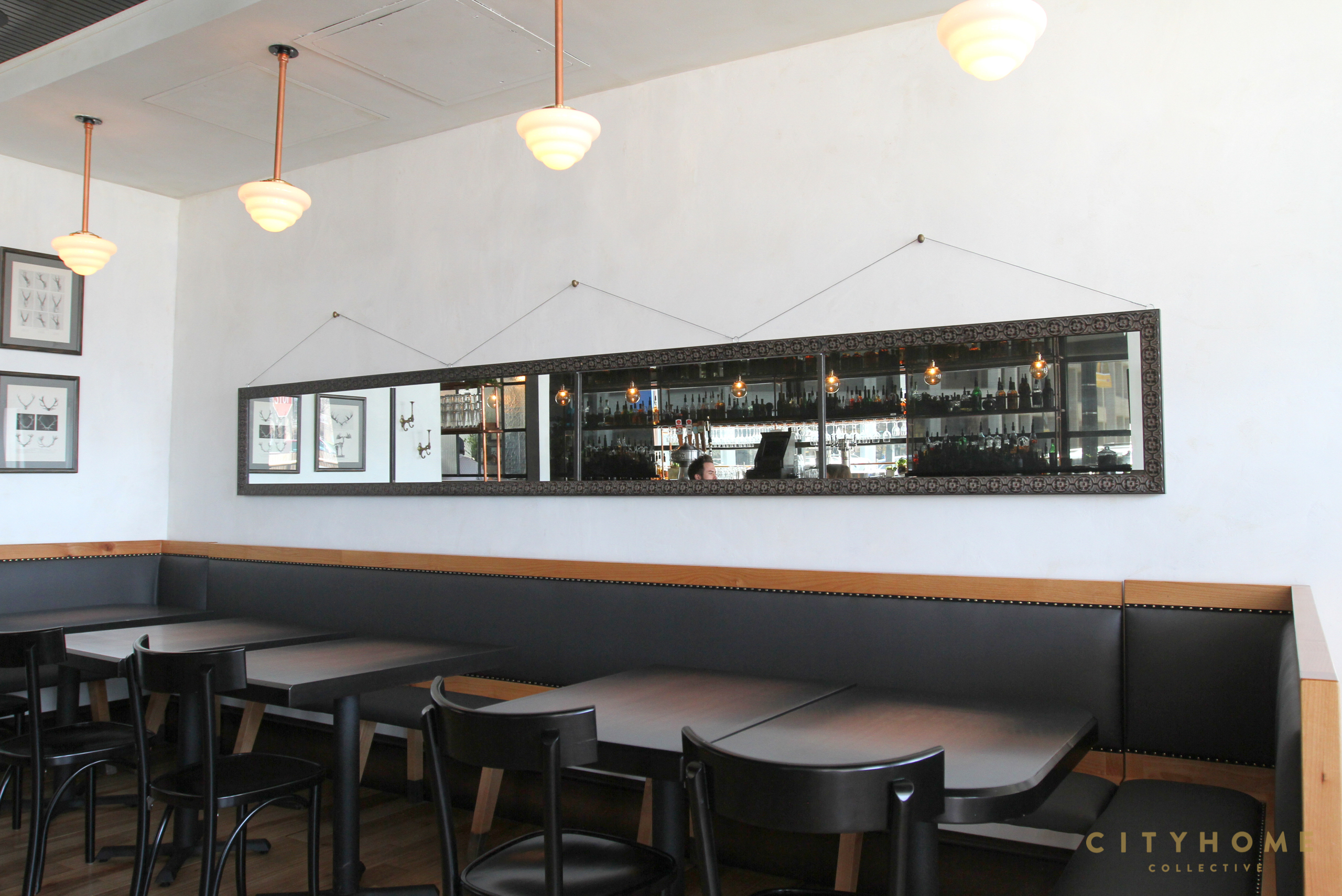
What was your inspiration for the interior? Copper Common is on the corner of Edison Street which, incidentally, was the first street in SLC to get power and was the city’s red light district once upon a time. We dug deep into the local history and came up with some killer inspiration. Colleen, Ryan's wife, found some awesome old photos via the Utah Historical Society that are hanging in the space. There are some great stories. We also looked at Thomas Edison. His commitment to innovation and craftsmanship lit a spark in me for sure. One of his factories became the foundation for the color palette in the space and informed the bar and furniture. His lab at Menlo Park was also a big inspiration.
Any challenges that came with this particular job that you were elated to have overcome? So many! There are always slips and trips along the way, but they can yield some unexpectedly terrific outcomes. We had our share. For this project though, I’m especially proud of how well everyone managed the time line. We opened Copper Common 28 days after Plum Alley closed. Whew! We had a terrific crew.
COLLECTIVELY, we're mega fans of dark, moody spaces, but we also know that folks are often a tad gun shy about using black. You employed the dark side on the facade of the building and with the high-gloss ceilings inside. We fucking love it. Was this a no-brainer decision, or did you have to do some convincing to get the go-ahead on that? There was some convincing to do. Using black for color can be counter intuitive, but it doesn’t always read as dark and can really brighten up a space especially when it’s glossy. I love black! It’s elegant and versatile and a little bit of a pain in the ass. You have to get the sheen right to make it work, but when you do it will surprise you. If you go into Copper Common during the day you’ll see that the ceiling reads as white or pale blue because it reflects the natural light. At night it reflects the warmth of the lights in the bar and is very colorful. Painting the window frames black made them disappear and brought the outside in. My fav is the matte finish on the exterior. It wraps itself around you like a blanket and makes you feel enveloped by the the patio. It was a real coup to get the green light on the black facade! (Big shout out to the RDA - who owns the building - for letting us do it.) Suddenly that corner is a place with it’s own identity and not just part of the parking garage.
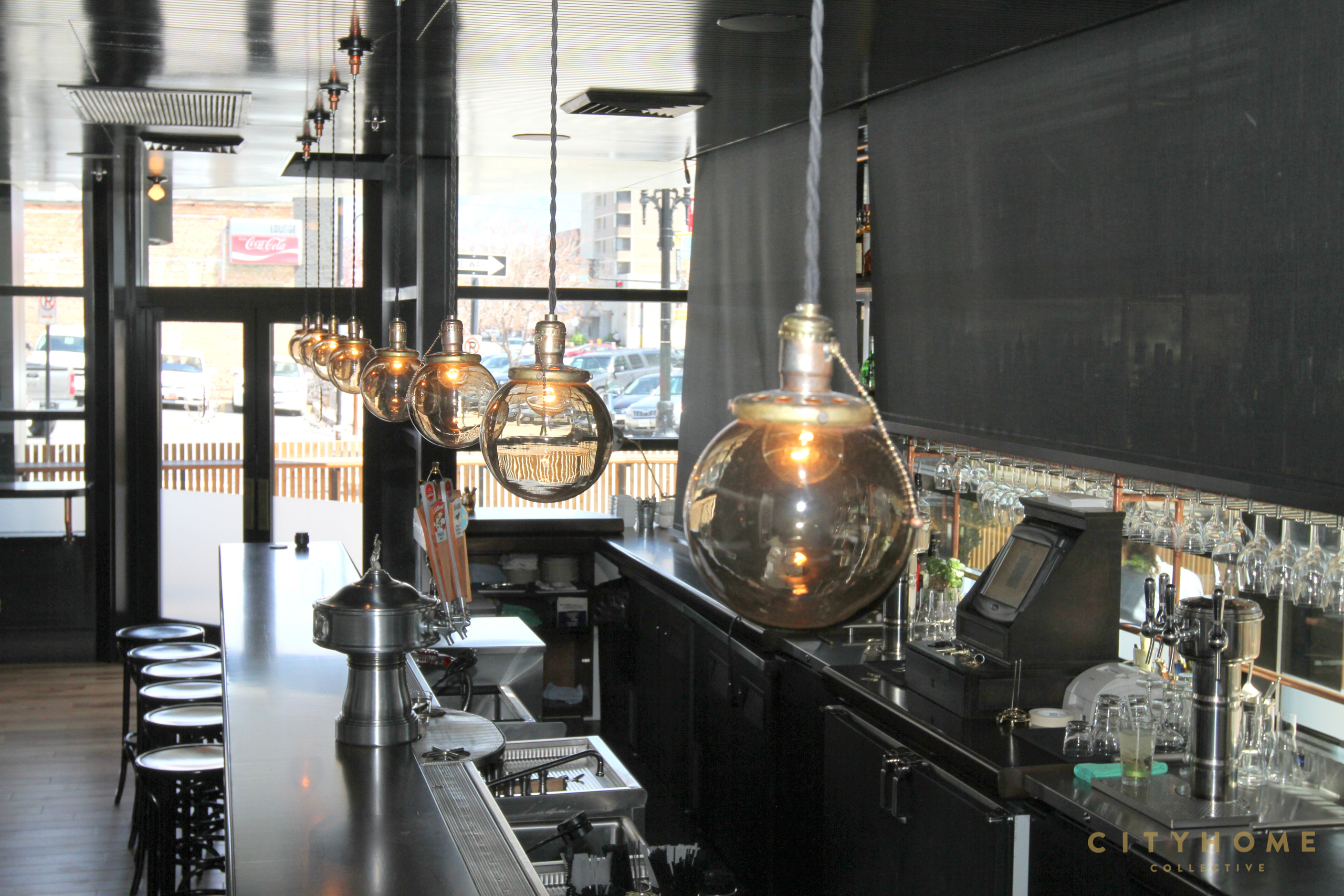
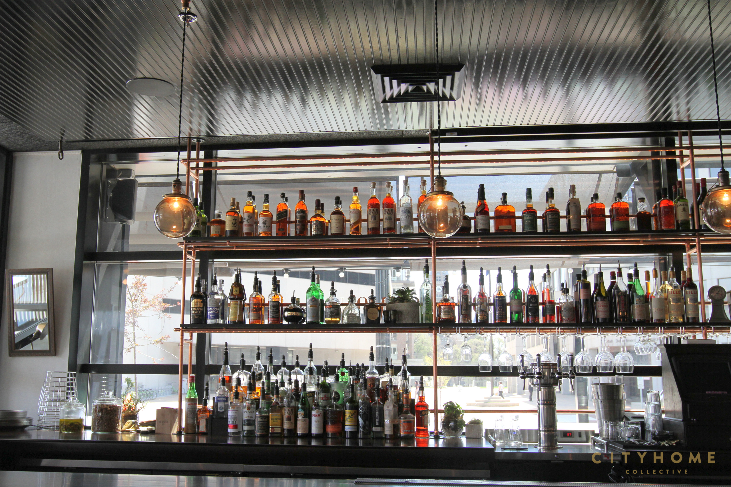
You also made a bold and clever decision in moving the bar to the opposite side of the room, right along beloved Broadway. Speak on that a touch. Thanks! I had big love for Plum Alley, and I wasn’t alone. I didn’t want to leave anyone pining for what was lost, so it was important to radically redefine the space. Moving the bar accomplished that in large measure. It shifts the focus from the north wall to the windows and highlights the views of the mountains and the historic City County building. So many bars are buried in the back of the room and leave patrons staring at a wall. I thought it would be refreshing to sit at the bar and watch the world go by for a change. And, I like that when you walk in you see the faces of the people sitting at the bar rather than their backs. Its welcoming. I also wanted the bar to be a kind of stage so the bartenders could be seen shaking their magic from every spot, inside and out. I tried to give every seat a view that gives you a solid sense of place. The bonus is that moving the bar made way for a square dining room with circular service flow which I’m a big fan of. I worked in restaurants for years and think a lot about service flow.
The wood on the bar is absolutely sensational. Can you tell us about that? That was a super fun collaboration with the cabinet maker, Simon Kirshman, at Great American woodworks. It’s a custom finish inspired by the remarkably beautiful cast iron generators in one of Edison’s factories.
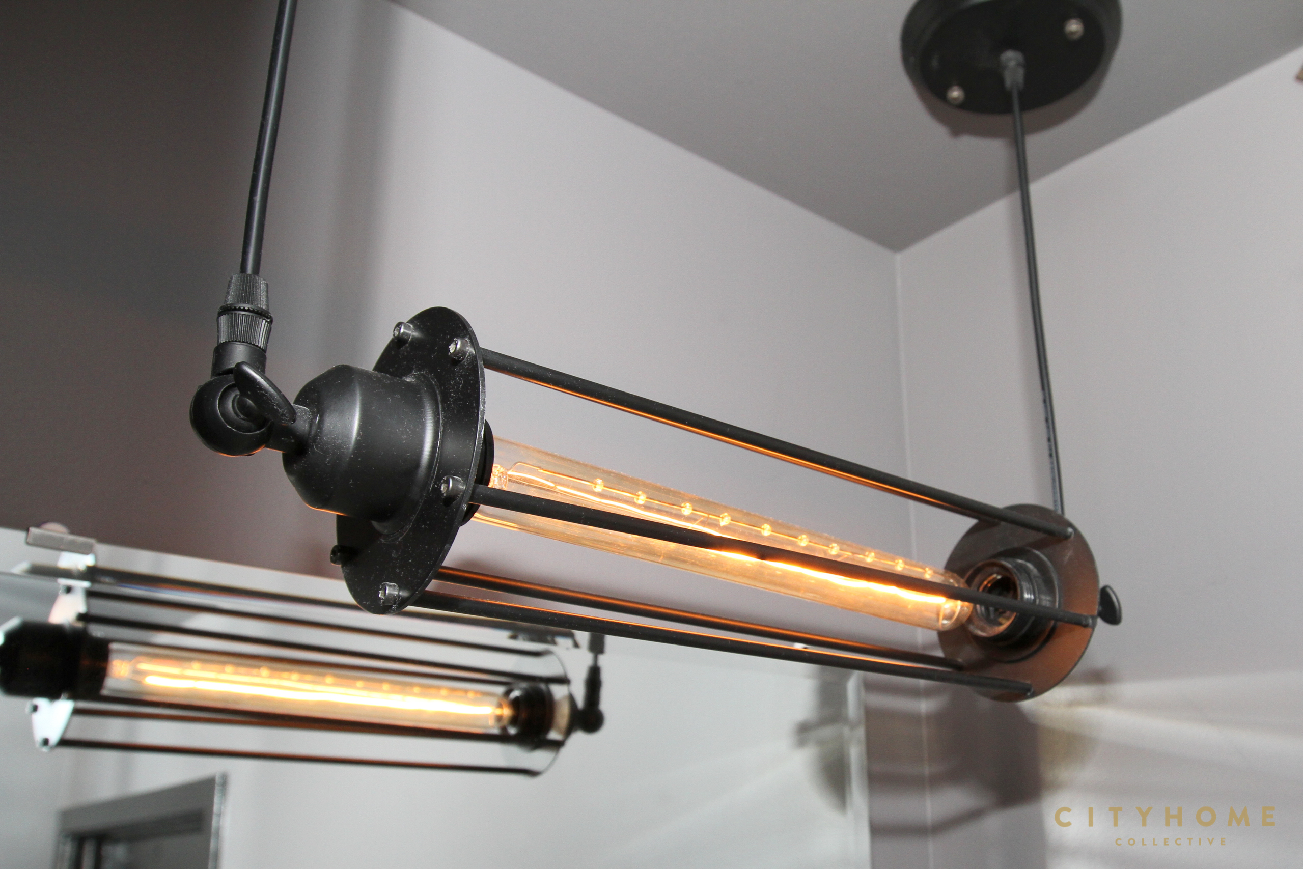
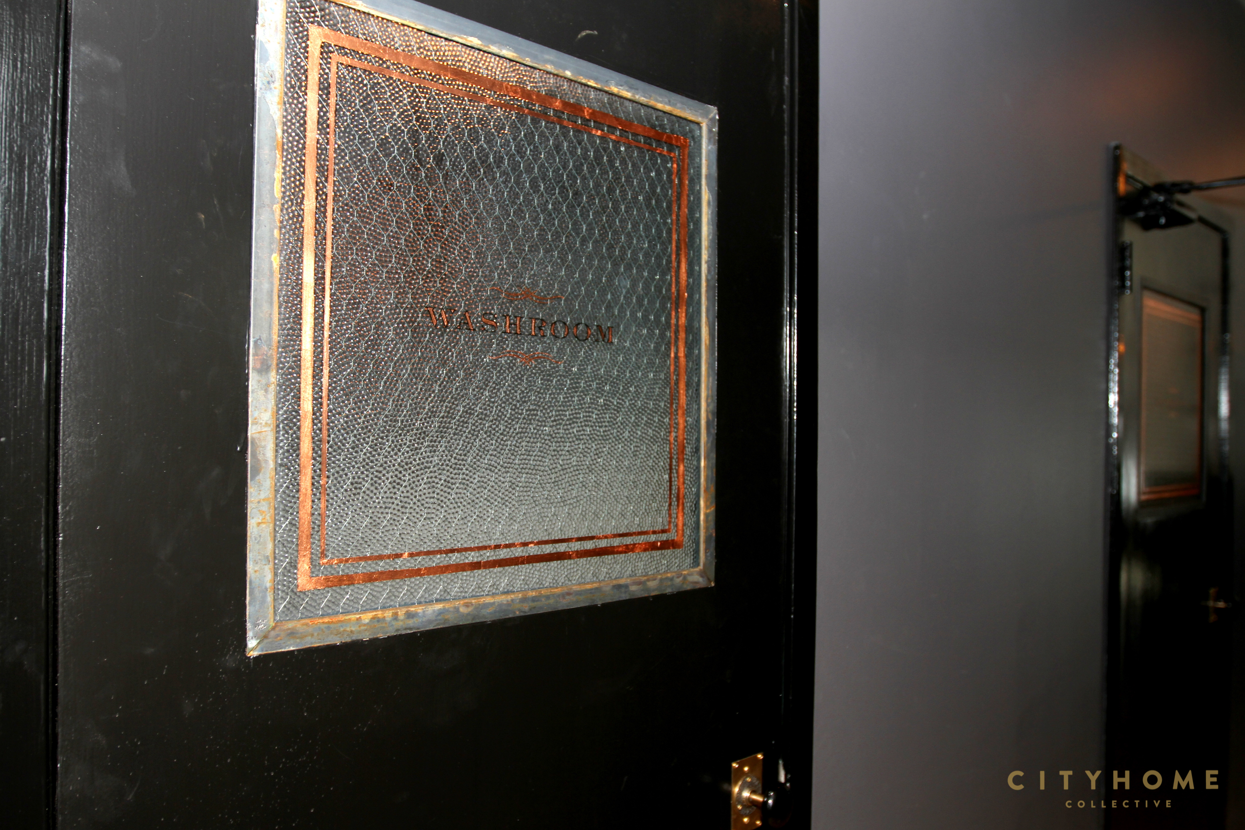
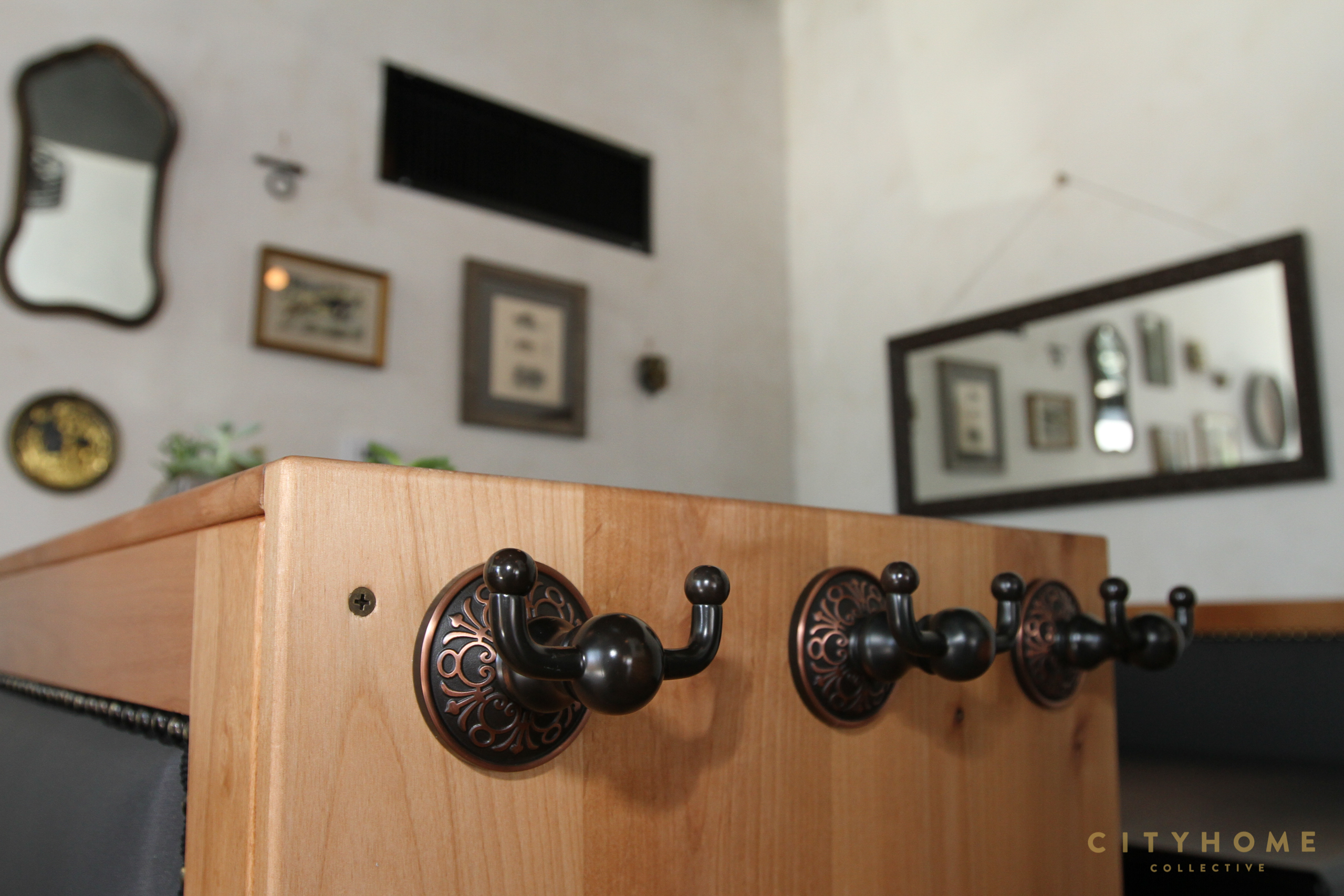
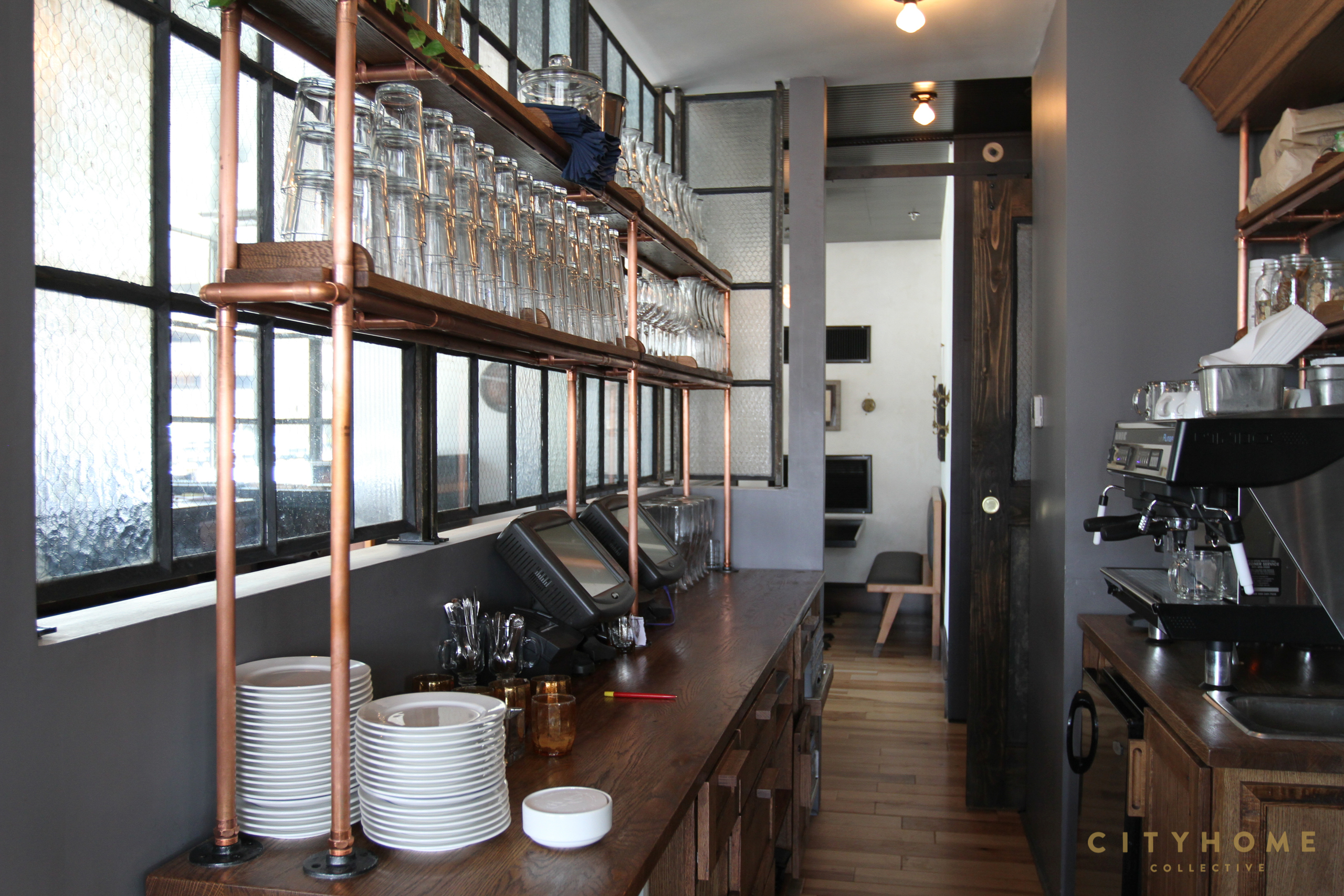
Having done a fair bit of design, we know as well as anyone that a project like this is never the work of just one person. Any collaborators that deserve a good old-fashioned shout out and round of applause in bringing Copper Common to fruition? True that! David Kelly (of IDEO) has said, “The big win of design thinking is that it’s a human centered process that people sign up to work together on.” The collaborative nature of the work is my favorite part and there were so many talented people on this project. Ryan and Colleen deserve a lot of credit. They both have terrific taste and contributed a great deal. Everyone on the crew was A-M-A-Z-I-N-G to work with - especially Kevin Meyer, our GC. Peach of a man. Brace yourself for the list: Boardwalk Construction for GC; Great American Woodworks for bars, tables, and cabinets; Project Sunday for server stations; Sharp Upholstery for the booths and banquettes; Colour + Surface for custom wall finishes; David Brothers for hand-painted signs; Hattabaugh Paintwerks for general painting; Sun Sets for custom shelves, partitions, and doors; Greg Hebard for custom door handles; Annie Sterenberg for logos and branding; and finally, Wild West Electric, Retrospect, and Felt were invaluable allies in accomplishing the lighting.
Do you have some favorite spaces in our Salty City? Any spots that you patronize just because they feel so god damn good? Well, Pallet is no slouch! And who doesn’t love Bar X? I love what Erica O’Brien has done at The Rose Establishment. Josh Wheatly does some beautiful work: Bodega/ the Rest & Whisky Town are welcome additions to our city. And I’m a big fan of the new NoBrow space. Hooray Atlas! There are lots.
Whatcha got coming down the pipeline? Will you be designing more pretty spaces in our city? And if so, how can we get in on some of this magic? I’m working on a few projects now. Look for a new addition to the Copper Onion family in Holladay this fall -- definitely an extension of that brand, but with it’s own unique character. I’m honored to be working on a facelift of the Broadway Cinema which will be unveiled later this summer. And I just began a collaboration with the new owners of Lugano on a new vision for that space. I’m really excited about all of them. They are radically different projects and it’s giving me the chance to stretch. I’ll keep you posted!
Copper Common | 111 East 300 South, SLC | 801.355.0543
