There is something I’ve learned to be true in all aspects of design: convenience kills creativity. When you’re given the world--too many choices, an endless budget, no timeline--some key part of the process inevitably gets lost. Perhaps it’s our innate desire to be problem solvers, or our constant inability to be satisfied, but designers and artists in most any capacity seem to thrive in an environment laden with obstacles.
“ever so much more than a restaurant”
Like any design project, the complete overhaul and relocation of the new downtown Finca had it’s share of said obstacles. The result, however, is a jaw-dropping, gasp-inducing, hang-out-for-hours-over-tapas, cozy, luxurious, “ever so much more than a restaurant” restaurant. This marks my second major commercial design project as assistant to lead designer, Cody Derrick. I saw first-hand the creativity, passion, and dedication with which he tackled this project. I am still in awe of what a beautiful space it is [and I dine there often--I’m sure the servers are sick of seeing our COLLECTIVE mugs]. But that’s the point. The idea was always to create a space where we would want to hang out…where you would want to hang out. I’d have to say: mission accomplished.
We were tasked with designing an environment unlike any other in Salt Lake.
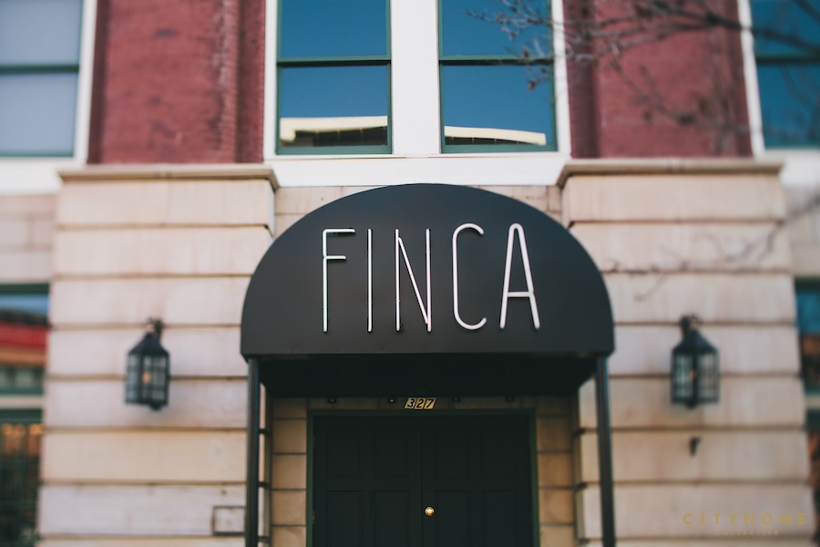
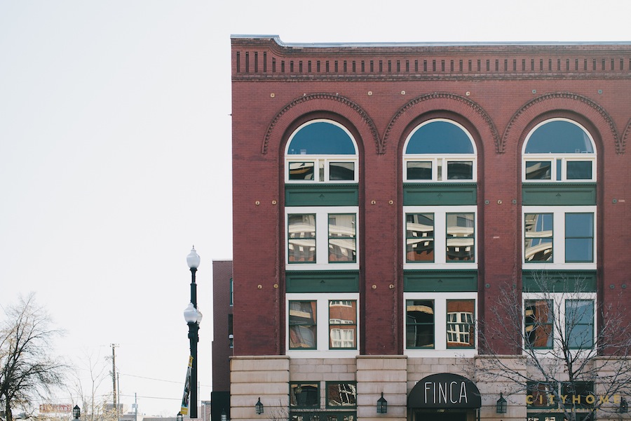
When Cody and I first met with Finca owners Scott Evans, Wendy Evans, and Briant Stringham, the goal was clear: create not just a restaurant, but an experience. We were tasked with designing an environment unlike any other in Salt Lake. First step: Location. After Scott spent countless hours in cold, dusty commercial spaces throughout the city, Cody [acting real-estate agent, as well as designer] helped in the decision and process of locking down the current location, which far outshone the others in terms of potential. The former Lemongrass building at 327 W 200 S was a diamond in the rough. The place was massive--around 6,000 sq. ft.--and completely gutted. It was a blank slate with unlimited potential, but it came with its fair share of design and structural challenges.
"It’s like an old-world Spanish hotel lobby or your Abuelita's cozy, sophisticated house"
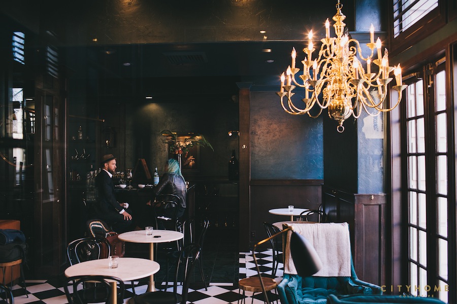
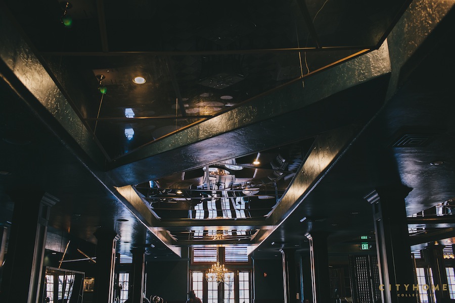
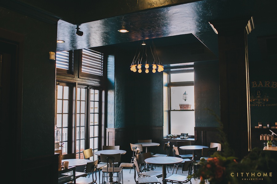
From the start of the project, the concept was to pay homage to the Spanish-style tapas that Finca serves. Aside from that, the owners nearly gave us carte blanche with the design [Hallelujah! Ave Maria! Ay dios mio!]. True to form, Cody Derrick had a vibe in mind: “It’s like an old-world Spanish hotel lobby or your Abuelita's cozy, sophisticated house that’s been in the family for generations. Now, the new generation has inherited it and added some fancy, modern elements to the classic space." Our inspiration came from the rubbled, brightly-colored walls of Spain and South America. We chose a bold color: a deep blue-green that accentuated, rather than hid, the imperfections in the walls. The rich color also made the cavernous space feel more intimate. This, combined with our decision to break up the space into smaller “rooms,” made the large restaurant feel cozy, and we were able to avoid the “cafeteria” feel some larger spaces incite.
this acute attention to detail makes for a sexy, moody, vibey, environment where you can spend hours.
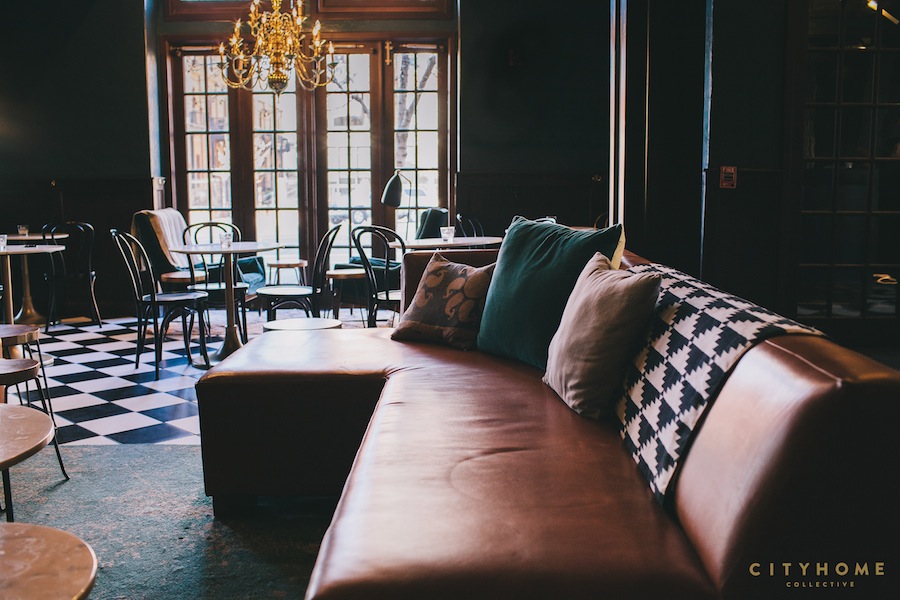
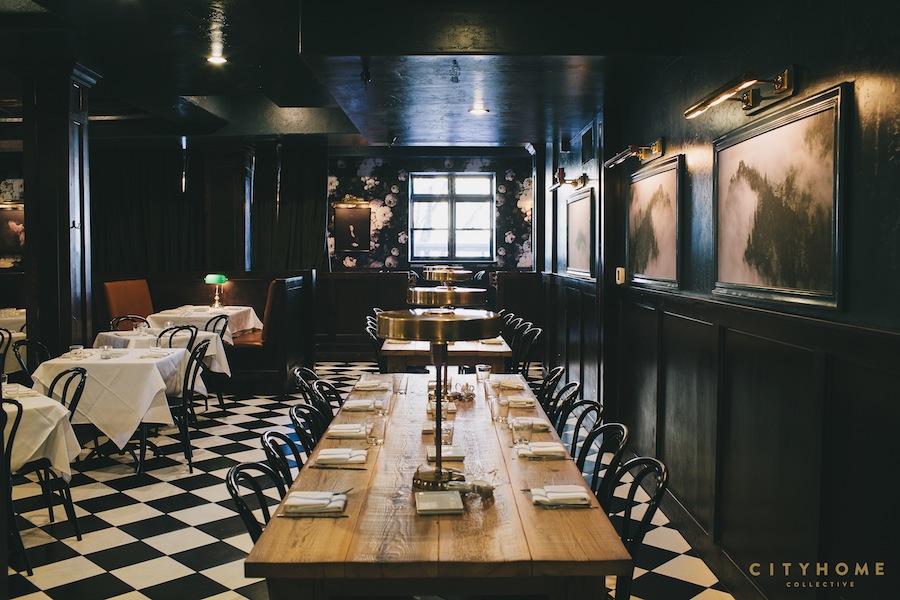
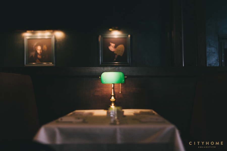
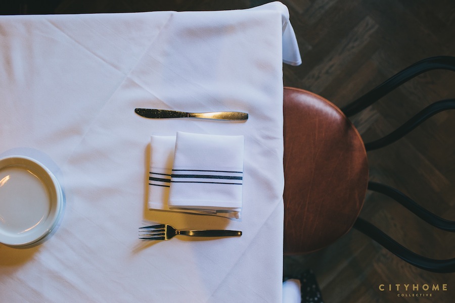
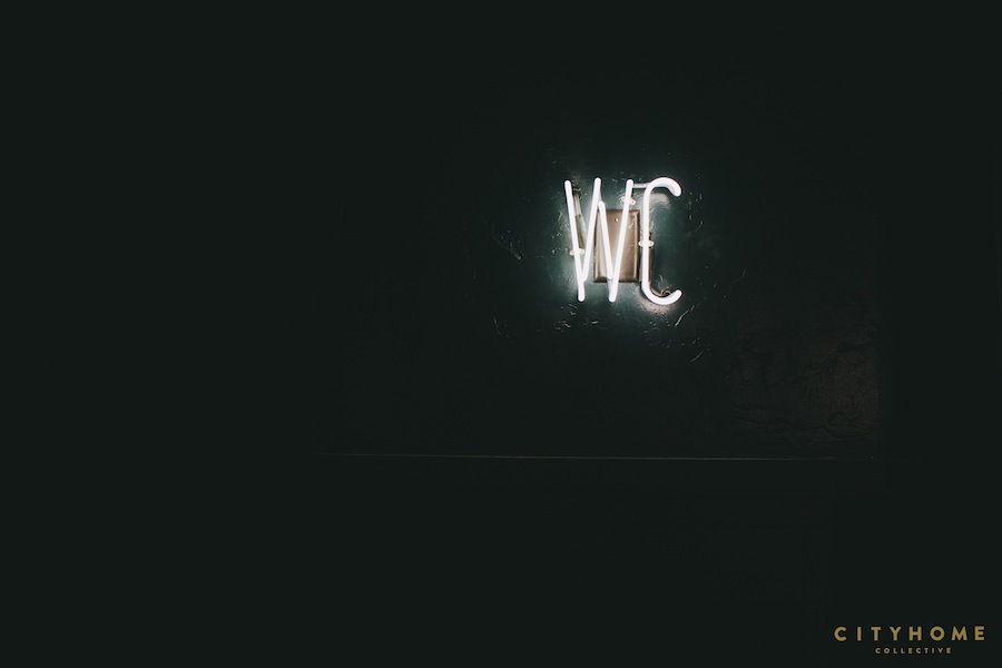
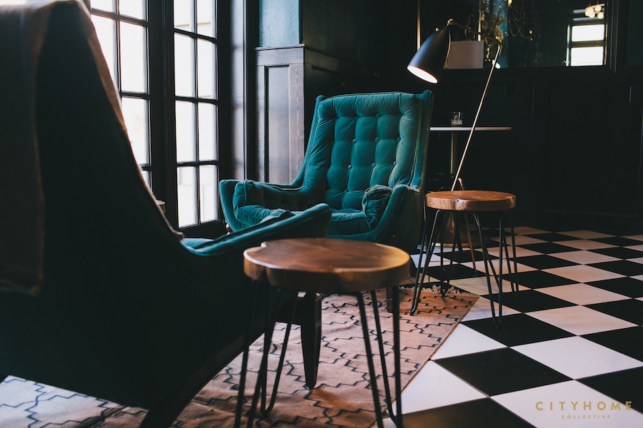
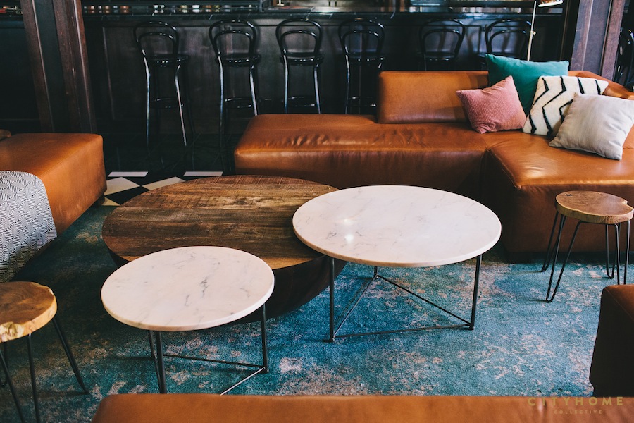
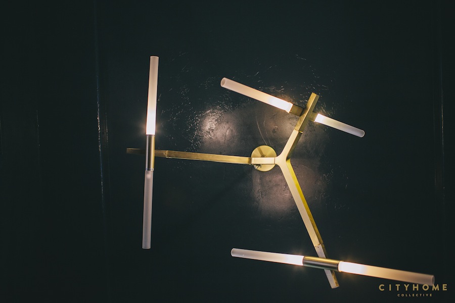
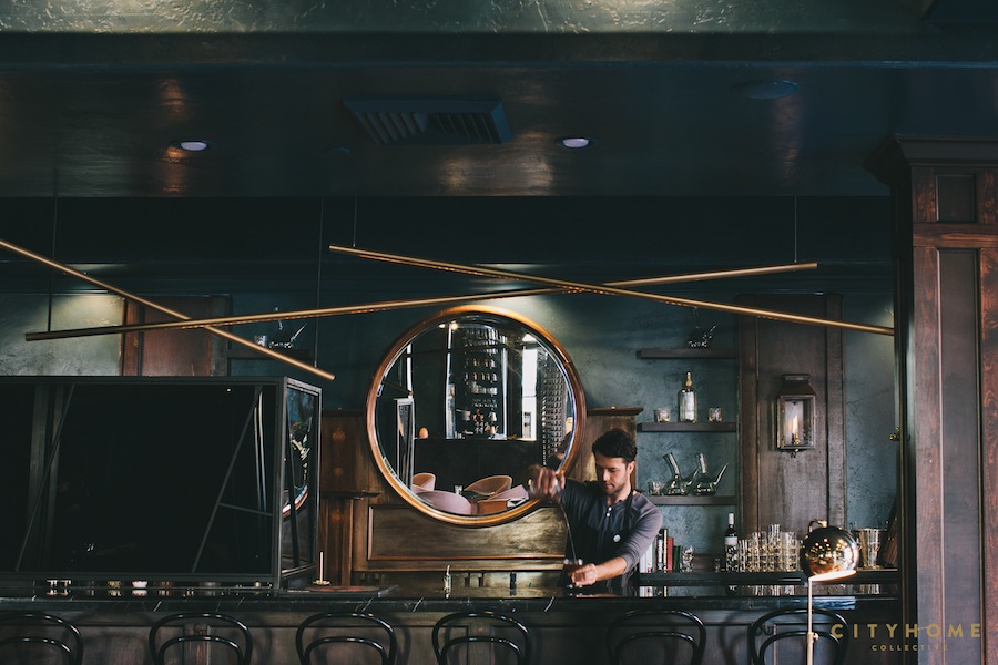
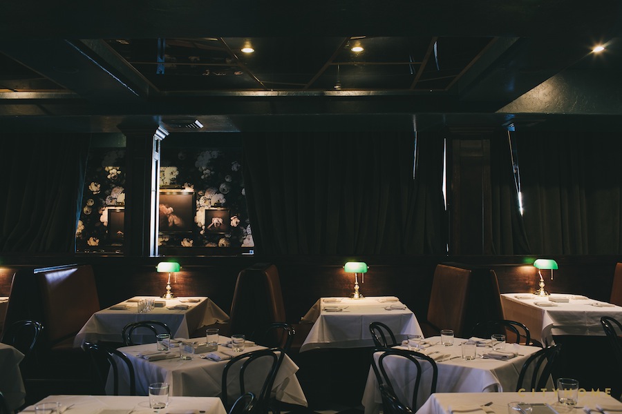
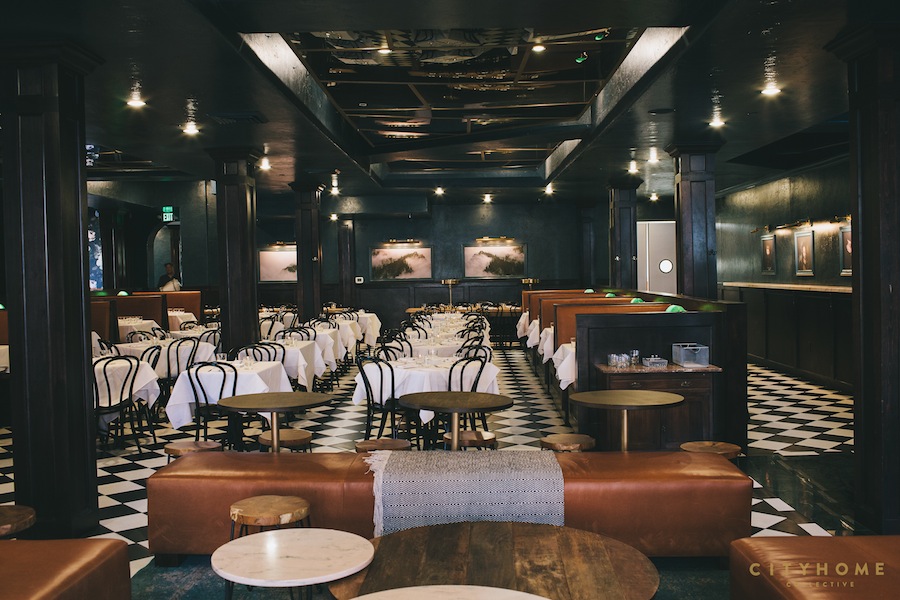
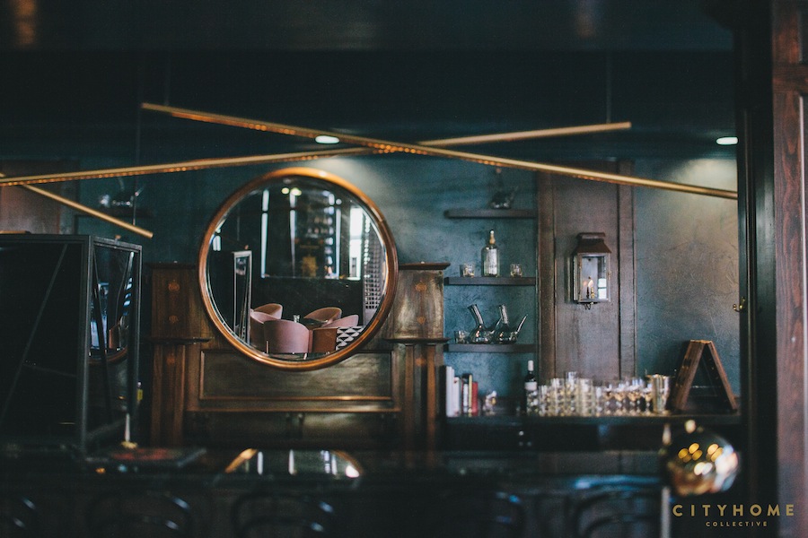
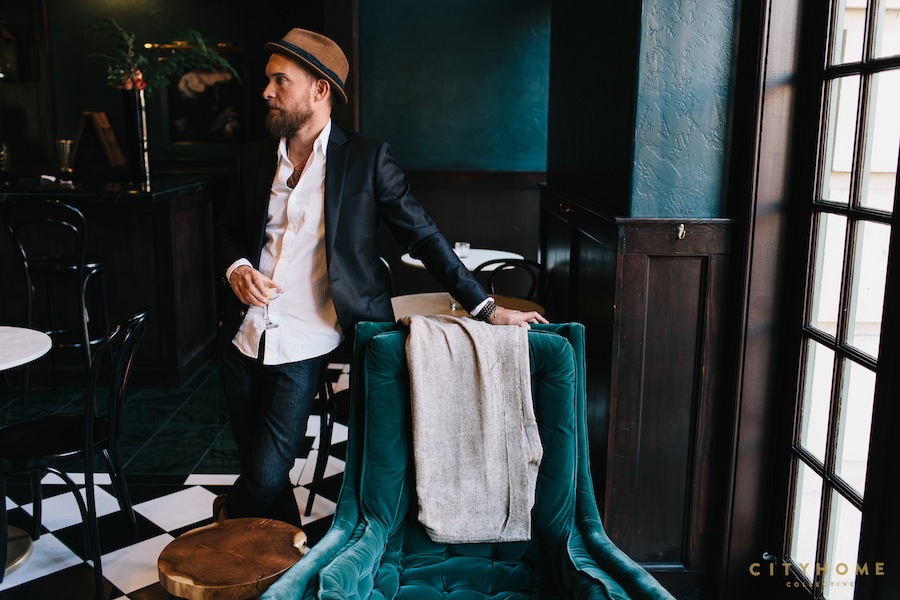
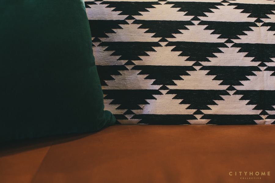
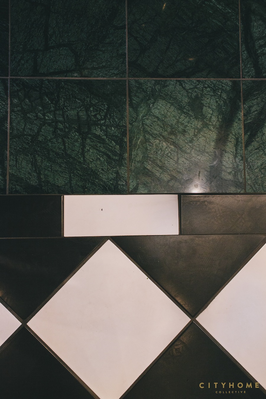
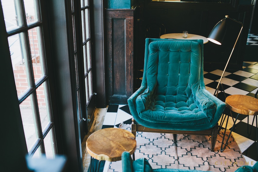
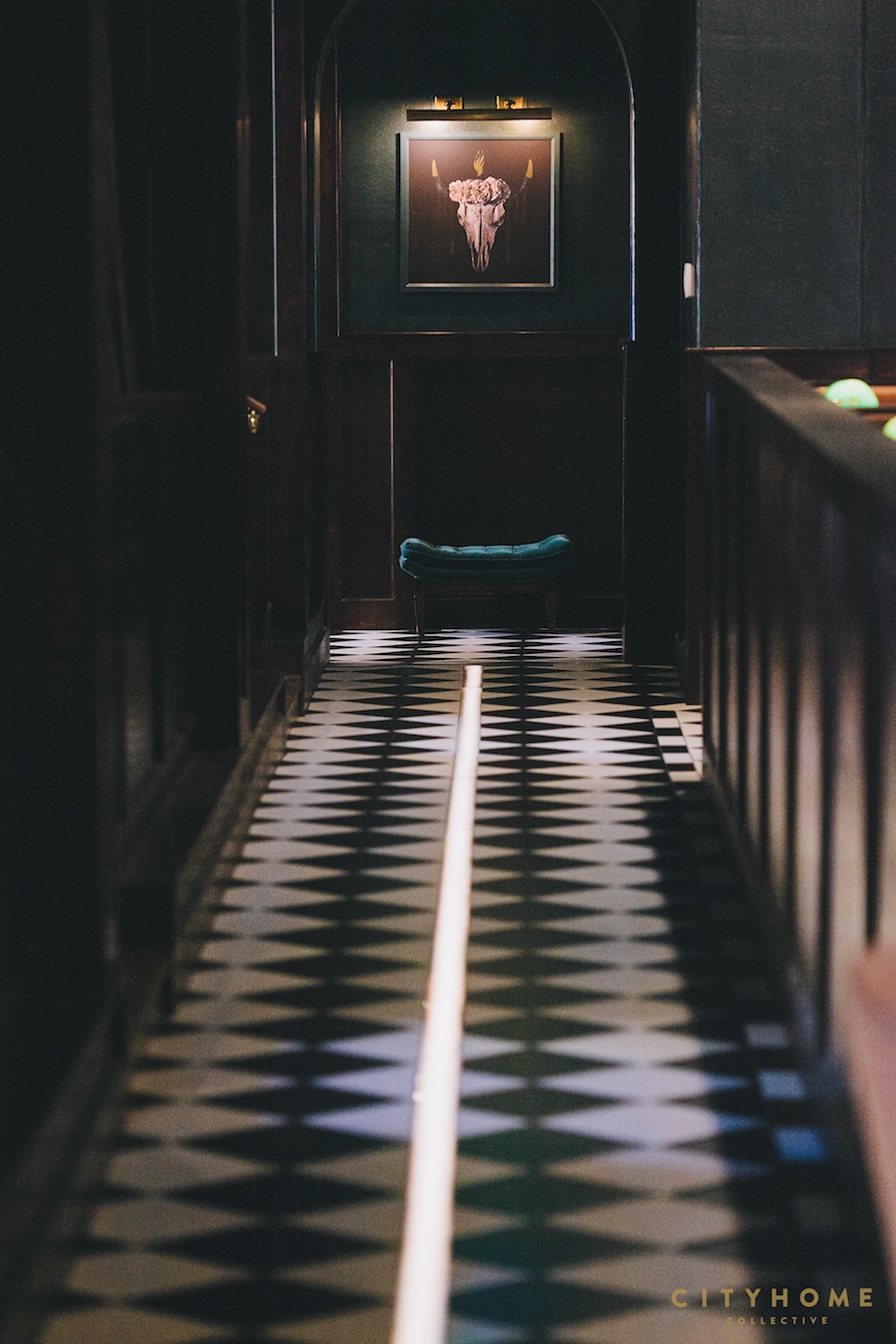
We went to work mapping out the overall layout, and Cody made sure there were plenty of layers to the design. We wanted to create an effortless combination of found antiques [that mantel behind the bar!], classic restaurant style, and pops of modern. The checkerboard floor, white linens, and bistro chairs have been restaurant staples for years. Combined, these elements create the perfect backdrop for the modern and unexpected touches--custom sofas, an array of pink, green, and black marble pieces, and neon lighting. Anyone who knows Cody or has stepped foot into our COLLECTIVE office knows that this particular facet of design--lighting--is everything to this man. He knows his shit, too. There are no fewer than ten different types of lighting in Finca, and this acute attention to detail makes for a sexy, moody, vibey, environment where you can spend hours, regardless of the time of day. Vintage brass art lights are met with ornamental brass chandeliers, tubes of neon, and classic green library lamps. The drop-down geometric ceiling grids serve to spruce up that oft-so-forgotten plane. And let us not forget candlelight--a must for any true Cody Derrick-designed space.
The space is meant to be explored, interacted with, and savored, time and again.
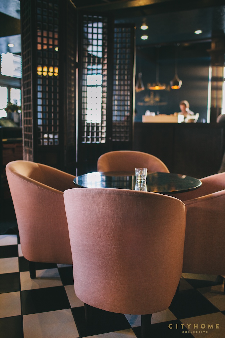
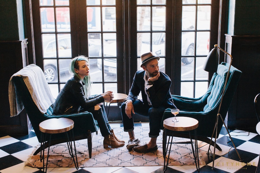
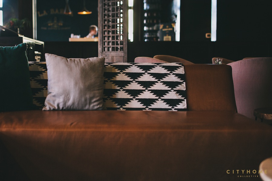
Diners at Finca can be seated in one of several “rooms” or designated sections...a very purposeful orchestration by Cody that required some creative thinking in how best to utilize the massive space. As part of the experience we aimed to create, we wanted to ensure that Finca wasn’t a place you left quickly or enjoyed just once. The space is meant to be explored, interacted with, and savored, time and again. You can pop in for a solo drink at the bar or sip cocktails on the sofa while waiting for the gang to arrive. Read a book in the crushed velvet chairs up front with a glass of big, bold red. Sidle up to a few new friends at the chef’s tables in back; they’re seated family style. If you’re on a hot date, Finca has you covered: comfy, leather booths are as intimate as they are well designed. Special occasion? Grab a spot in the fabulous, pale pink chairs up front--you’re sure to be spotted. Or wait. Perhaps you want to get more private...
Everything looks sexy in these rooms.
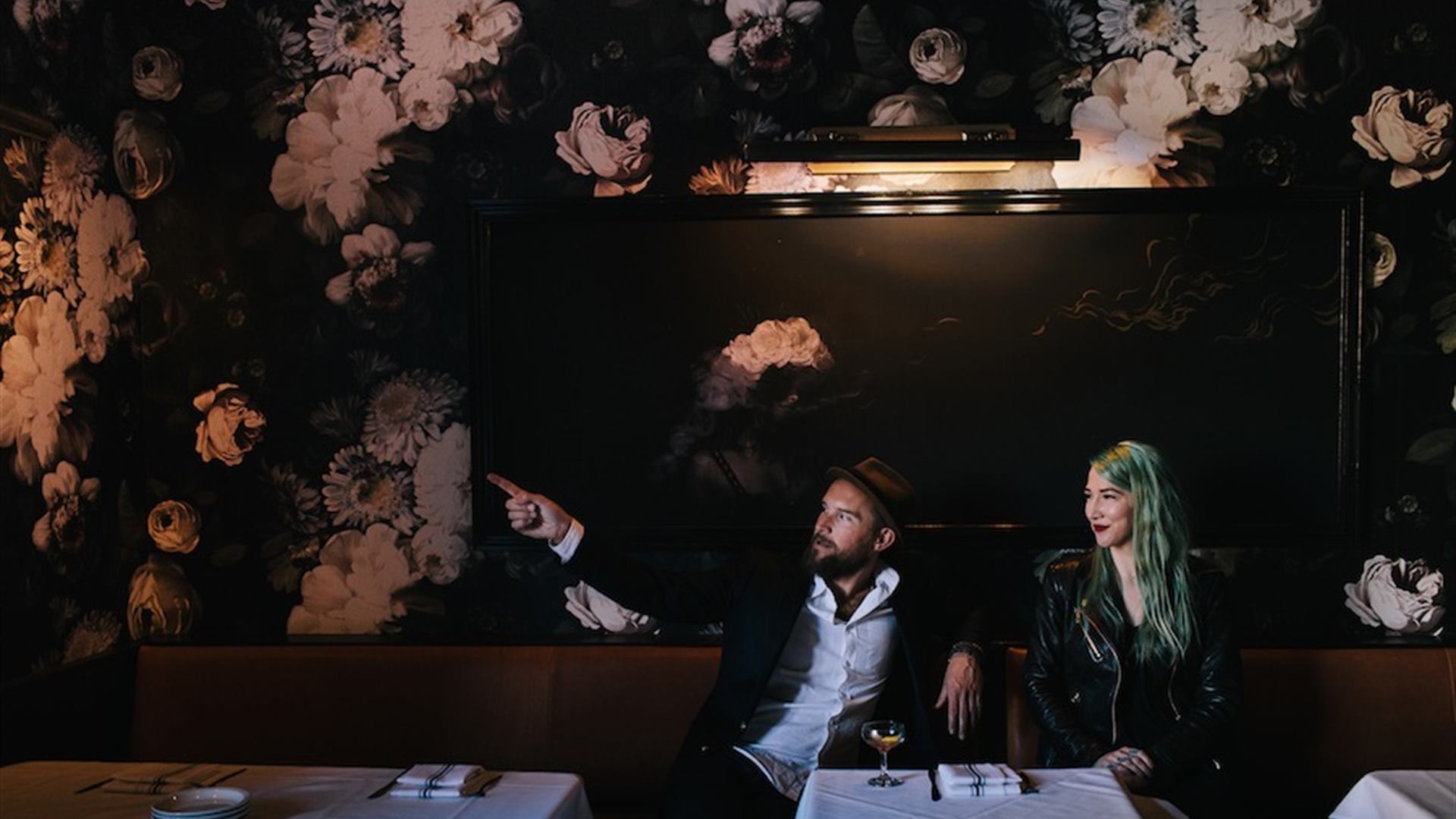
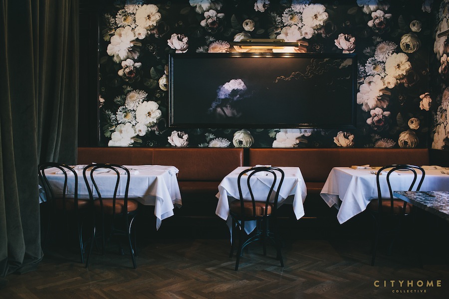
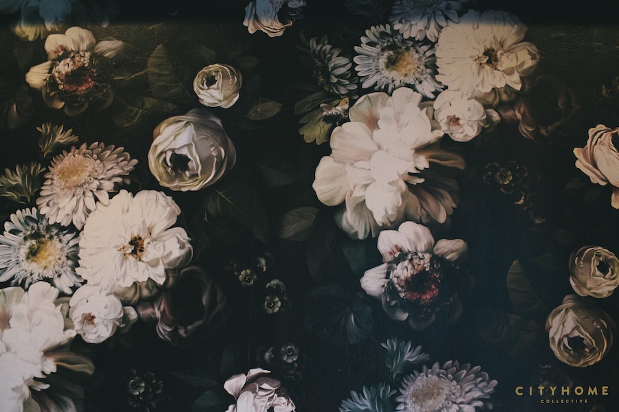
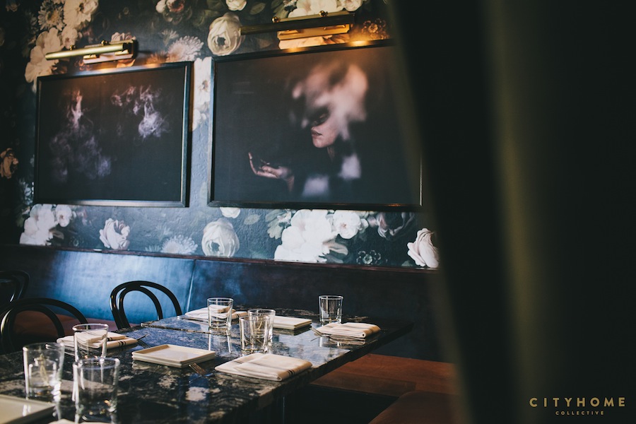
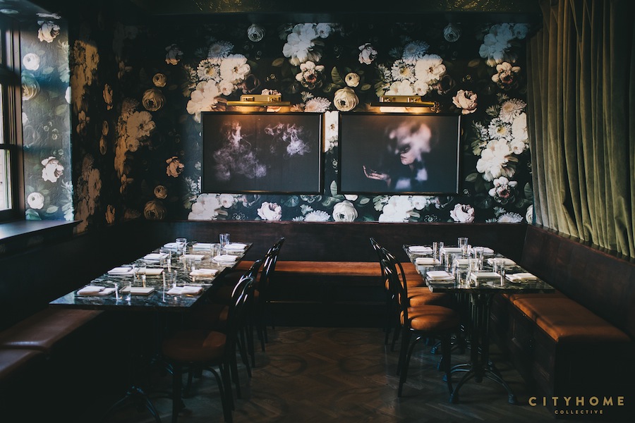
The private dining rooms at Finca were one of the first things to be designed. Even before the paint color was chosen for the restaurant, Cody knew he had to have that floral wallpaper. It's bold, it's sexy, and it's as multidimensional as the tapas on the menu. After sourcing for countless hours, we finally tracked down the paper to British graphic designer, Ellie Cashman. Well worth the flight across the pond. These rooms are dark, brooding, cloaked in grey crushed-velvet curtains, and my favorite space to dine. Everything looks sexy in these rooms.
These photos are SLC. And so is Finca.
The icing on the cake of this once-in-a-lifetime design project is the art; a specially-curated photo shoot by two of our own. Jess Downer and Renata Stone are local photographers who frequently shoot for the cityhomeCOLLECTIVE website. Each photograph in Finca was artfully shot by the pair and styled to a T by Cody. Local artist, Dan Christofferson, then embellished the photographs by hand with tiny gold delicacies. Cohesive layers are what make the art in Finca truly special. The landscapes aren’t frivolous; photos of Big and Little Cottonwood Canyons were taken on a particularly drizzly and beautiful fall day. The models aren’t models; locals, friends, and family posed for the walls. The face of a proud restaurateur and a COLLECTIVE employee may have been thrown in for good measure. These photos are SLC. And so is Finca.
The design is purposeful, balanced, invigorating, refreshing, and unique.
Here at cityhomeCOLLECTIVE we glorify the creation of spaces. It’s our pan y mantequilla. I wholeheartedly believe we have created one hell of a fine space in Finca. The design is purposeful, balanced, invigorating, refreshing, and unique. Cody Derrick has done it again, and I'm proud to have been a part of it. In chatting with him about the project, he told me: “We’ve gotten to create a space where we’re inspired to be. It’s something that’s never been done before; something that’s inspired by the space itself. It’s inspired by the food and the chef, the owner, the locals. It’s inspired by all of that, but it’s still here. It’s in Utah. Which is why we have mountains on the walls, and locals in the photos. It’s not trying to be anything other than what it is. Finca is a Spanish restaurant in Salt Lake City, so let’s just celebrate that.”
Couldn’t have said it better myself.
Sourcing guide: Lighting by Buzz at Retrospect, custom upholstery by Lenny Sharp, marble/bedrock quartz by European Marble & Granite. Contact cityhomeCOLLECTIVE for other design questions.


.jpg)
.jpg)
.jpg)

