Let's get one thing straight: Our clients are numero uno. This is something we chat about internally all the time, in truth. Above all else, we consider ourselves to be part of a service industry, and we happily spend hours and hours brainstorming how to better serve. How to create the most caring, distinctive, and wholly effortless experience for our people. Whether it’s design, real estate, staging, or city love, we're here to serve. When investor, Chris Day, jumped on board with cityhomeCOLLECTIVE for a new project, we were tasked with designing a home that he would ultimately sell. "Flip" is a term which often alludes to generic or shoddy design. We don't do that. Instead, the goal was simply to create a space for a future client. So we were faced with a question: how do we best accomplish the desire to serve when we're working for a client we don't yet know? How to be sure this unknown future owner would be thrilled with the final result? In answering that, we had to consider our current clients. You’re smart. You’re well educated. You have a passion for design and you--like us--know that your home is a direct reflection of who you are. You're way cool, you're totally kind, and your informed tastes are matched only by your innate, impeccable style. It's these qualities we had in mind when we set to work designing 1619 Roosevelt. We were designing for you.

we opted to raise the roof (both literally and metaphorically, obviously)
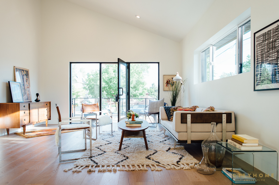
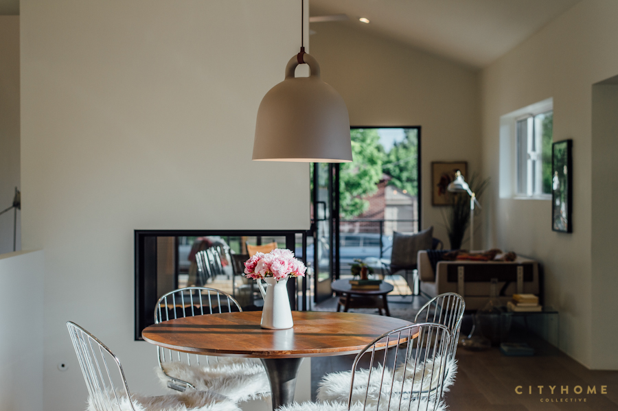
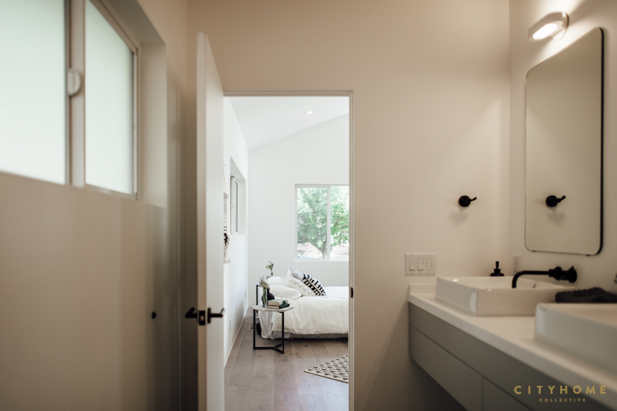
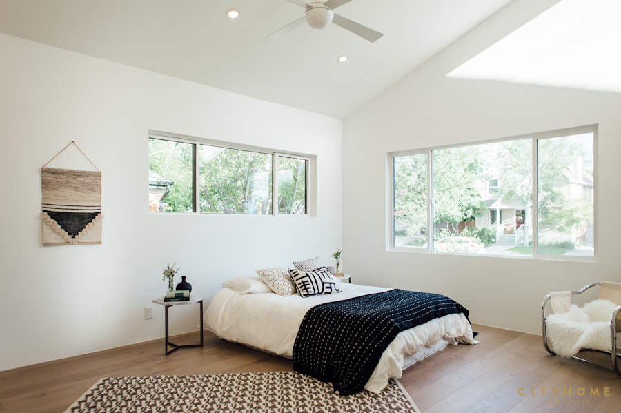
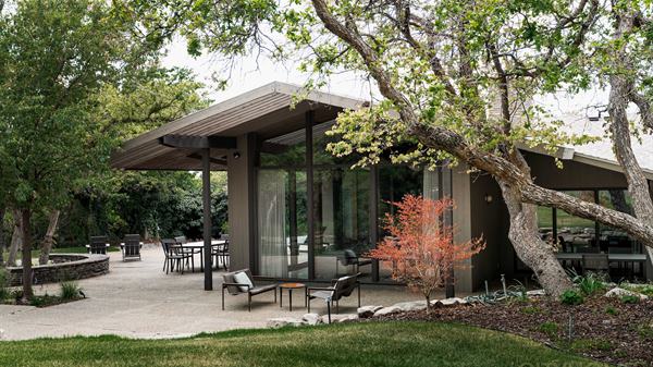
The bones of the house were swimming with potential, but as with most good investments, they required some vision. What existed was a dark, 1964 duplex with a maze-like layout and scant sunlight. The only windows in the kitchen served the pantry, and the basement level apartment had a sloping floor and felt something akin to a shoebox. Our first aim was to invite in some light and space. To that end, we opted to raise the roof (both literally and metaphorically, obviously) to create soaring, vaulted ceilings in the living room and main suite.
.jpg)

All design elements, we reasoned, that a smart, savvy, future owner might expect.
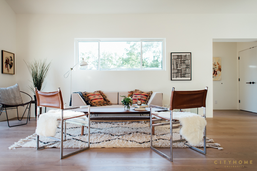
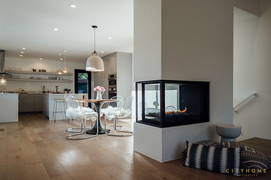
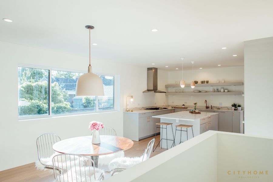
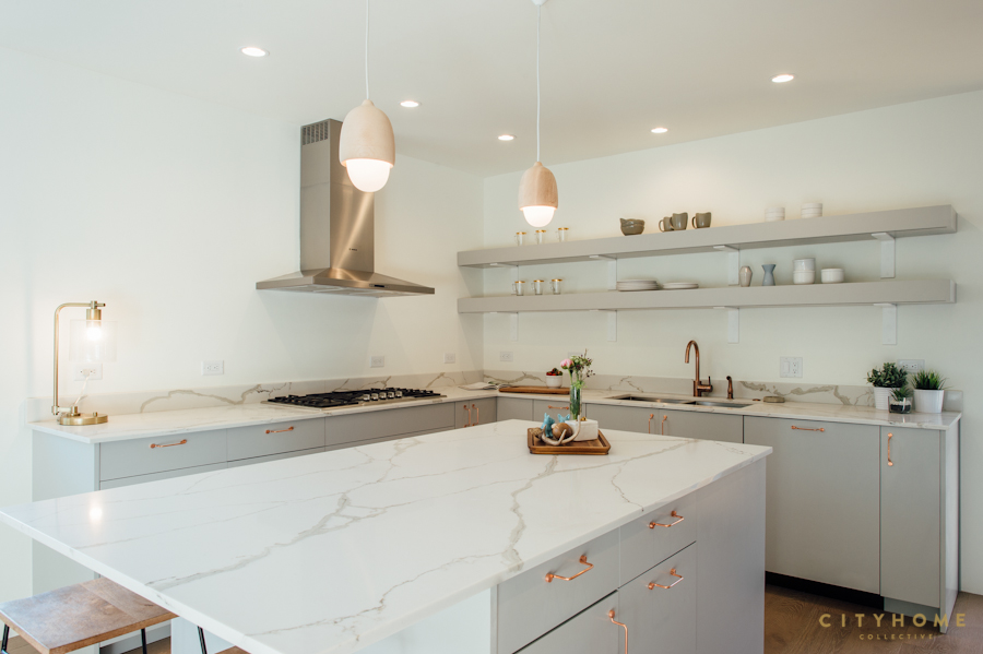
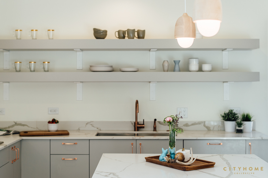
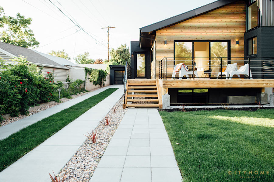
We used storefront windows for loads of natural light, and since the flow of the space was highly important, we tore out walls--rather than a separate kitchen and living space, a 3-sided fireplace effectively delineates without a closed-off feeling. Similarly, we wanted to continue that open feeling with the staircase, so we used vertical cables, rather than a classic railing and balusters. Finally, the addition of a tidy front deck made the entire lot usable and continuous. All design elements, we reasoned, that a smart, savvy, future owner might expect.
we'd say it's safe to assume we hit the nail squarely on its well-designed head.
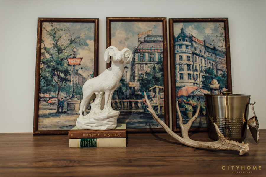
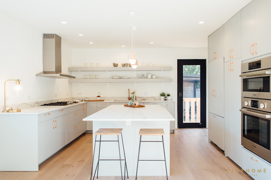
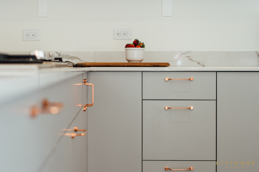
Neither would this future owner be willing to settle on standard-issue finishes, we assumed, so we decided on Scandinavian Modern, an aesthetic known for neutral, but design-forward elements. Light wood. White walls. Of-the-minute copper kitchen hardware, straight from Stockholm. We balanced the streamlined, wall-mounted, main bath vanity with a pop of pattern via cement tile from Morocco. We opted for a wall-mounted sink with exposed piping in the powder room, and updated the concept of a wooden rain screen by planing the cedar down to size, and retaining the raw wood color. Because ultimately, we think these are the sort of details that our clients can appreciate. And since the home was sold to happy camper, we'd say it's safe to assume we hit the nail squarely on its well-designed head.
Contact cityhomeCOLLECTIVE today to discuss your next interior design project (or your next home/investment), big or small | 801.718.5555
Of-the-minute copper kitchen hardware, straight from Stockholm.
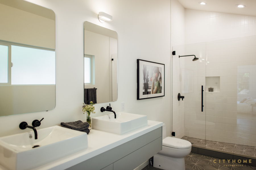

We balanced the streamlined, wall-mounted, main bath vanity with a pop of pattern via cement tile from Morocco.

.jpg)