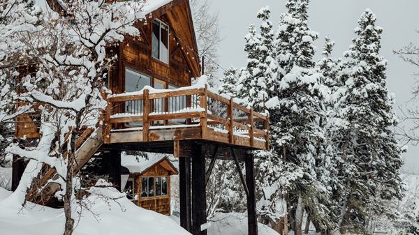
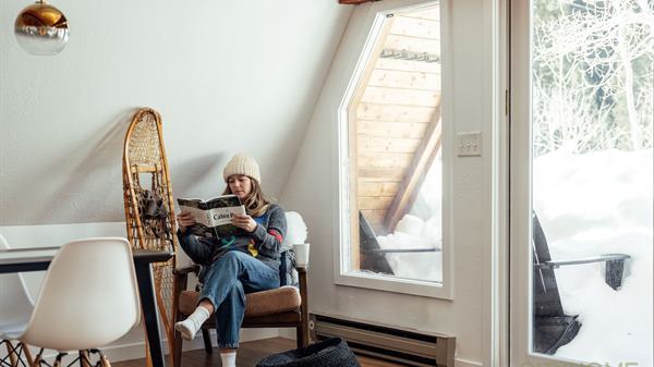
Salt Lake City has a plethora of talented architects, without question. But, really, there are only a few firms that are pushing the boundaries of modern design in every facet of their work portfolio. And, since we pride ourselves on enlightening you all on the many amazing sides of SLC's design/architectural landscape, this marks the first installment in a small series: three stories on fantastic SLC-based architecture firms, all of which happen to start with the letter "A". First up: Pierre Langue and Axis Architects. This gang has brought a modernist aesthetic to a boundaries-be-damned array of projects including sexy homes, noteworthy projects for government agencies, and super-cool commercial spaces (including their own office, shown in the first two photos below, which sits inconspicuously in the midst of a row of rough-edged storefronts at 900 S and State). One of the COLLECTIVE's own architectural advocates and real estate agents, Paul, had some original face time with Pierre about recent Axis projects and what we can expect from these talented folks down the road...
Axis Architects | 927 S State Street | 801.355.3003
"The design is very abstract, but also very logical"
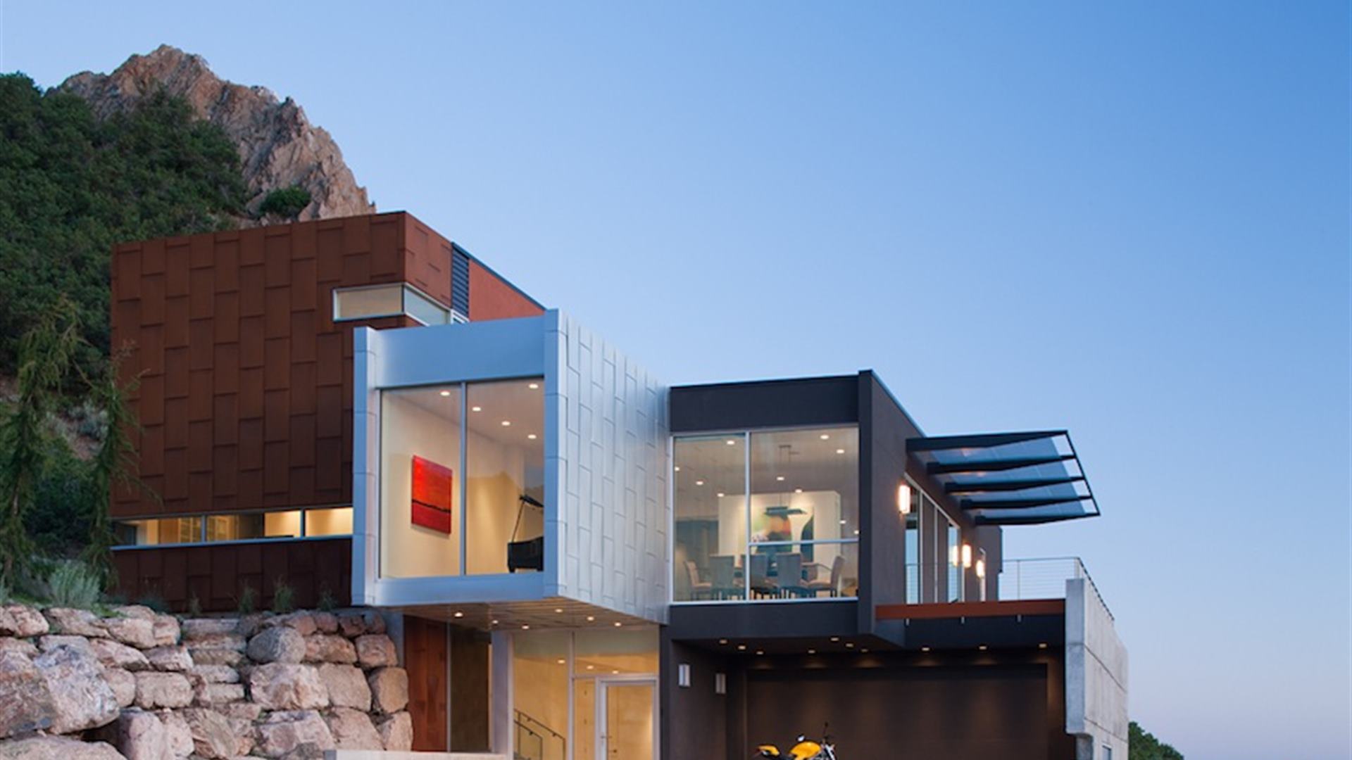
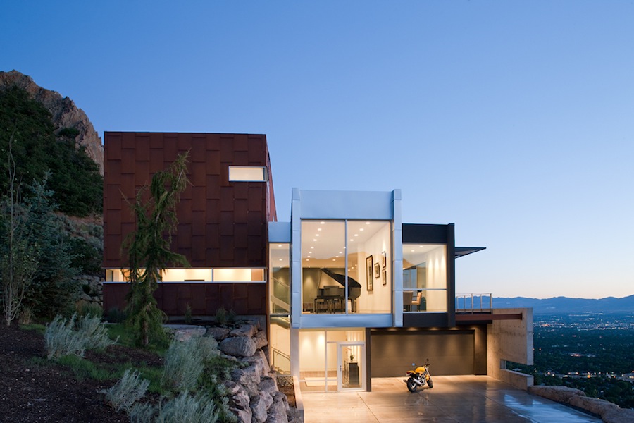
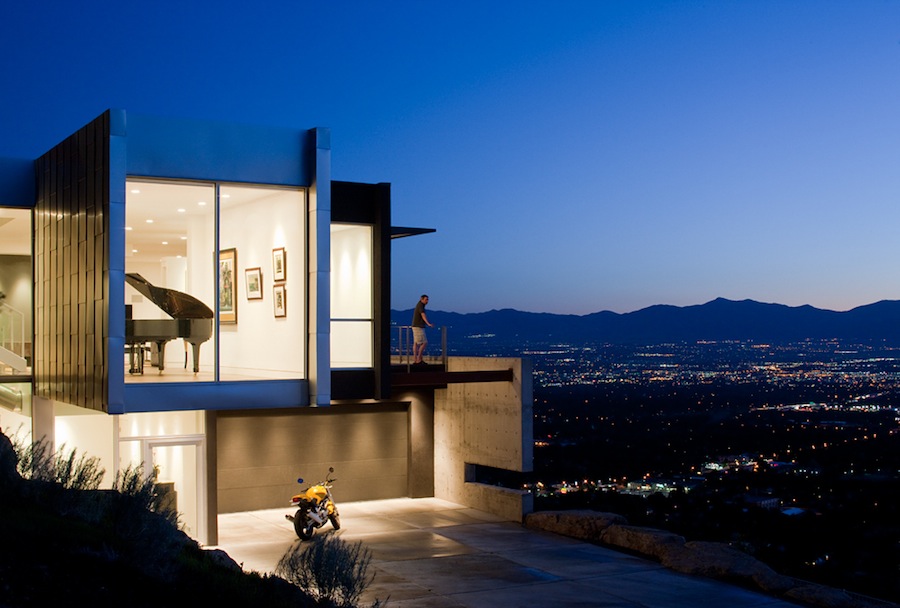
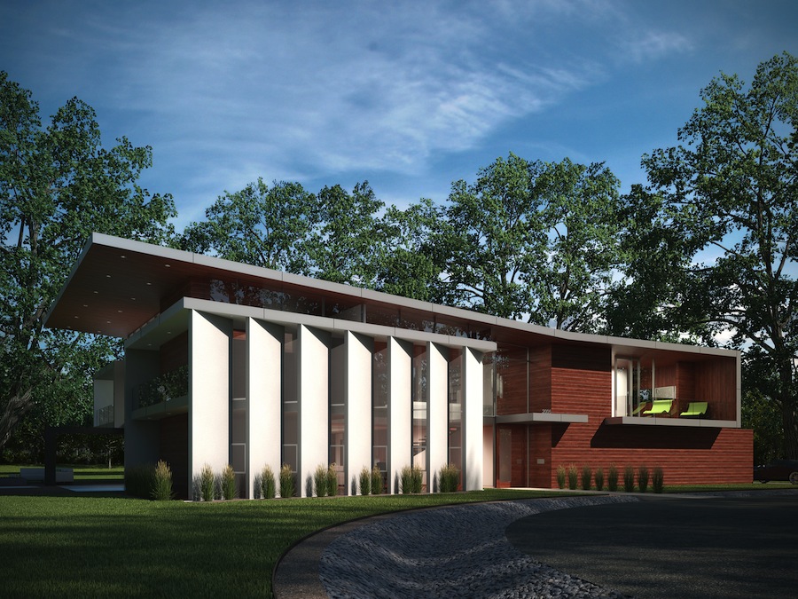
Your work on the H House (next to the H rock on the east bench) earned you an award form the local AIA chapter, and it's gotten loads of press in the architectural world (Ahem: full page ad in Dwell Mag? Nice.) What is it about the design of that home that makes it resonate with people so strongly? Yes, the H house has been published in many magazines throughout the world and online. It's even featured in a Disney Show. I designed the house ten years ago and it was built in 2010, but it is still very progressive today. I think the reason it has gotten so much press is that the design is very abstract, but also very logical. At first glance, it is very sculptural, but a second look starts revealing clues of what might be inside. It is human nature to be curious and the house is intriguing that way. It's integrated into the slope of the site. The living spaces of the house are oriented toward the expansive views of the valley and the Great Salt Lake and you can see that from the outside. One of the challenges of this project was to allow for the views to the west, while protecting the house from the afternoon sun. A large overhanging shading device provides shade and gives a distinctive character to the house. I believe that good design makes sense.
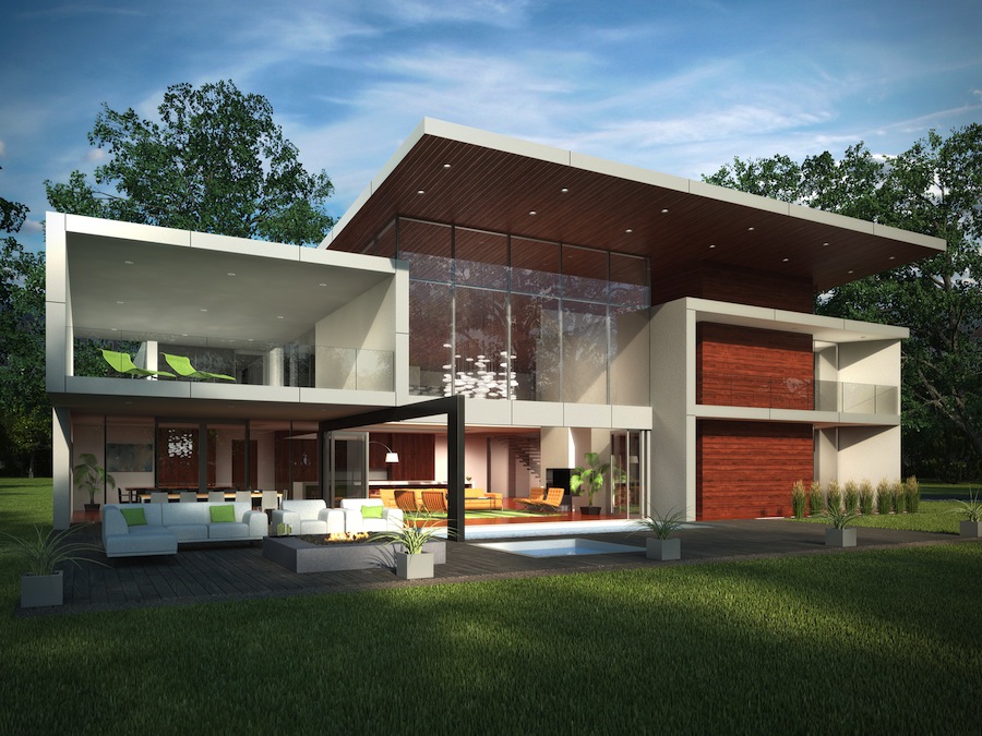
Are there other modern, residential Axis projects in SLC? I designed another really modern house on 18th Ave, which is also very green. The façade is Corten steel and zinc, and it requires very little maintenance. The heating is hydronic and the cooling evaporative, but ducted to every room in the house. It also incorporates many passive solar principles and we carefully studied the solar angles through software analysis. The Mullin residence in Park City is also very progressive (and is currently under construction). I also just completed the design of House 55 in Holladay for a private developer. I love designing houses and we are always looking for that special client who wants excellent design.
"Since the structure serves a hospital, I chose a microscopic photo of a bone marrow."
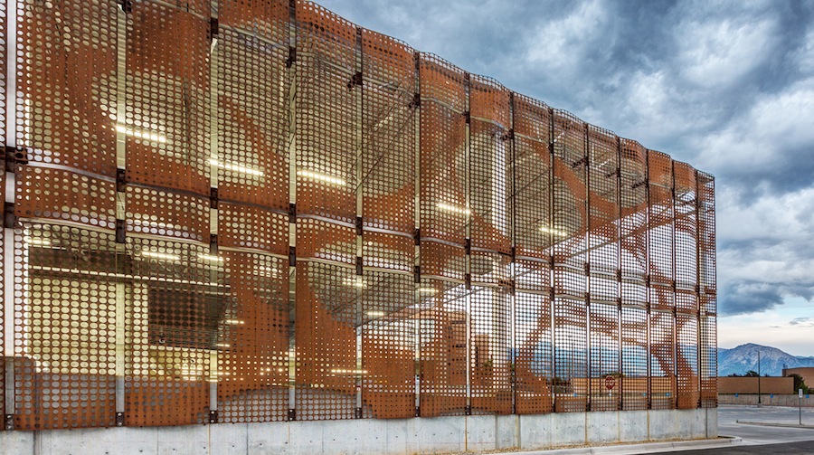
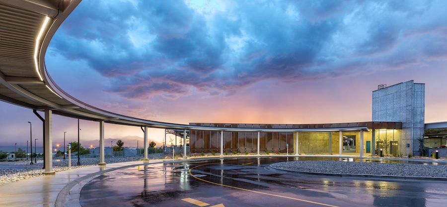
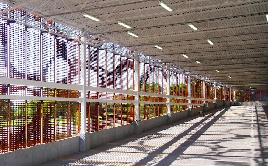
One of your more prominent, recent projects is the parking structure on 500 South for the Veterans Adminstration Medical Center. Why did you propose the metal panels, and what inspired that rad perforation pattern? That solution, as in most cases, came from a great problem. Did I mention we love complex problems? In this case, the design challenge that was presented by the client was to create a parking structure with a solution for suicide prevention and fall protection. Most parking structures have large openings, which allows for possible suicide attempts. The exterior skin of the VA parking structure was designed to prevent this by creating a metal cladding system that creates a virtually impenetrable exterior. The client also requested a material that would require little maintenance. I chose perforated steel panels as the material for the skin. As the metal naturally oxidizes, it creates a self-sealed surface which will not spall, discolor, or require repainting. Perforated steel sheets were bent and folded to create rigid panels. This allowed the skin to be constructed of a lighter gauge, lowering the overall weight, as well as decreasing the amount of structural support and of course, cost. Since the structure serves a hospital, I chose a microscopic photo of a bone marrow. Interestingly enough, it resembles camo and resonated with veterans of all ages. A lot of these guys were just very excited that someone wanted to do something different for them. We actually saved money by using the panels over the standard VA brick veneer.
"We live in a fast-changing world and it creates new problems that require new thinking."
We can't conceive of any parallel design concepts in Utah…was it tough to convince the VA to do approve an out-of-the-ordinary design? We found the VA administration to be very open to new ideas. We live in a fast-changing world and it creates new problems that require new thinking. Ultimately that is what Axis Architects provides--real solutions to real problems.
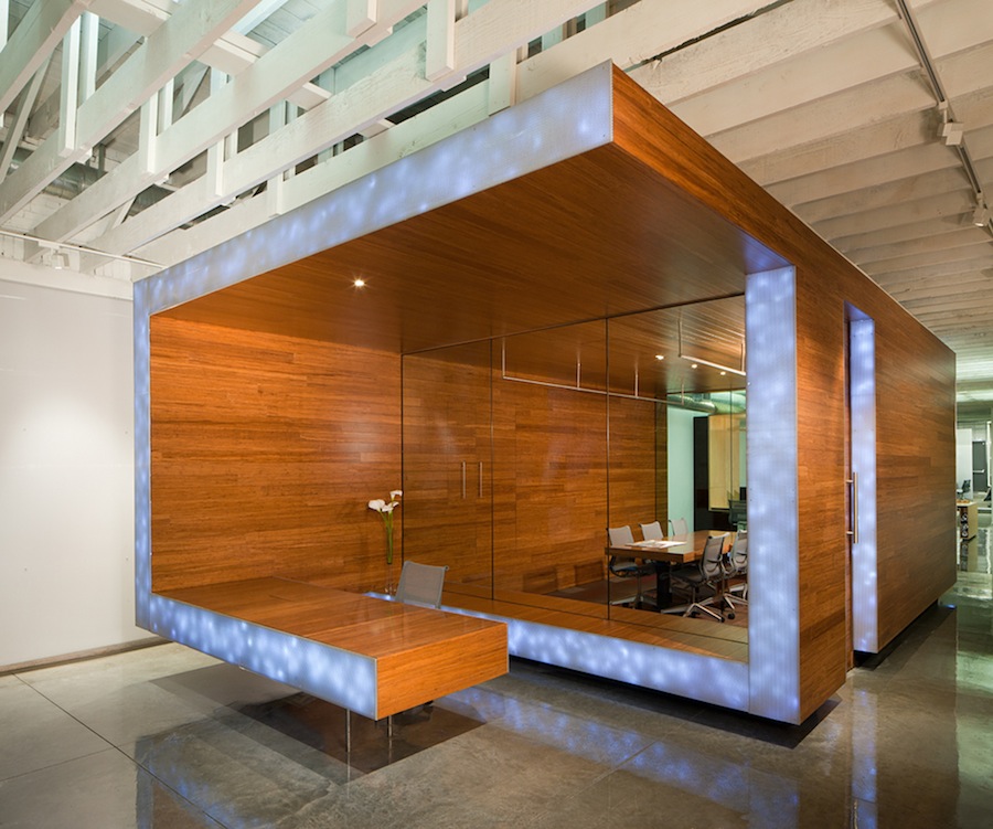
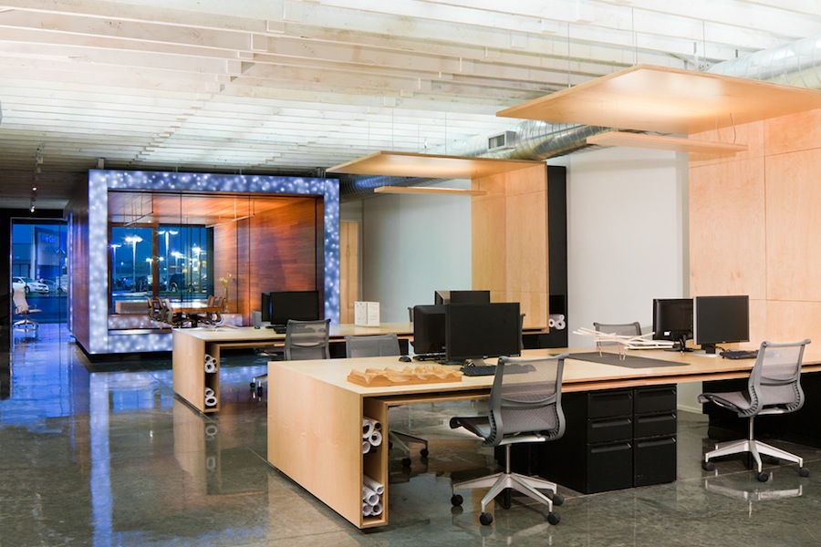
Your office on State Street used to be a dilapidated trophy shop, and now it's one of my favorite office spaces in SLC. Especially that bamboo and glass conference room floating in the center of the space. Talk about that a bit. I bought the building for $100k and put another $150k in the remodel, which is great for 3,500 square feet. I did some of the construction myself, after hours and on the weekend. It was especially difficult because I was also building my house on 18th Avenue at the same time. The design is very simple…it had to be. We reused a lot of materials from demo projects. We designed our own Curtain wall system and had the glass installed onto it. The building only has views on the front and back, so the conference room had to be a “tube” so it wouldn’t obstruct the views. Again, it just makes sense. The building is also LEED Gold and has gotten an award from the American Institute of Architects, Utah Chapter.
Any exciting projects on the boards that you can share with us? I’m working on a really cool project made entirely of shipping containers and a student housing master plan for the USU campus in Moab.


.jpg)

