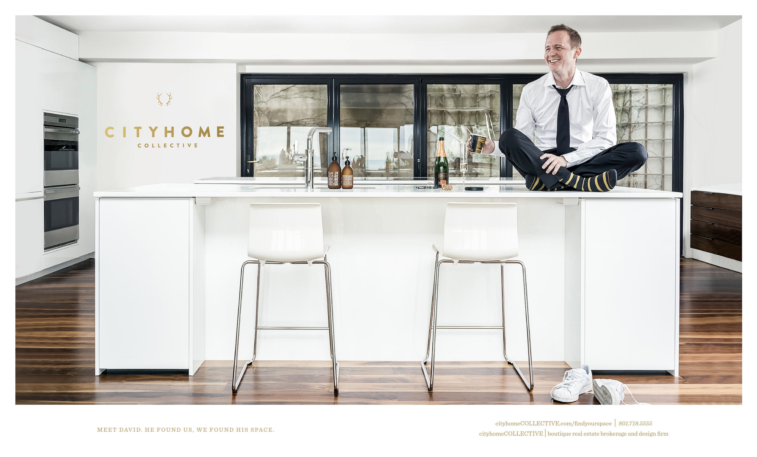
MEET DAVID. HE FOUND US, WE FOUND HIS SPACE.
When we launched our most recent ad campaign, we knew one thing with a surety: we wanted to highlight why we do what we do. That is to say, we wanted most fervently to spotlight our clients...the beating heart and settled soul of our business. Spaces are of the utmost importance [duh...we preach it err'day], and our job is making the connection. Whether you're moving in or moving out, we match the human to the home [on the real: this lovely site doesn't pay for itself...we're a team of goodly realtors who help clients list, purchase, and design the spaces they love]. And hopefully -- in the process -- we hook up with some really solid people. Hand to heart, our favorite clients are the ones who become our favorite friends. Enter, David.
you really should find your space [and, of course, that we can help you do that]
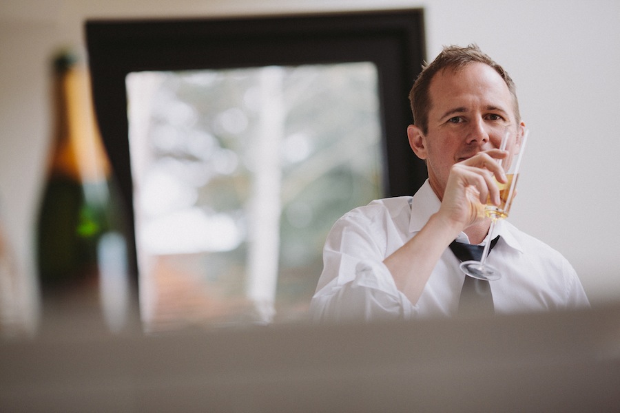
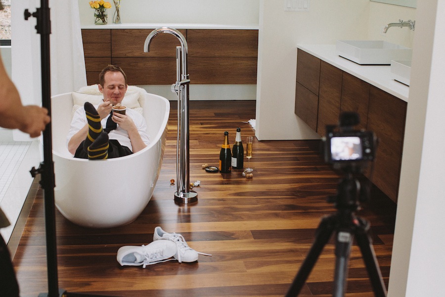
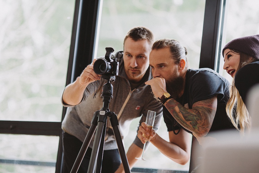
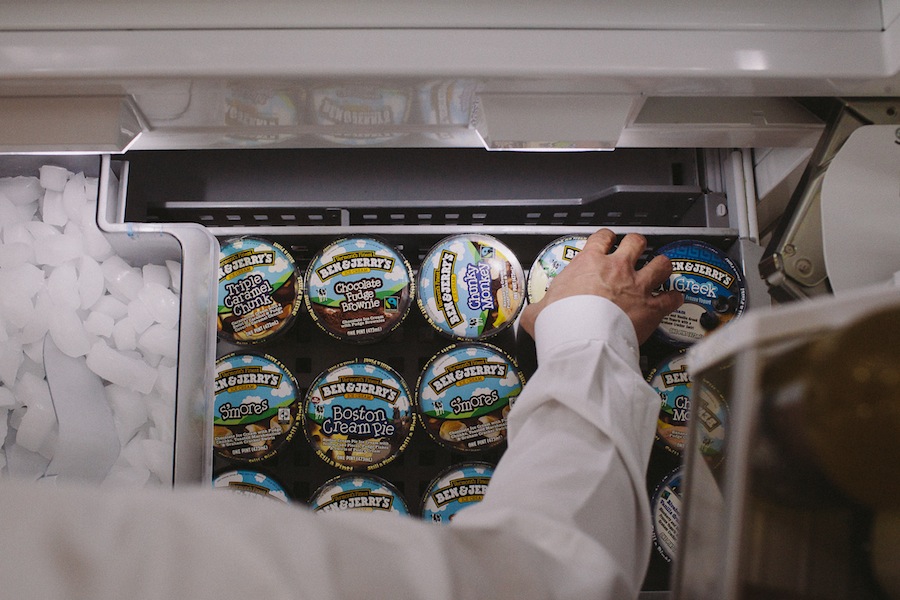
Kicking and screaming [but less dramatic than that], we talked him into letting us take a few shots to prove our most pointy of points: only that you really should find your space [and, of course, that we can help you do that]. Each campaign, current and coming, is an authentic representation of the magic/joy/contentment that comes with finding your space and loving where you live. Case in point, for our first ad [hitting the shelves in April in the pages of the fab Utah Style & Design] we employed the power of ice cream. It's no lie. Our subject is an avid fan, and the shots of his freezer below are an accurate representation of how you'll find it on any given day of the week. No surprise, then, that he willingly blazed through a couple of small cartons for the shoot. We also went through an undisclosed amount of champagne, but that's got more to do with friendship and a productive workday than anything else.
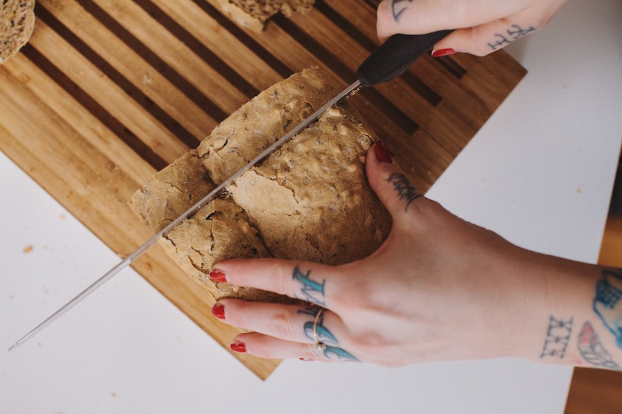
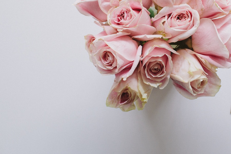
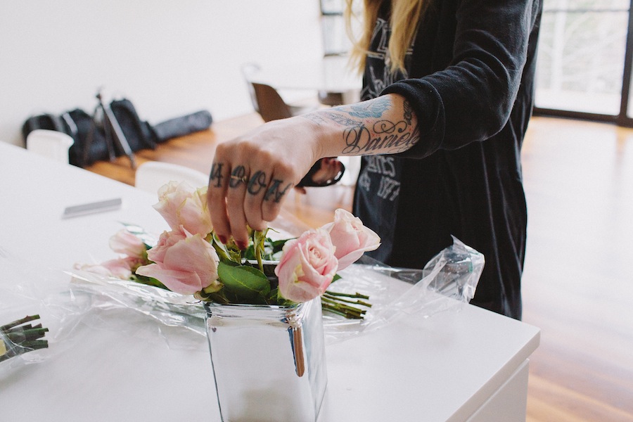
our shoot was a mixture of 'the talent,' some fresh flowers, and a bit of creative thinking.
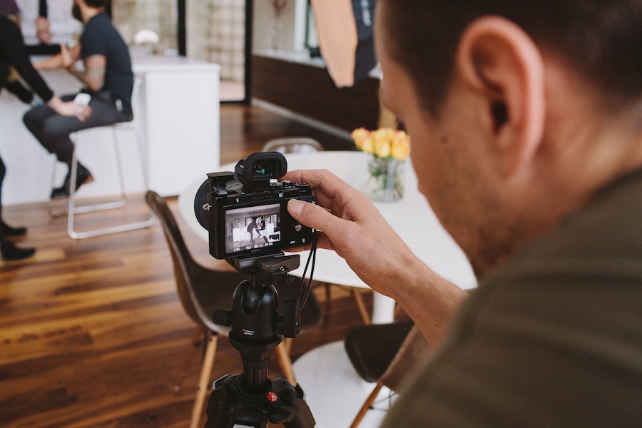
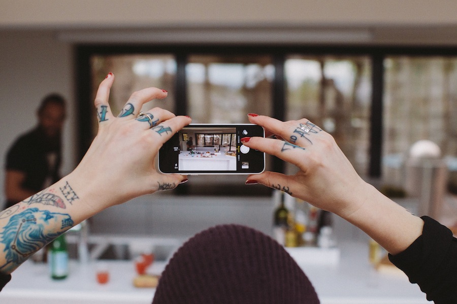
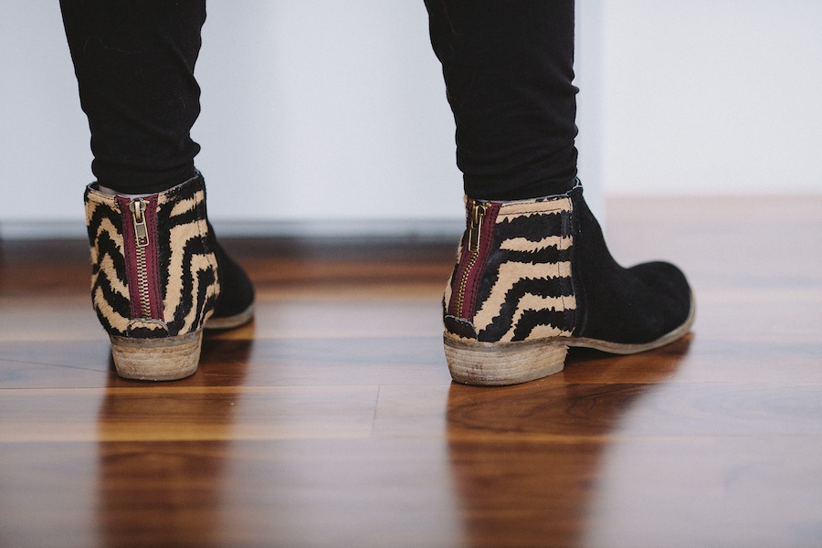
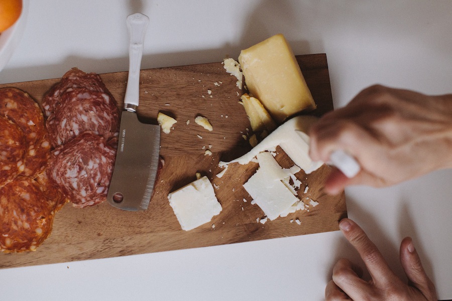
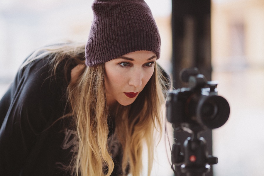
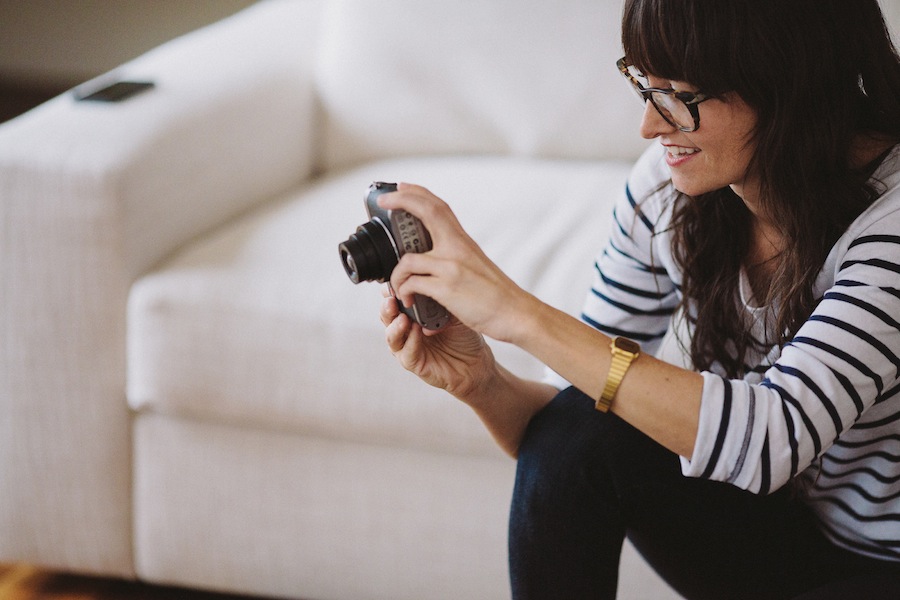
Our recipe for the shoot was a relatively simple one. COLLECTIVELY, we had a concept in mind, so we gathered a few key creatives to round out the process. For the ad itself, we employed the keen eye and cool camera of George Oakley. He's the looker behind the lens, and upon gazing at the ad below, you'll understand our new-found adoration for this fella. For our behind-the-scenes shoot, which you can feast your eyes on below, we turned to one of our most adored and talented clients, Renata Stone. She's as savvy with a camera as she is easy on the eyes, and between her and hubby, Jess, some seriously good shit has been delivered as of late [watch for this week's Eva blog, and a future story on the pair]. The rest of our shoot was a mixture of 'the talent,' some fresh flowers, and a bit of creative thinking. We hope you love the final ad as much as we do -- pick up a copy of Utah Style & Design [or just head to your mailbox if you're a subscriber].


