Fed Up Kitchen
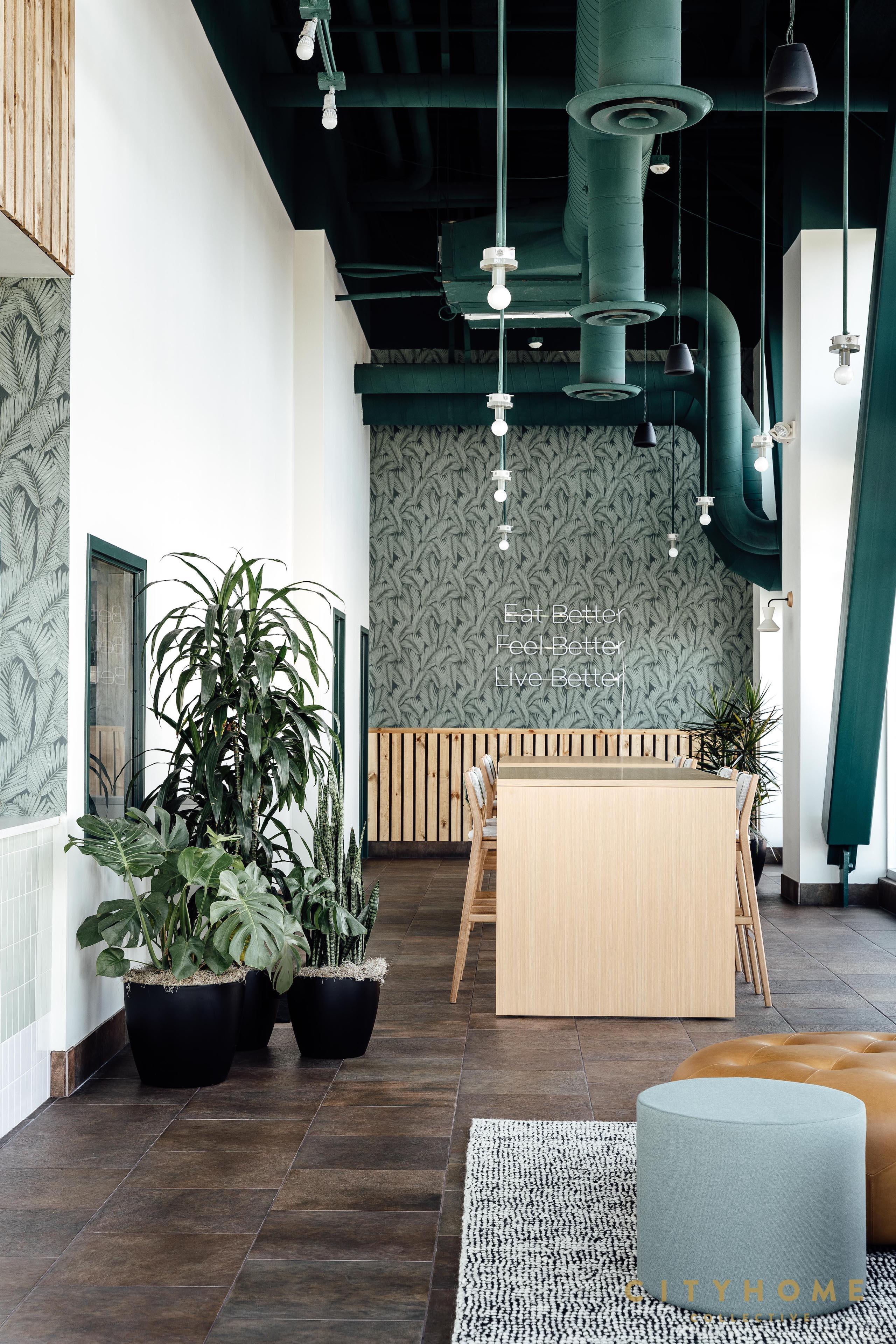
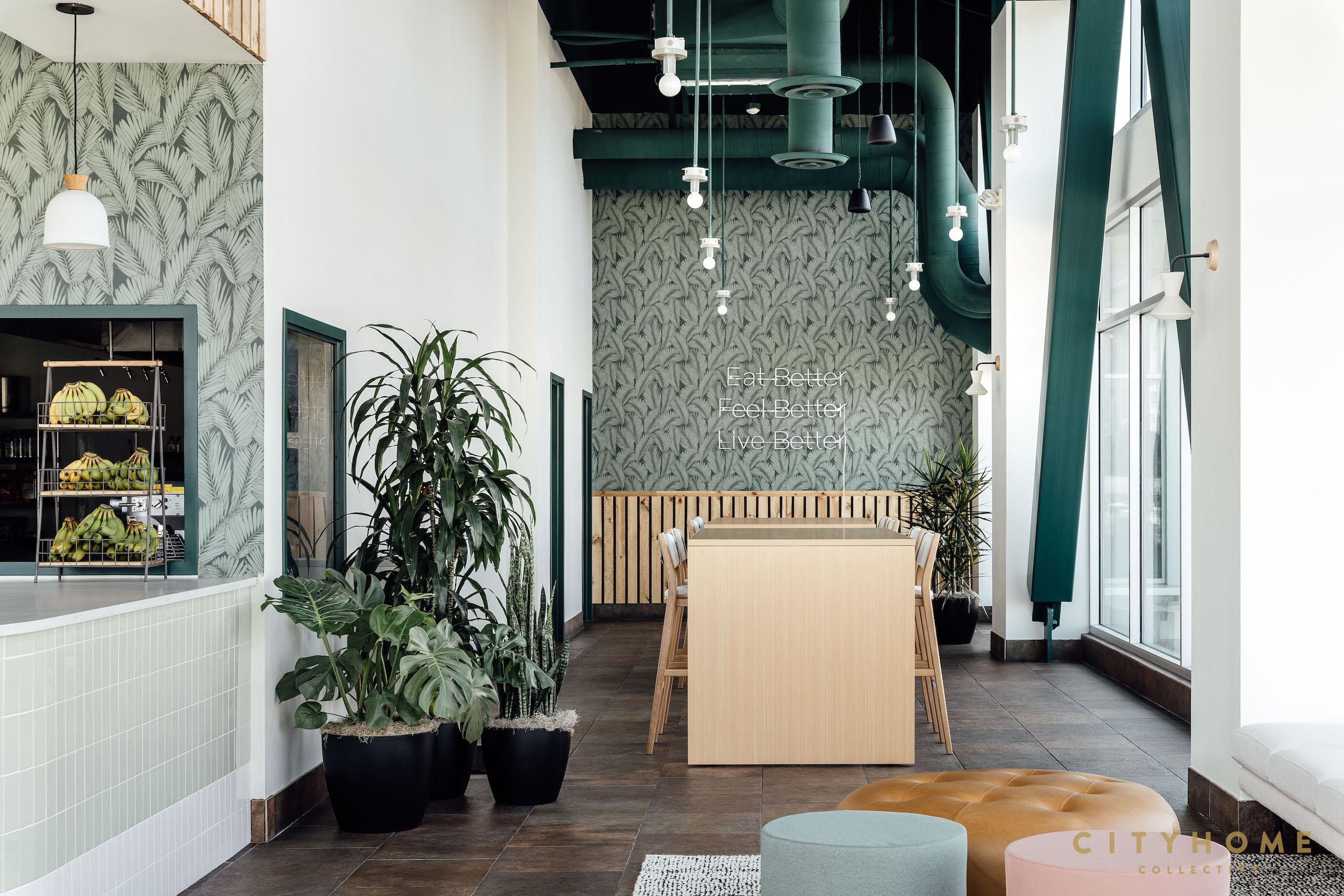
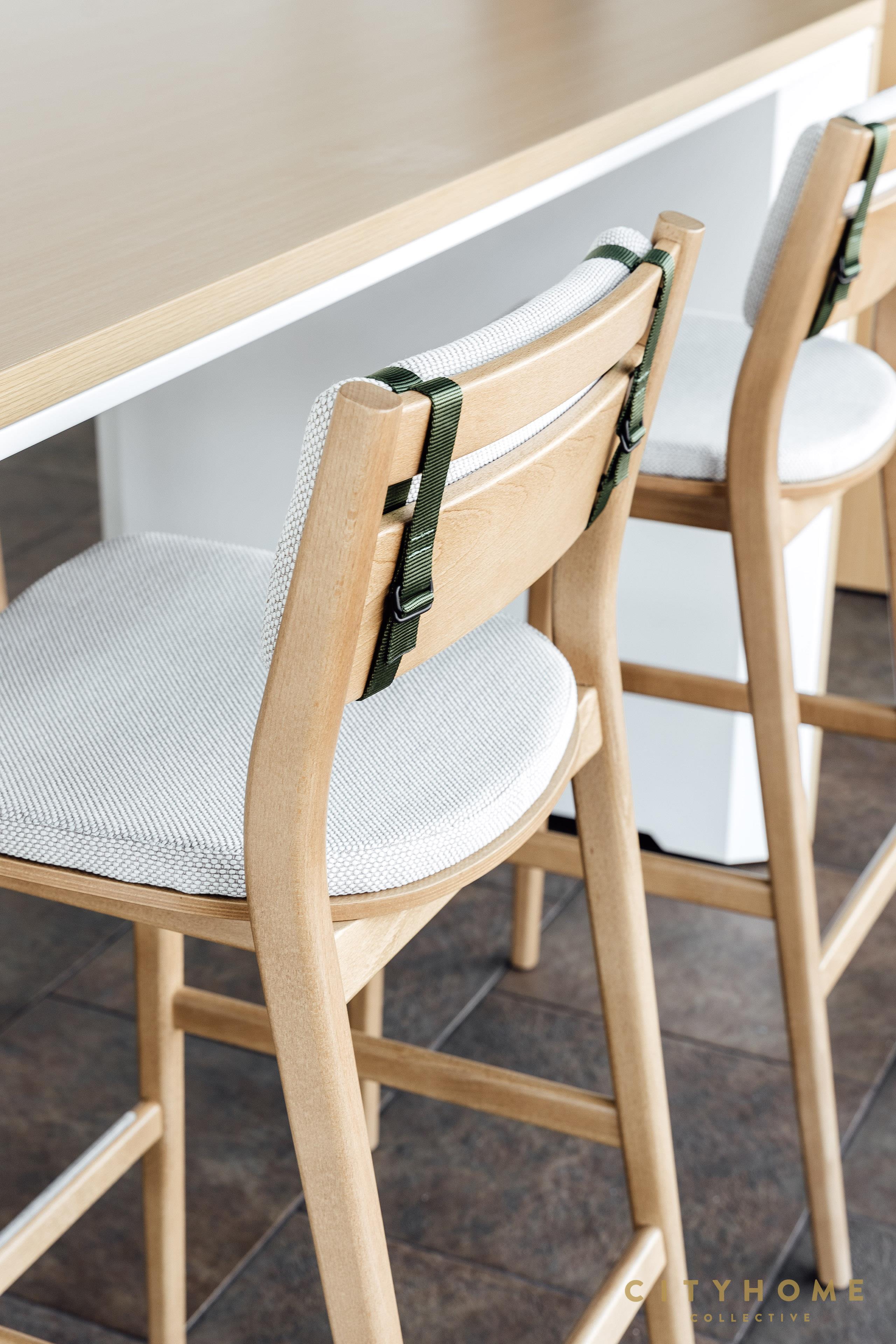
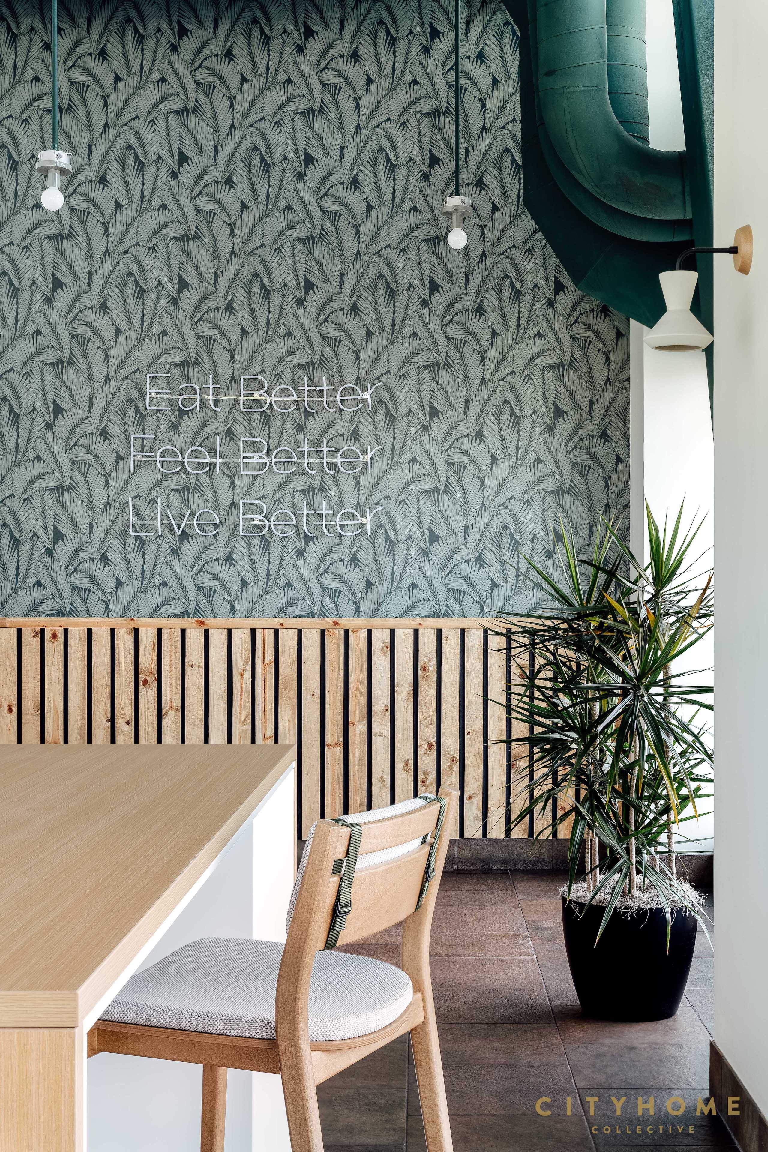
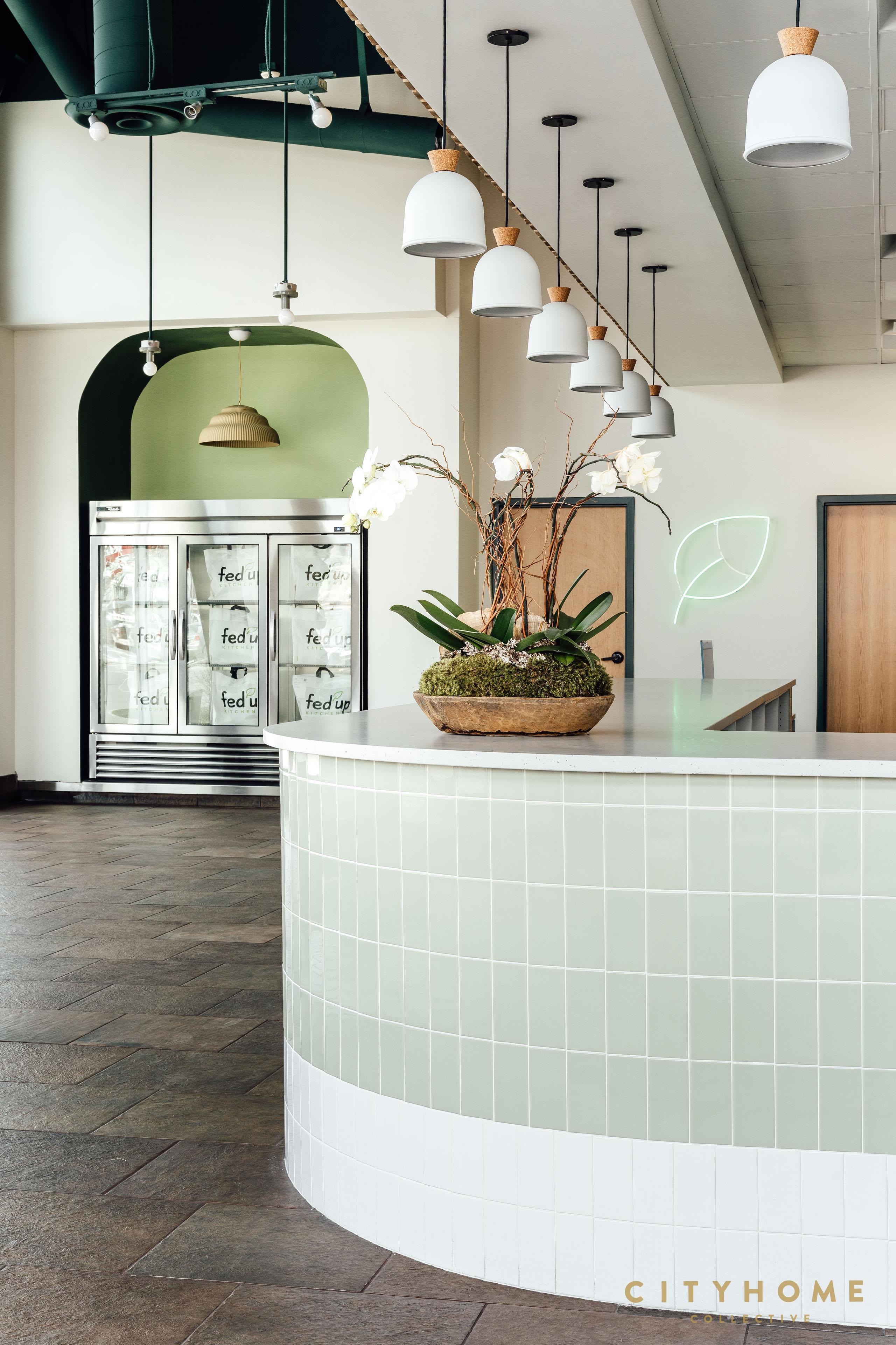
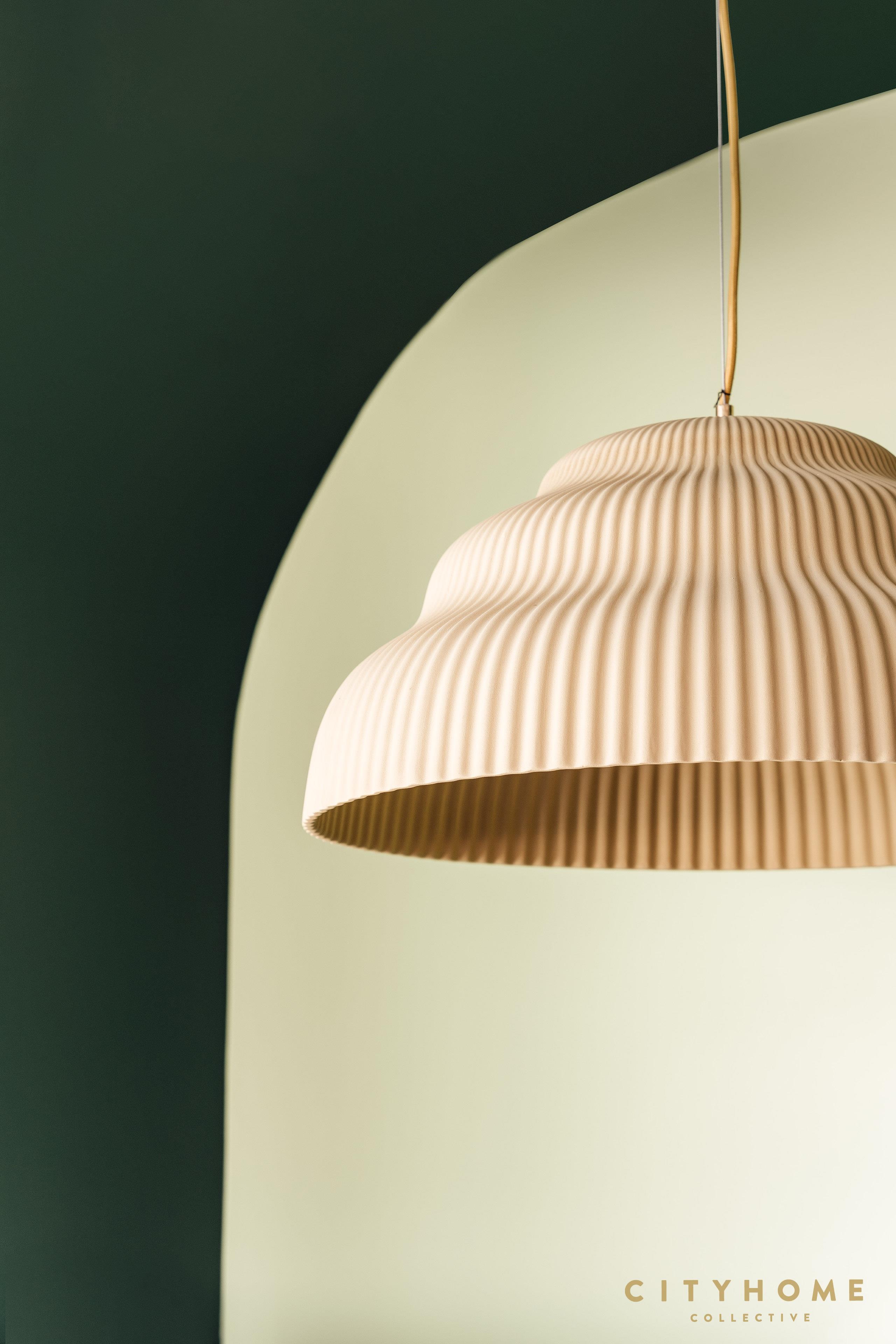
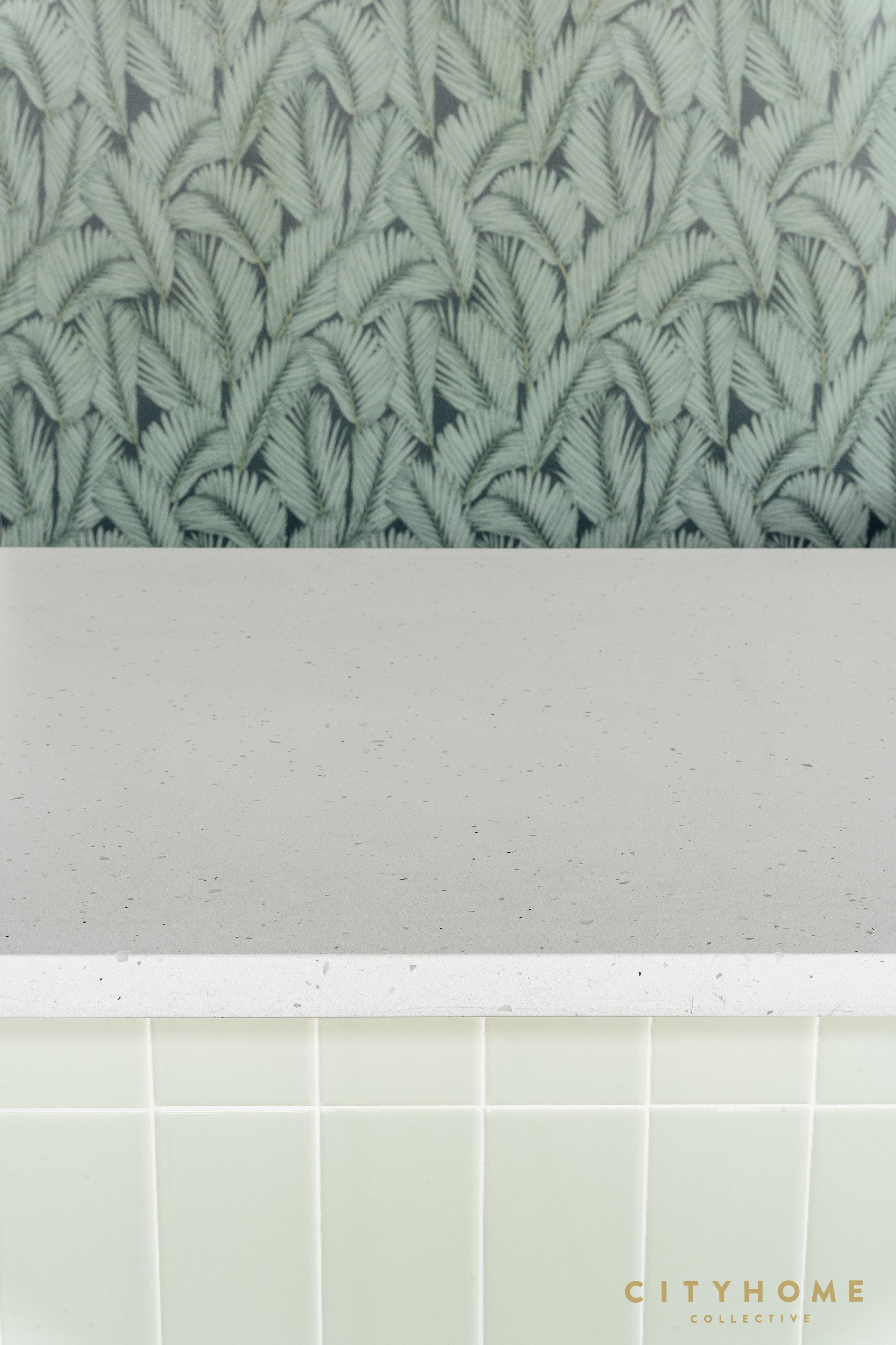
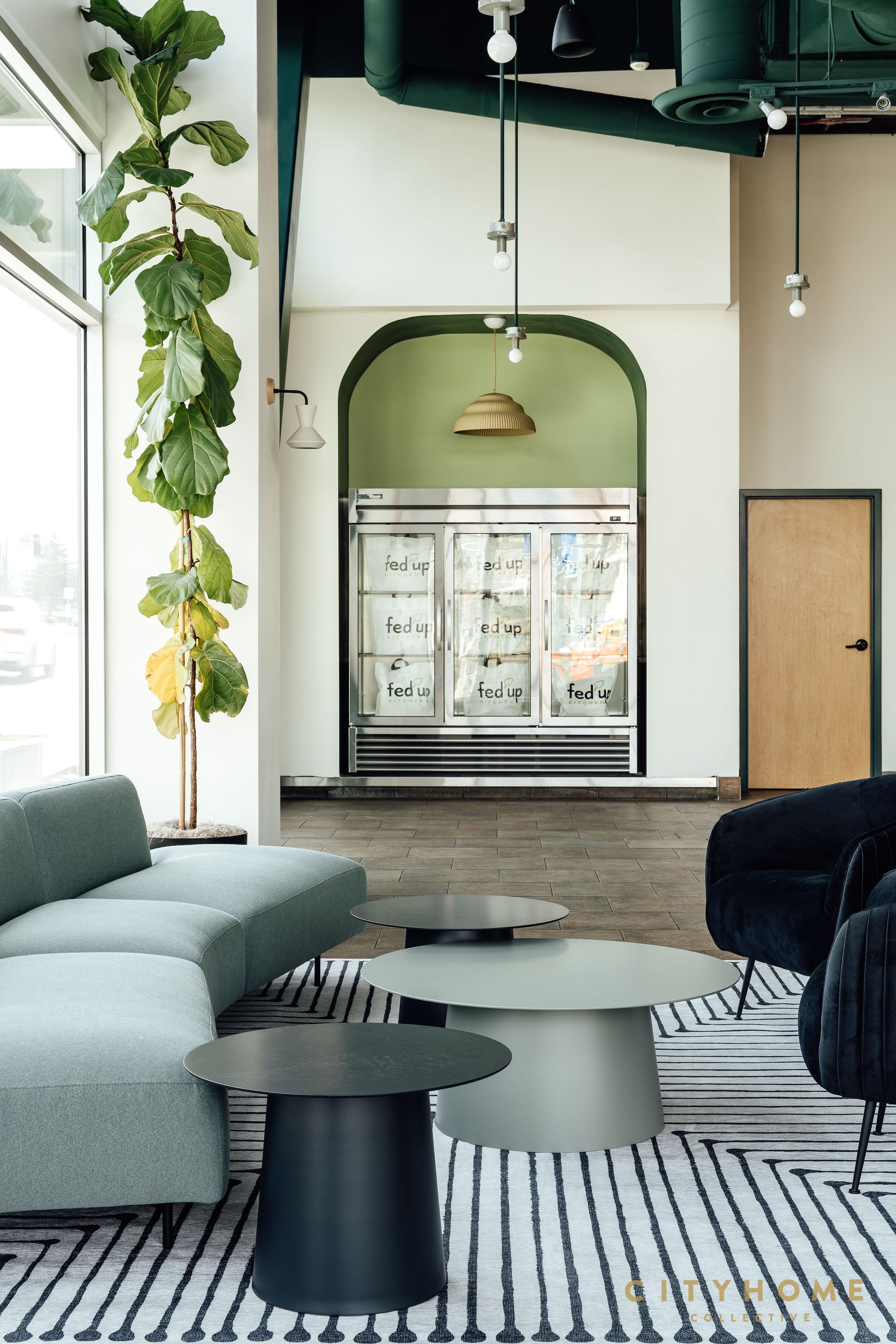
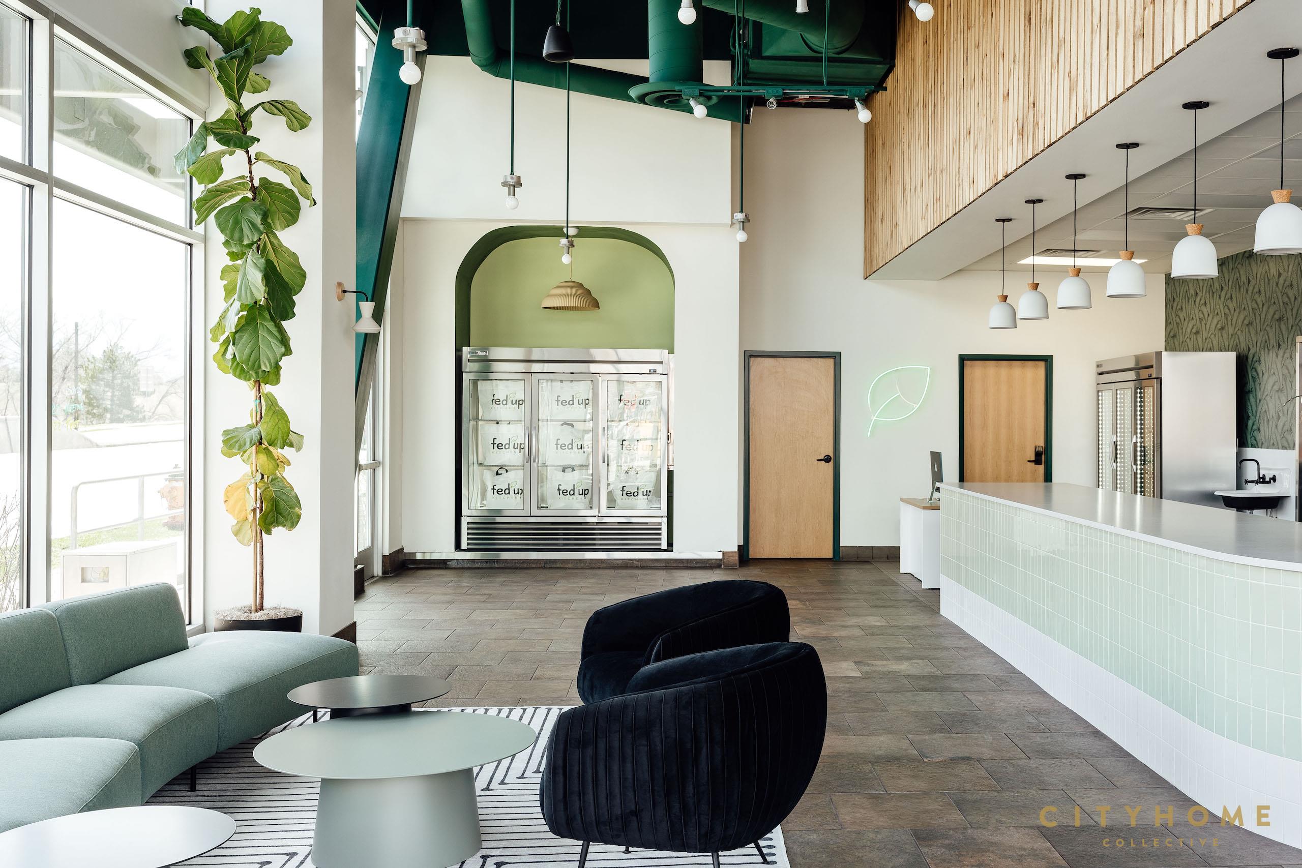
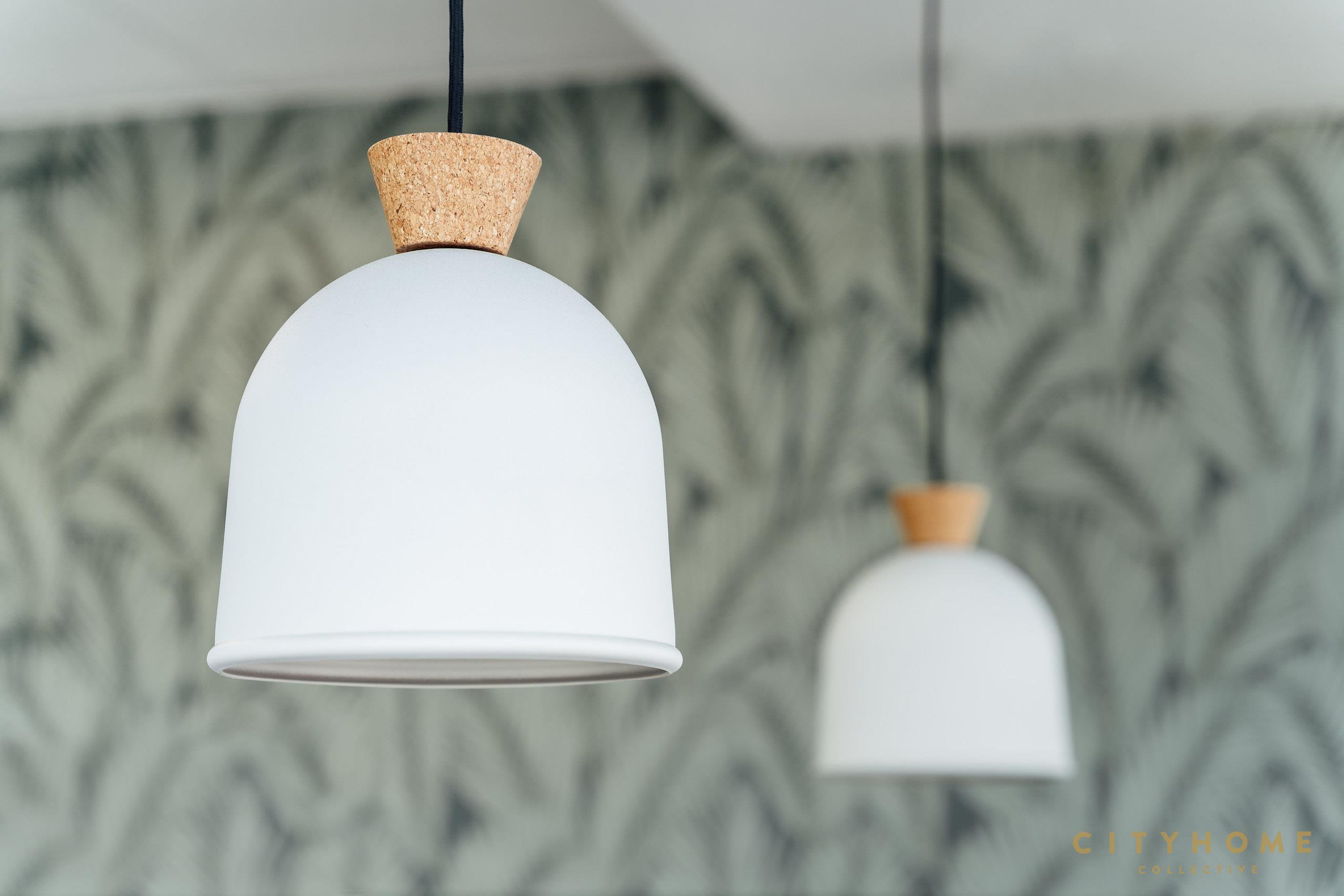
Lauren KerrFed Up Kitchen wanted this space to feel as vibrant as their meal plans - a bit of a challenge when taking over a dark and muted storefront. Thankfully, our design team loves a challenge and got to work creating a fresh palette to uplift and re-energize the space. Our team embraced the storefront's existing height by incorporating vertical tile and wood paneling to draw the eye up, concluding with a verdant exposed ceiling for an unexpected color pop. Botanical wallpaper, neon lighting and playful furniture pieces bring forth an element of fun - boosting the mood of anyone stopping by for pick up. We're so happy with the final product and the clear representation of Fed Up Kitchen's mantra - Eat Better, Feel Better, Live Better.
Image Gallery
We need to talk.
It'll be fun. You've got questions, and we can't wait to answer them. Don't hold back--getting down to brass tacks is kind of our thing...
Done. That was probably an excellent question, and we're ready to help. Hang tight...someone at cityhomeCOLLECTIVE will get back to you in a flash.
-97d1b-2560x3840.jpg)
-1qvt0-2560x3840.jpg)