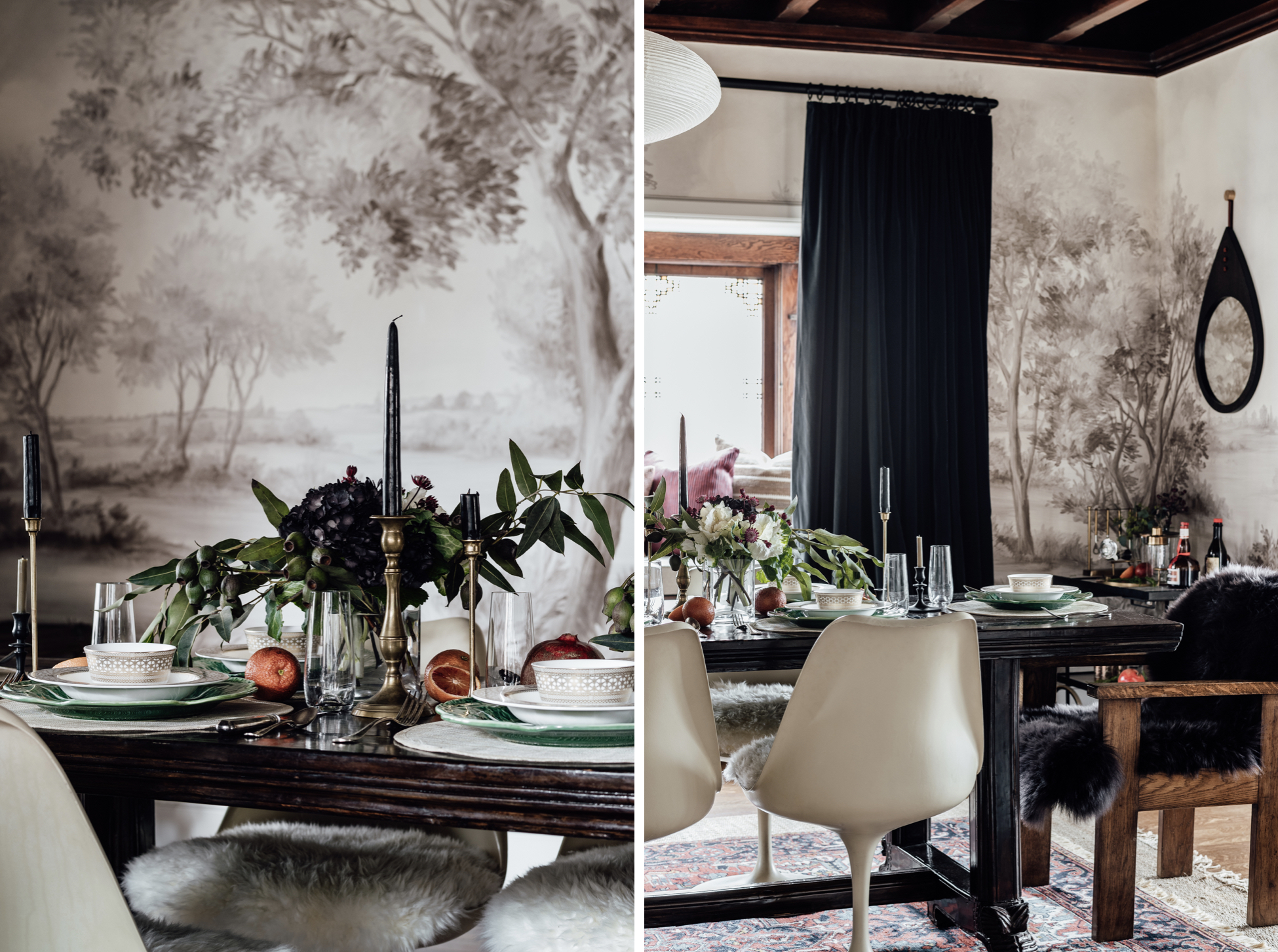
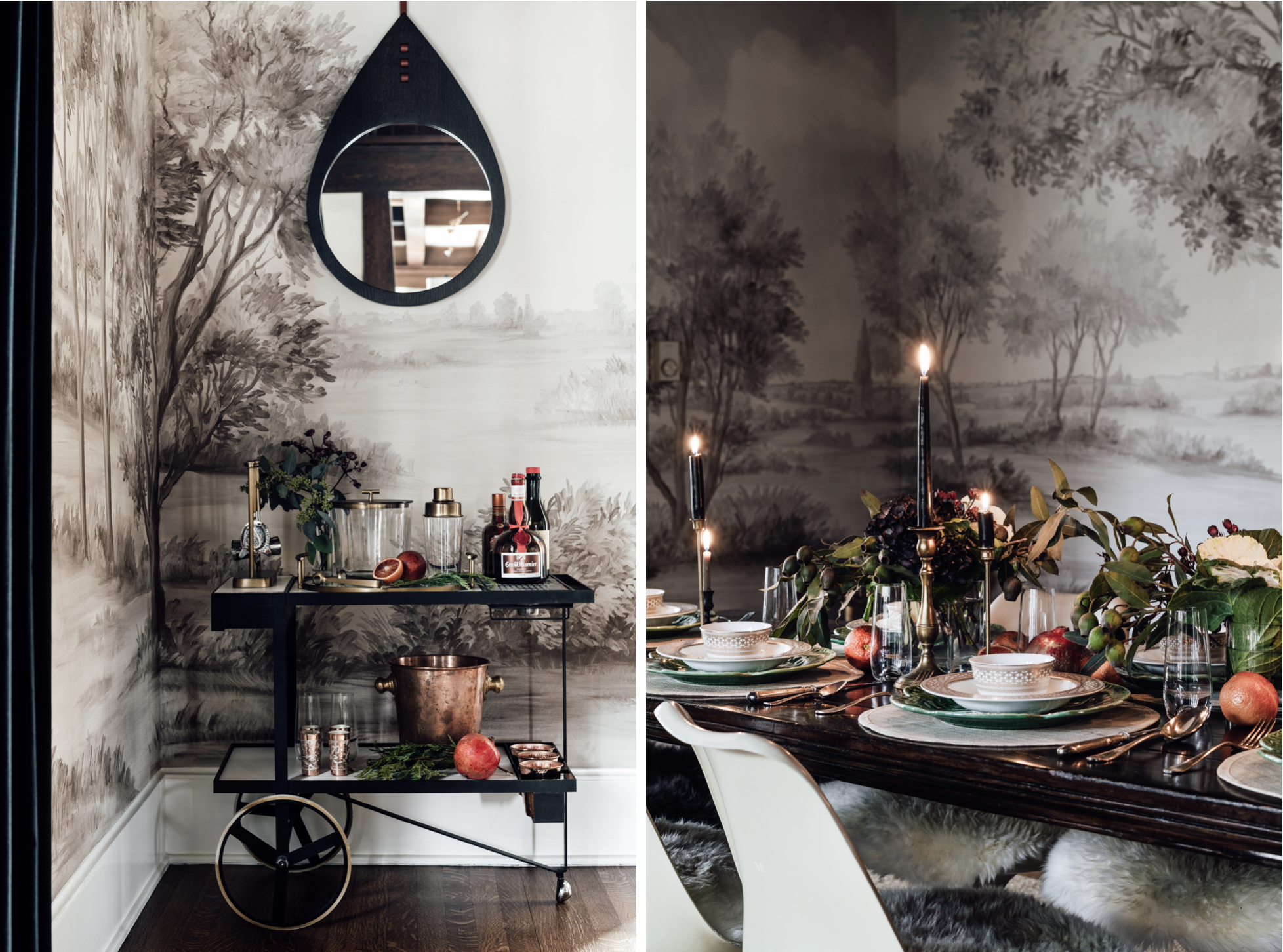
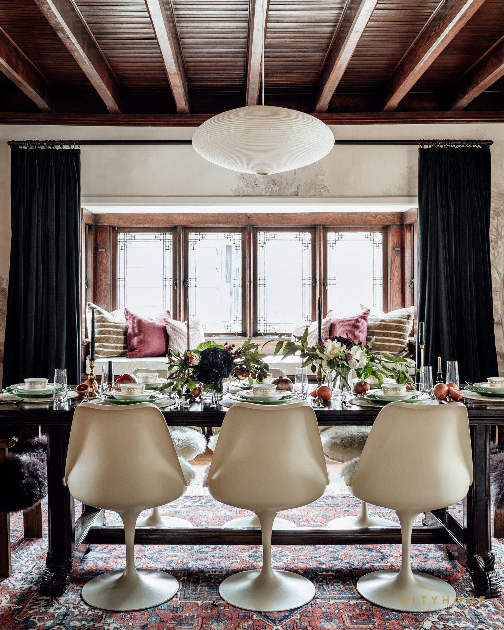
Taking the “best foot forward” approach when entertaining certainly showcases a home, but it also ensures that guests will be comfortable, cozy, and well cared for. As such, in prep for the holidays, we recently visited one of our design projects for a bit of place setting practice. Consisting of moody flowers, candles, and blood oranges, the spread instantly conjures up a rich, classic, and festive vibe that pairs nicely with the dark woods, detailed wallpapering, and mid-century elements of the surrounding space.
Happy Tablescaping, y’all!
As the glistening, summer glow begins to fade from your face and your laugh lines and age spots start to flex a little bit, it’s possible you’ll be on the lookout for some solid skincare. Lucky for you, we know just the place–a new dermatology practice making its way to Kimball Junction that going to be drenched in good design and filthy with full-service medical, surgical, and cosmetic dermatological care.
It’s called The Dermatology House…
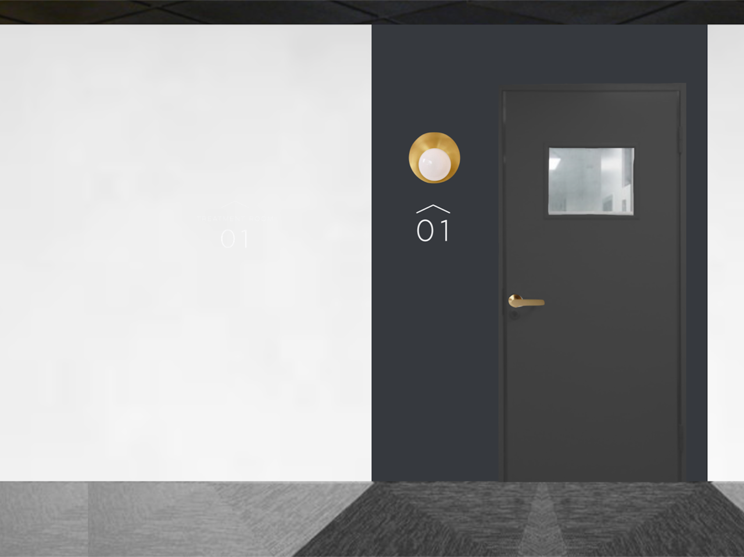
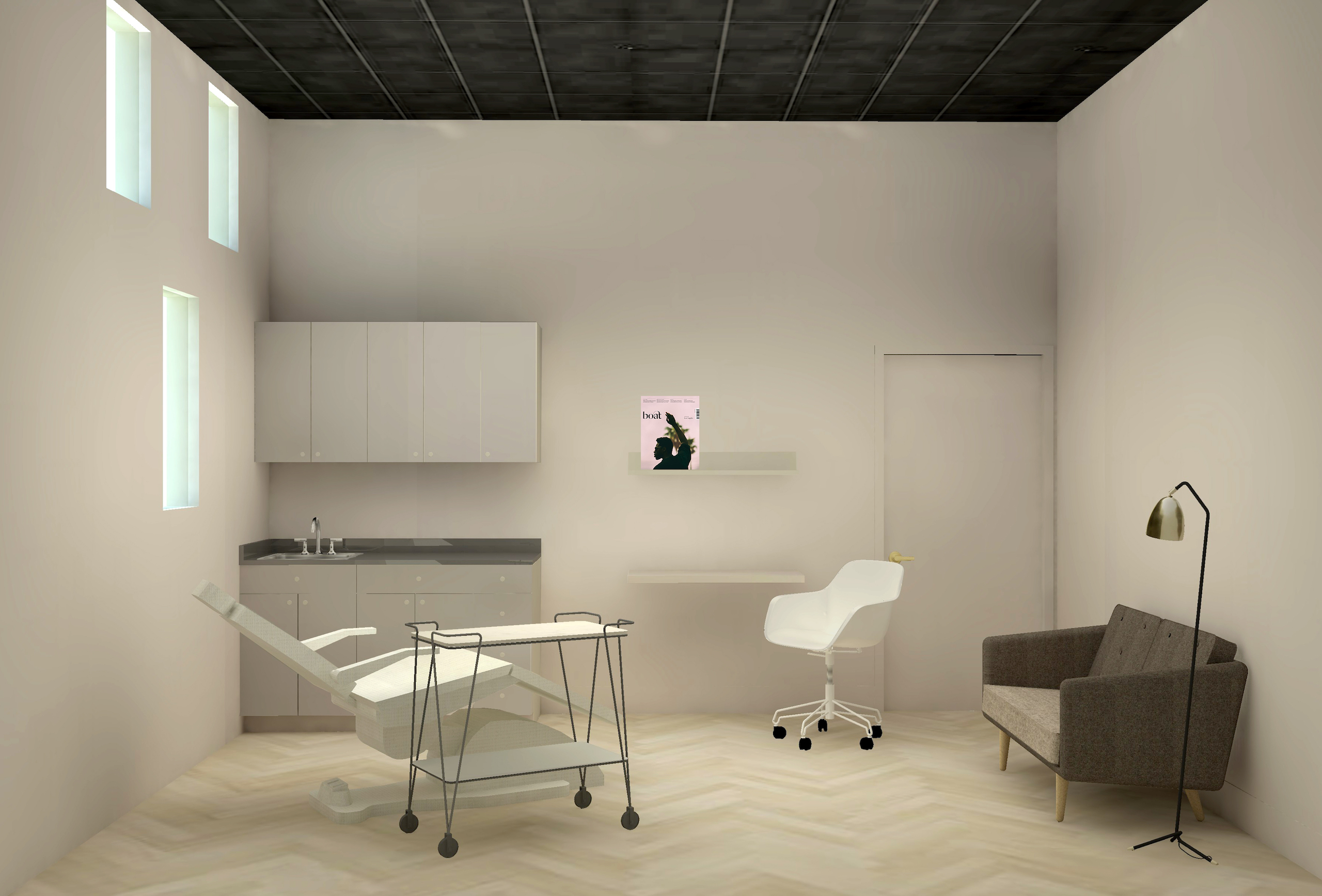
And they’ll be seeing patients of all ages as of November 8th. Started by Dr. Kelly Stankiewicz, a recent Chicago transplant equipped with a resume of gold, The Dermatology House will fill what Kelly sees as a substantial gap in our area. “No other practice is offering the full-service dermatological care people are craving. I’m excited to have this opportunity to provide the highest quality, compassionate care.” That said, Kelly’s commitment to creating a space that doesn’t feel like a doctor’s office will play a big role in setting TDH apart, as well…
And she’s chosen yours truly for the task.
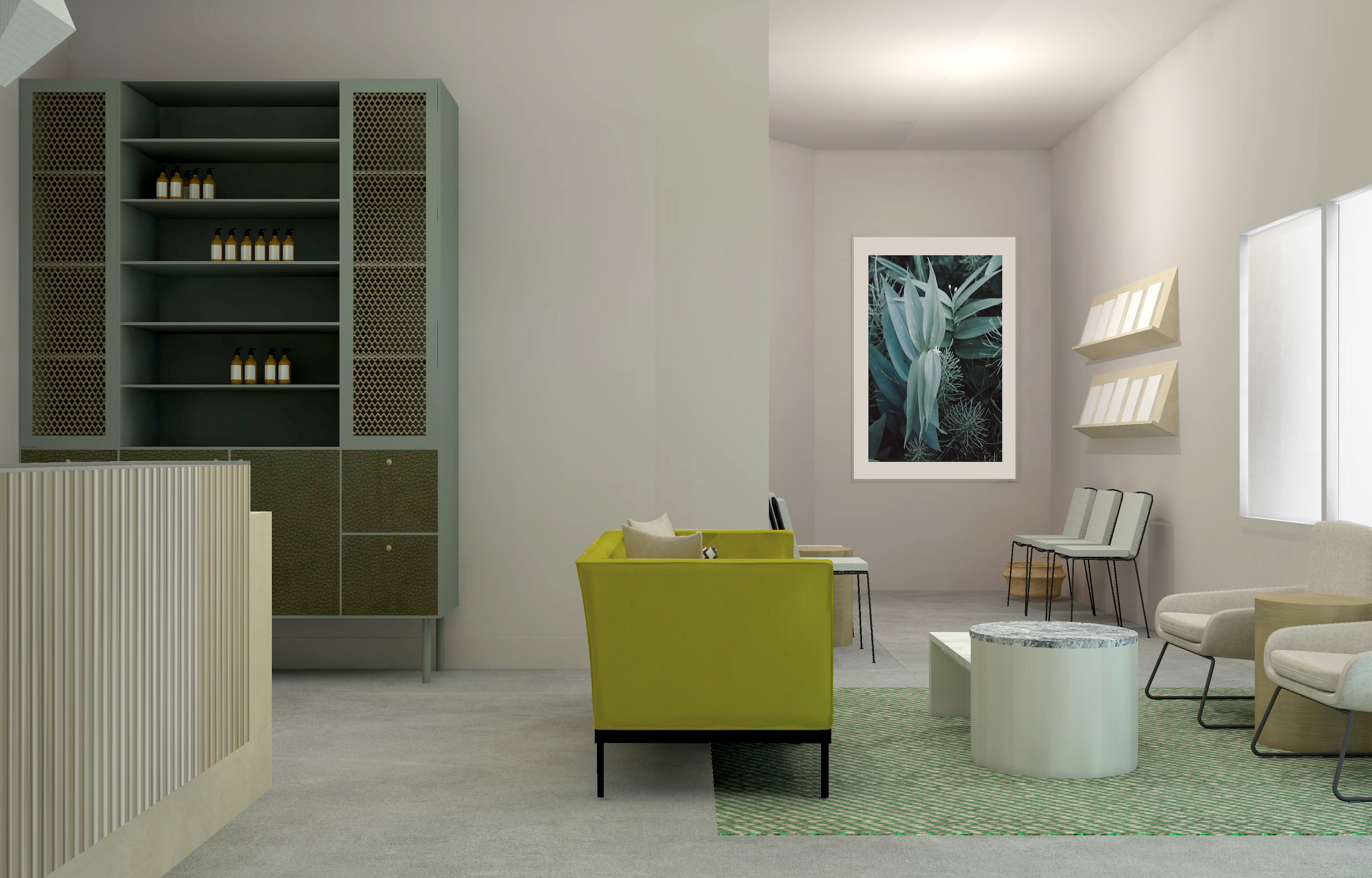
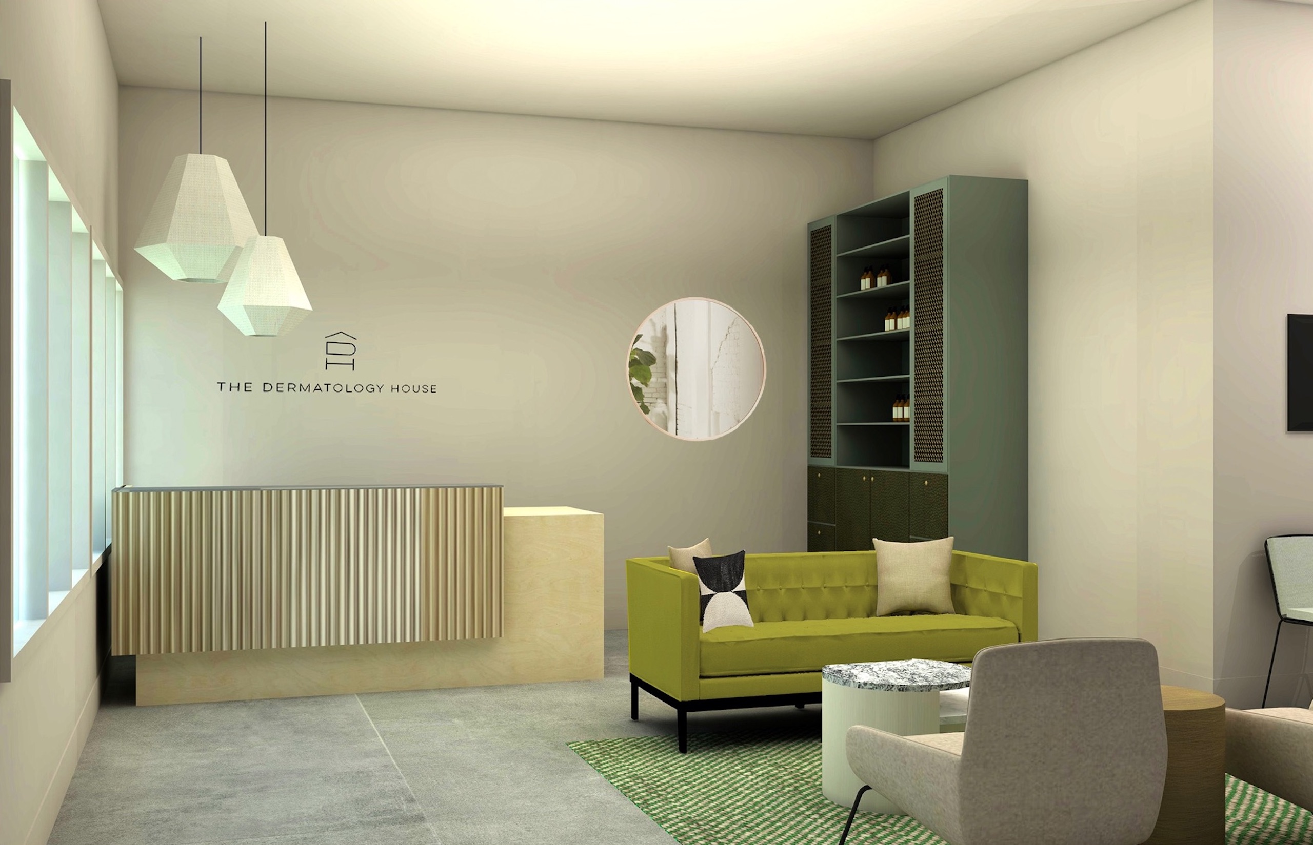
We’ve consulted on everything, from the walls and furniture to the logo and floors, and we’re feeling like it will be the best kind of fresh face. Featuring six exam rooms, patients can expect a full range of skin care, both medical and cosmetic, in a space that is equal parts hip and soothing. Original cement floors in the reception room paired with a palette of greens and brass to keep things fresh and welcoming. We swapped your grandmother’s vinyl for one that mimics hardwood to allow the treatment rooms to function medically without sacrificing good design.

In a recent conversation with a fellow SLC transplant, we each excitedly announced that some of our very favorite people in the world live in this fair city. I’ve grown entirely accustomed to the fact that–despite the opinion of those not in the know–this place has some really great things going on, be it in the caliber of locals, architecture, music, retail, or design. The list of ‘noteworthy’ is quite long (just look at the many pages of this blog). Thus, it was in this vein of things-that-were-surprising-but-are-no-more that I discovered Henriksen Butler, a mecca of design housed in a 124-year-old synagogue right in downtown Salt Lake City.
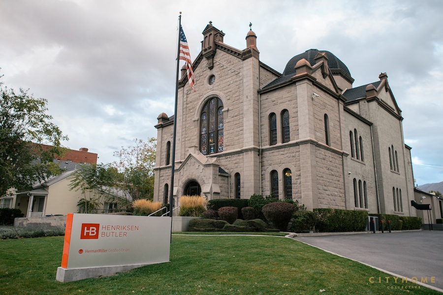
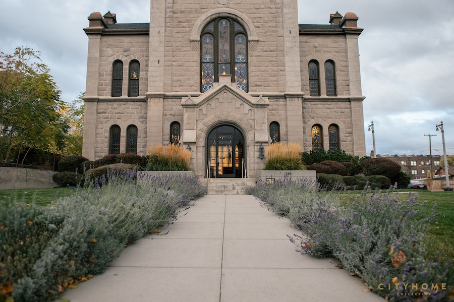
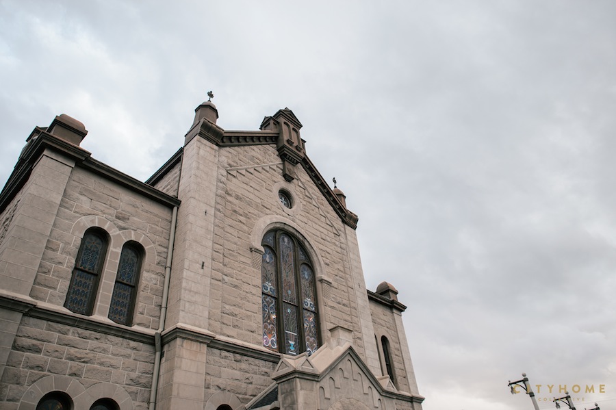
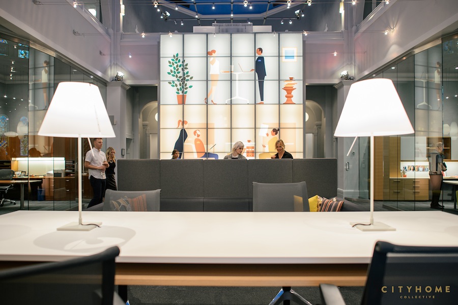
The incredible structure, based on an actual German synagogue, is replete with original stained glass. It has undergone a few incarnations: it was a synagogue until the 70s, then a restaurant. At some point, during a spell of vacancy, a few squatters borrowed the space, and Henriksen Butler finally took it over in 1987. Story goes, while some parts of the building were misused by its homeless tenants, the stained glass remained completely intact…a blatant testament, we think, to the power of design. Today, the building stands in fine form as ‘home’ to Henriksen Butler’s SLC branch and its 140 designers, salesmen/women, accountants, and managers. HB is the exclusive, certified Herman Miller dealer for all of Utah, Nevada, and Idaho, and if that’s your gig–to be quite frank–you’d better fill your space with the kind of stuff that inspires good work and begets happy employees. This particular branch is firing on all cylinders. The sacred shell and modern interior make for a quirky blend of spiritual and efficient…a killer place to work, in essence.
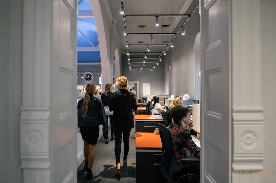

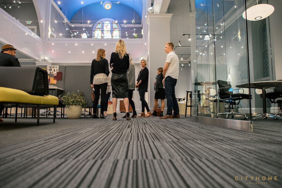
The walls are lined with desks and a few gorgeous, glass offices, and two-story ceilings enable the stained-glass windows to do what they do best: a patchwork of green, blue, and purple is cast onto the carpet, enhancing the already-divine vibe inside. Maharam wall graphics offer touches of bright, clean color. Modular pieces of furniture from S.F. brand, Fuse, as well as pieces by Herman Miller allow for flexible meeting spaces and accommodate a shifting organization of teams. And, in one of our favorite details, walls are daubed with inspiring messages from the lexicon of Herman Miller: “We feel before we think,” “The next big thing isn’t for you.”
In other words, this is the sort of space wherein emotion stands firmly behind design.
A space that embodies the notion that thoughtful design creates healthy minds and bodies, and ultimately, happiness. It’s the concept nearest and dearest to our COLLECTIVE hearts, so we took our design team for a full tour of Henriksen Butler to take in the rightness first-hand and have a chat with their head of marketing, Andrea Barlow…

Why is the restoration of historic buildings so important to Henriksen Butler? Henriksen/Butler’s main office is in a 124-year-old former Jewish synagogue. Having been run down and neglected for many years, the founders of the company knew this Salt Lake historic gem was in jeopardy of being lost forever. With a little daring, a lot of vision and tons of TLC, the synagogue and its original stained glass windows were restored. That passion for preserving historically significant buildings is still a core value of H/B. Our Las Vegas office is housed in a former bread factory, one of the oldest restorations ever completed in Las Vegas. In Boise we’re in the former American Legion Hall, a social club for veterans built in 1939. In Reno, a 79 year old apothecary. And as we grow, we continue to seek buildings that are part of the fabric of the architecture of the community.
In your own words, why is the phrase “we feel before we think,” so important to Herman Miller? And design in general, for that matter? Instincts are powerful. The human brain is constantly reacting to and processing input/information beyond our conscious perception. Purposeful design can accommodate and harness this human operating system. In a workplace, people will immediately grasp what they can do, where they can go, what things are for, and why they are the way they are. Productivity and pleasure will come naturally. It will just feel right.
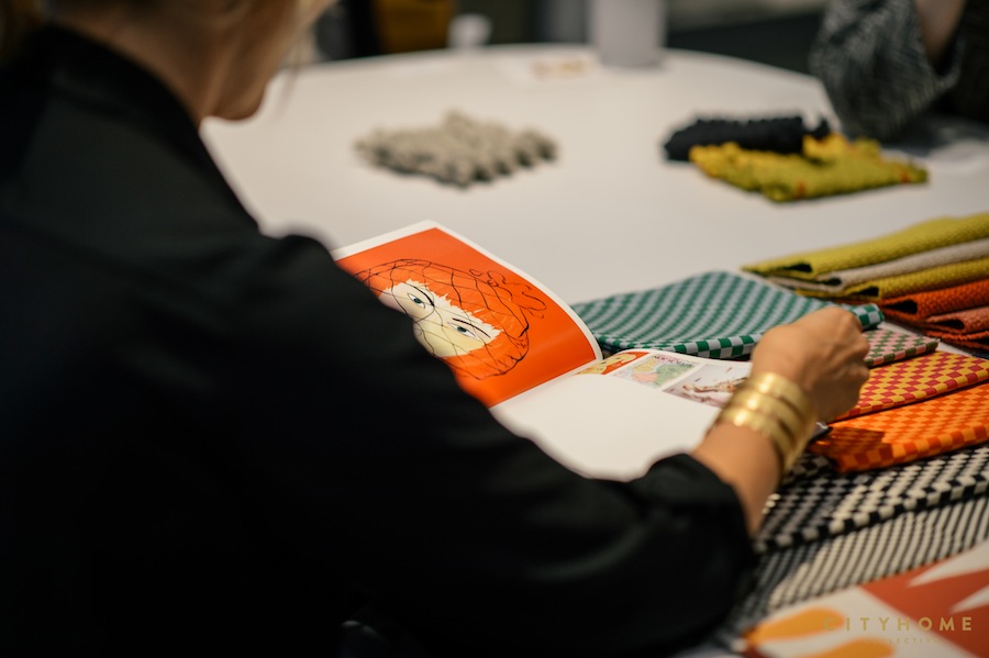

Efficiency is of utmost importance to Henriksen Butler, both in terms of the environment and keeping costs down. Speak to this a bit. Sustainable business practices lead to better financial performance, attract talented and committed employees, and leave a better world in place for future generations. Herman Miller’s lean manufacturing, along with Henriksen/Butler’s detailed ordering and install processes, means shorter lead times, minimal errors, and less waste. That translates into lower costs for higher quality products.
Herman Miller, as well as the other brands you carry, are obviously in a different league than many of the chain furniture brands out there. Why would you encourage a consumer to purchase a Herman Miller piece? Herman Miller believes problems are best solved through design. This belief is rooted in decades of experience. Herman Miller’s view of design is research based, human centered, and problem solving. In its early years, Herman Miller partnered with design greats including George Nelson, Charles and Ray Eames, and Alexander Girard who passed along this crucial value system to future Herman Miller employees and designers; this remains a driving force today.
We agree that good design can create happiness in the workplace and in life. How so? Design goes way beyond aesthetics. It’s a way of thinking, of asking questions and seeking answers. It is a driving force for positive change. It is a spirit of collaboration. It’s our connection to the world. When we design a great workspace for people and give them ergonomic tools that support the body, we’re contributing to the happiness of individuals. And hopefully in turn, that means more positive work environments, better communities, and a better collective whole. It’s a lofty goal, but it starts with the simple act of design.
Henriksen Butler | 249 South 400 East | 801.363.5881

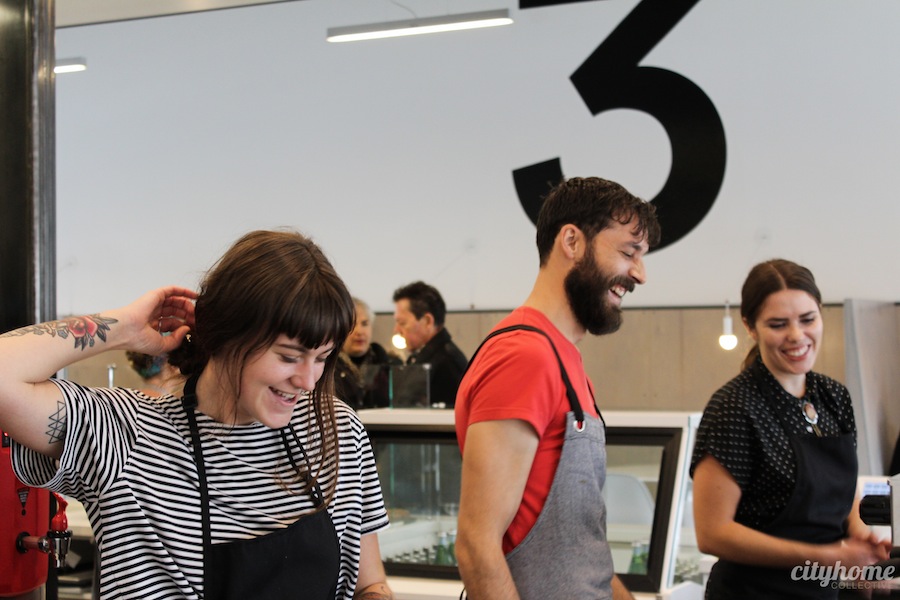
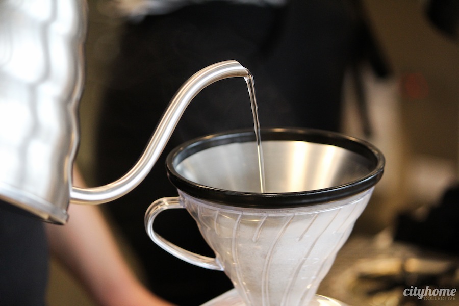
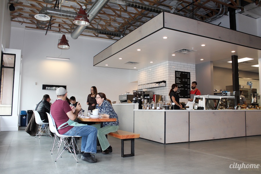
Coffee shop design has taken a clean, bright turn over the last few years. Makes us want to spend our days chatting and sipping for hours on end. Rather than small, dark spaces with a few mismatched couches, we’re looking squarely at joints like this: 3 Cups in Holladay. Sure, the Blue Copper coffee they’re serving is sensational, but we were too busy looking in every direction to hold still and drink. We knew to expect great things upon chatting with Derek Belnap (a long-time fixture at the 9th & 9th Coffee Garden) and his wife, Lisa Dickman, before opening–but our first visit was still a happy surprise.
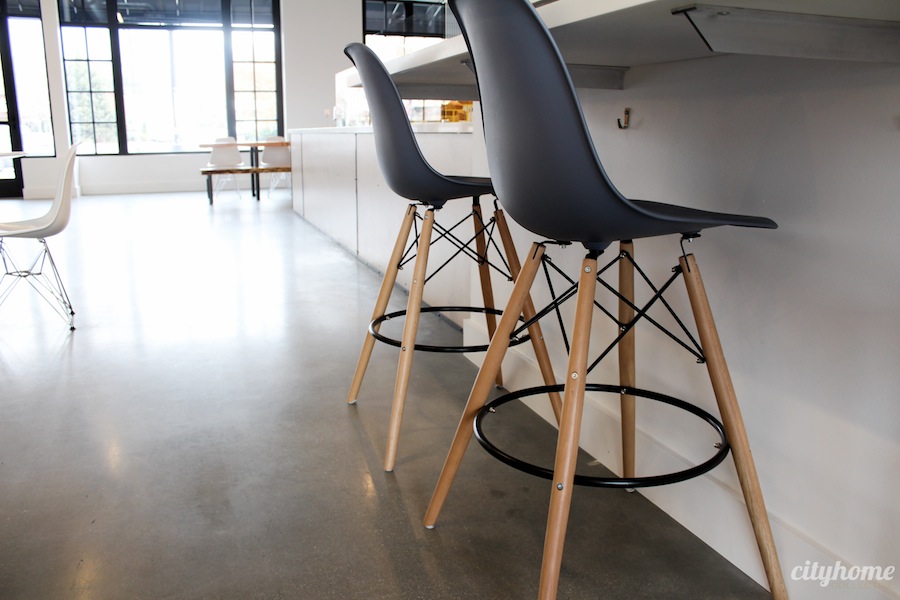
Heavily influenced by Scandinavian design, the space is elegantly pared down.
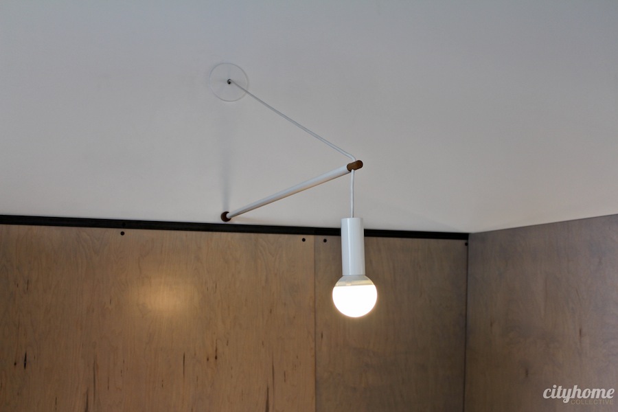
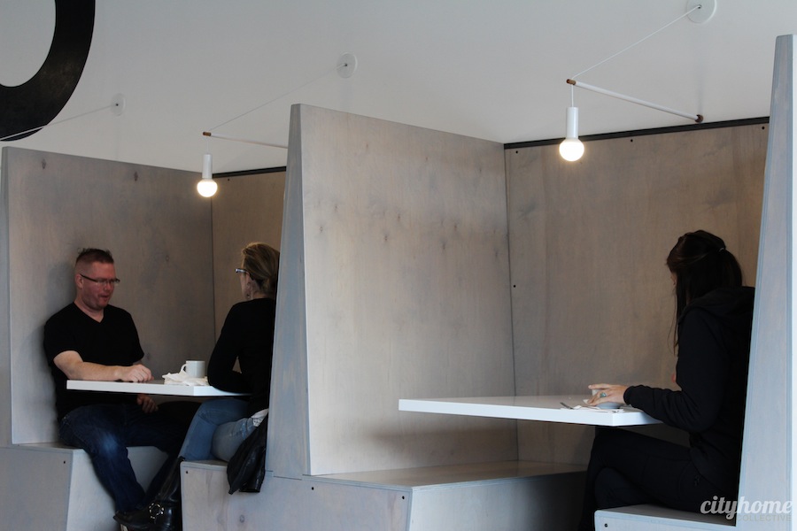
Spare can be tough to pull off, but 3 Cups nailed it. Within the clean space, designed by SLC’s Craft Architecture + Design, the subtle details really pop. Take, for example, that lovely ash-grey wash on the plywood booths. Or even the carefully placed black screws that dot them. Or the white wall sconces by Cincinnati artist, Andrew Neyer, that crane over the booths under a hand-painted, black 3.

It’s SLEEK. IMPECCABLE.
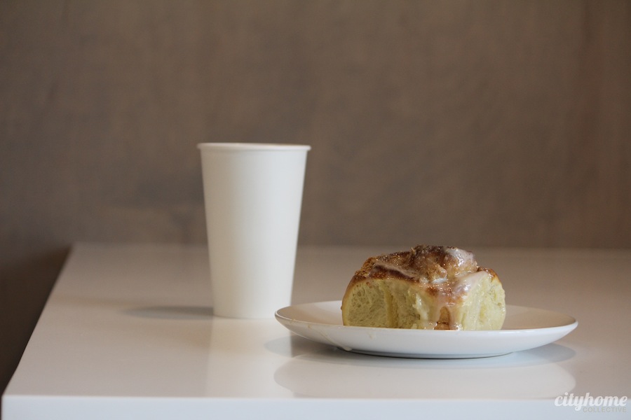
Balance ever in mind, there’s a big warm, family-style table and benches hewn from a single tree (by none other than Modern Union)…it makes for a damn fine spot to sip a cup and nibble a pastry, each of which have been crafted with the same precision as the space itself. Everything is prepared in-house by renowned-around-town pastry chef, Amber Billingsley. Think: hella-velvety pumpkin bread, brownies that brashly toe the fudge line, and a surprisingly-tasty acai bowl. Holladay deserves good coffee and treats; 3 Cups is officially serving both.


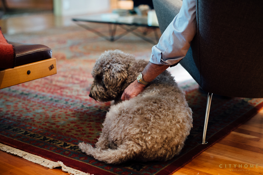
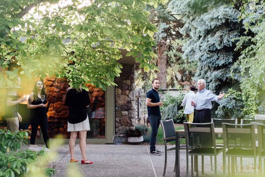
There is little in this world as satisfying as seeing clients live happily in the spaces that we’ve spent months–sometimes years–helping to create. Design is a collaborative effort. We work with our clients to design a space that represents that which they love, what they value, and who they are. If we can land on something that unequivocally makes them feel supported, then we’ve successfully done what we set out to do. And it’s precisely why we do what we do. Fittingly then, we were all a bit eager (quite possibly a bit too eager) to partake in the joys of a finished design job. We paid our delightful clients, Pete and Connie White, an evening visit to sip wine and celebrate the completion of a light remodel in their gorgeous Stephen MacDonald-designed home in Millcreek.
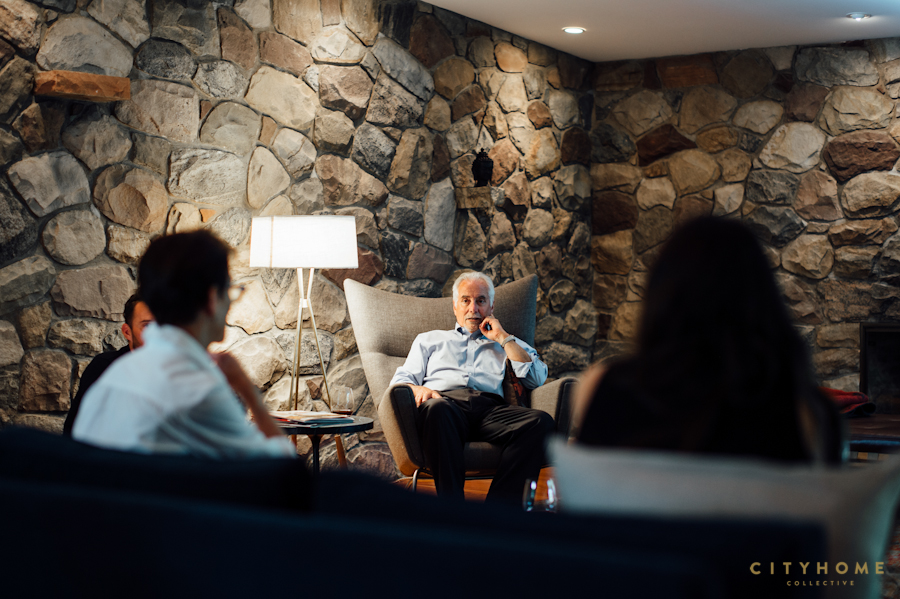

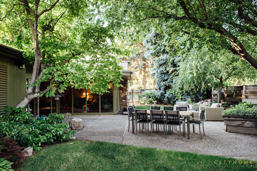
Open. Airy. Warm. Devotional.
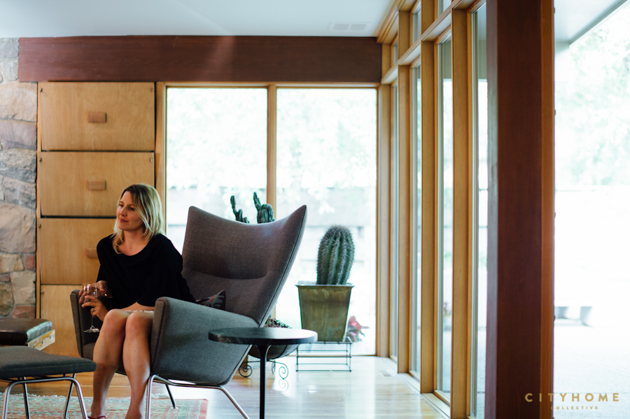
When the Whites approached us to help round out the interior design in their space, we were thrilled and honored. This is true mid-century architecture, and to us, it felt akin to a sanctuary. Case in point: there is not a spot in the home that doesn’t beckon to the outside, from the stone walls and fireplace in the living room to the walls of windows that line the living and dining areas, den, and main suite. Nothing more than a pane of glass to separate you from nature–and yet, a feeling throughout of cozy protection. No space so large that you feel too exposed. Throughout the years, they’ve made tasteful, well-thought-out additions to create a well-rounded home. Open. Airy. Warm. Devotional. While the additions and landscaping are synchronous with the original architecture, however, Pete and Connie felt that they could use a bit of rounding out with the interior furnishings. And this is where we came in. They’d acquired a few pieces over time that were one-of-a-kinds, and we wanted to work those into the scope of the project. Beyond that, however, our choice took a turn that many may not expect in design: rather than adding furniture, we pared down much of it, in order to let the house itself have a stronger presence. Some mid-century pieces were introduced, as well as a few design touches that nodded respectfully in the direction of the era.

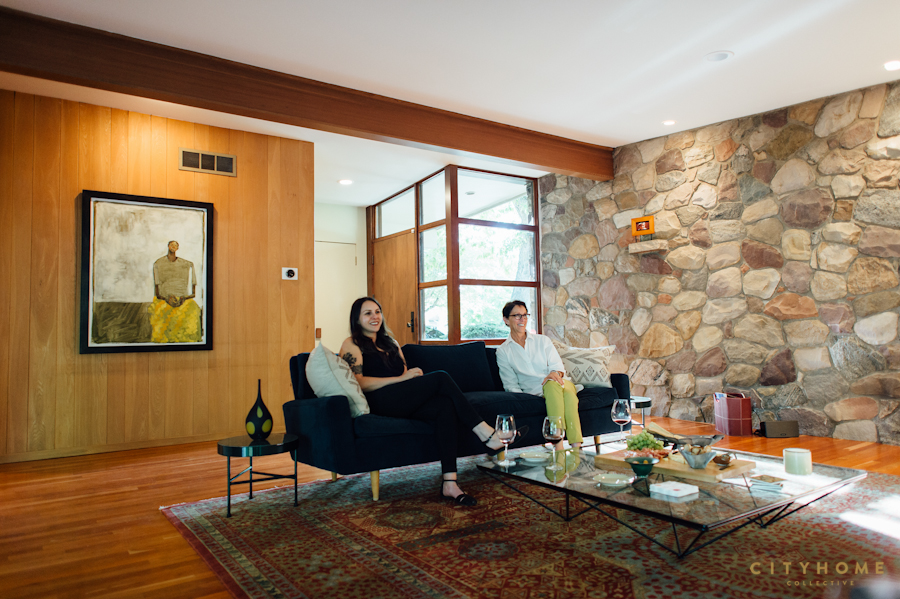
A light-filled reading nook came to life…
We chose to complement an existing, stunning Tibetan rug in their living room (purchased from local Foothill Rugs) with an original Knoll sofa that was re-upholstered in a rich, blue velvet. An original, Italian Alanda coffee table (by Paolo Piva) squared off the living space, and we added to new wing chairs by Hans J. Wegner for Carl Hansen & Søn. Additionally, we reupholstered a daybed that would go in front of the fireplace in a dark, saddle-brown leather. A light-filled reading nook came to life with a blue grasshopper lamp by Gubi and vintage Moroccan Kilim in combination with the existing black Eames Lounge.

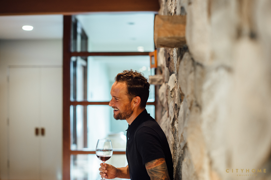
It’s not just any home. It’s their home.
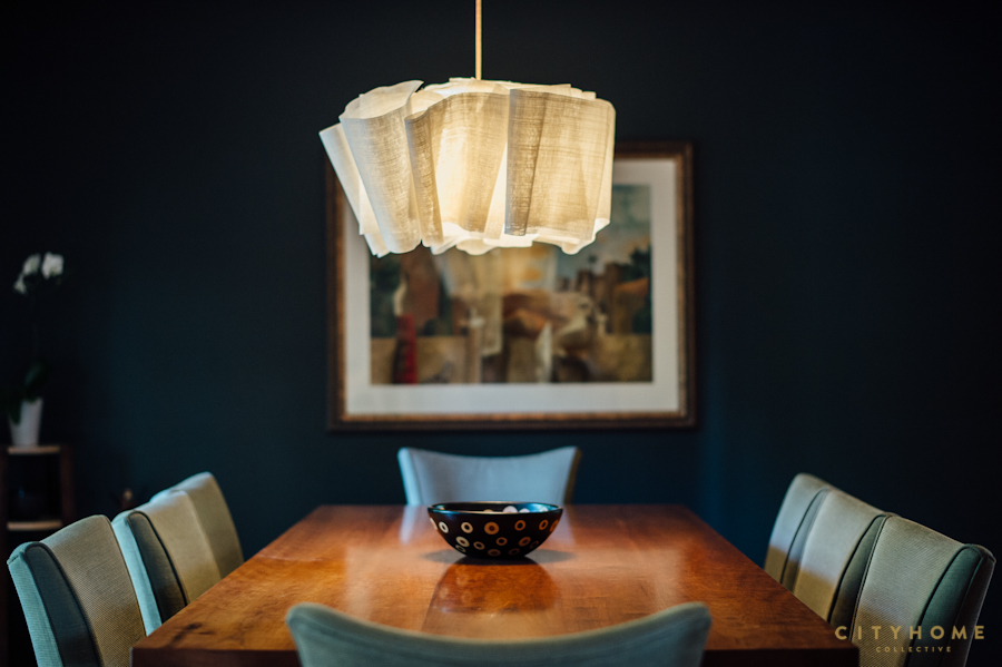
In order to maintain a richness in the overall design, we strayed a touch from mid-century (not too far, mind you) and chose green-marble end tables from Ferm living, a batik-wrapped African bench, and an antique Asian credenza in the family room. Finally, in an effort to offset the folded-linen lamp (by PINCH) over the dining room table, we painted the back wall of the space a dark, greenish-black. Ultimately, we wanted a feeling of layered inclusiveness. Never one-note. And while none of our changes in the White home were substantial, the transformation itself felt pretty profound. It’s not just any home. It’s their home.
Contact cityhomeCOLLECTIVE today to discuss your next interior design project, big or small | 801.718.5555


COLLECTIVELY speaking, we love to see growth in all aspects of Salt Lake City’s cultural landscape. Our artistic landscape, however, is of particular interest to us, and thanks to the efforts of so many incredible people, our city is home to a thriving art scene. Case in point: Andrew Moncrief’s most recent series of paintings, A Strange Feeling, which will be exhibited next month at UMOCA. It feels like a significant departure from his previous work. His last series was less about his subjects and more an inquiry into the relationship between paint and the human form. I loved the work and there were moments of striking epiphany–though, it felt as if Moncrief happened upon these moments rather than having sought them out. They were strong, beautiful paintings, but they lacked the intentional mood of someone who desperately needs to speak his mind. This new series–each depicting 2 men, coupled in what appears to be an embrace at some times and a fight at others–feels fueled by an absolute need to take the reins, to convey an impassioned point of view.
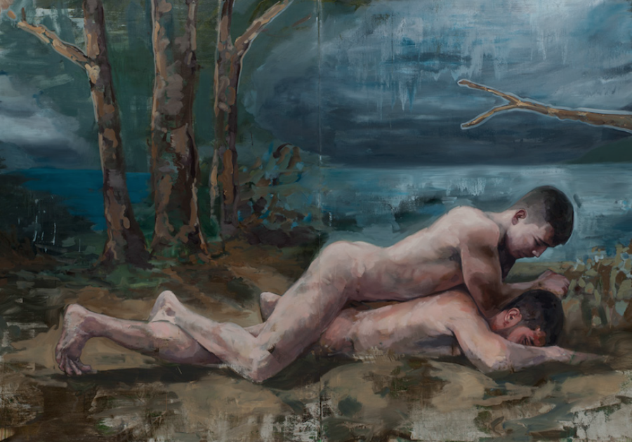
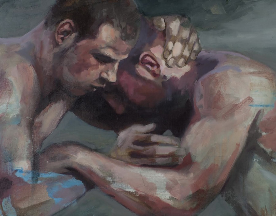
Sensual, but aggressive. Homoerotic, yet straight.
This is the first thing I asked Andrew when we spoke last week. Why was this work so different? He told me that it had largely to do with the fact that he painted this series in his hometown on Vancouver Island–a place where he hadn’t spent any significant time since he left at the age of 18. At that point, Andrew had yet to come out, and so in many ways, he was reliving the experience of what it was to be closeted. It was his rumination on this, paired with an inspiring work by Marian Wagschal depicting a pair of wrestlers, that got Andrew thinking about the violence within love. A “violent embrace,” he calls it. He started researching images of Turkish oil wrestling, an 800-year-old sport that struck him as equal parts sensual and violent, and ultimately, his thinking came full circle. He was left considering his former self, an 18 year-old wrestler who couldn’t let on that he was gay. For Andrew, it’s the dualism inherent to the act of wrestling that is so fascinating. Sensual, but aggressive. Homoerotic, yet straight. Physical touch in an arena where men aren’t “supposed” to be touching.
I told him that the series reminds me of the phrase, “keep your enemies closer.” That there is an unnerving tension to the paintings as they vibrate between love and violence. An unsettling feeling of deception. Andrew agrees. “This was the motivation in setting the men in Bouguereau-inspired landscapes,” he says, “where the bucolic scene is disrupted by the mens’ act.” For me, this is what gives the paintings life. The fact that we are voyeurs to either an inherently-violent or inherently-private act. Even more powerful, though, is being a witness to the hard confidence of his skill, in direct contrast to the absolute vulnerability of what he’s working out on the canvas. We can’t look away.
A Strange Feeling, by Andrew Moncrief | January 29th – March 15th | UMOCA, 20 S. West Temple, SLC

COLLECTIVELY, we’re a tad biased when it comes to the work of Andrew Moncrief, but that doesn’t diminish the fact that this is an artist to watch. A recent transplant from Montreal, SLC should count herself lucky to gain a talent of this stature (and jawline). You know that buzzy feeling you get when you’re around a person who’s clearly creating the stuff of genius? Yes, that. That’s the feeling that Andrew’s work evokes. As a designer for cityhomeCOLLECTIVE, I’m frequently tasked with curating art for client’s homes. It’s one of the most important elements of the final design in any given project, and I spend a good part of my day gazing at contemporary art.
Nevertheless, I was floored the first time I walked into Andrew’s studio.
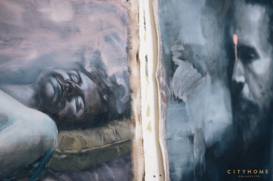
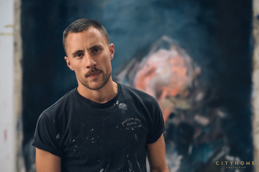
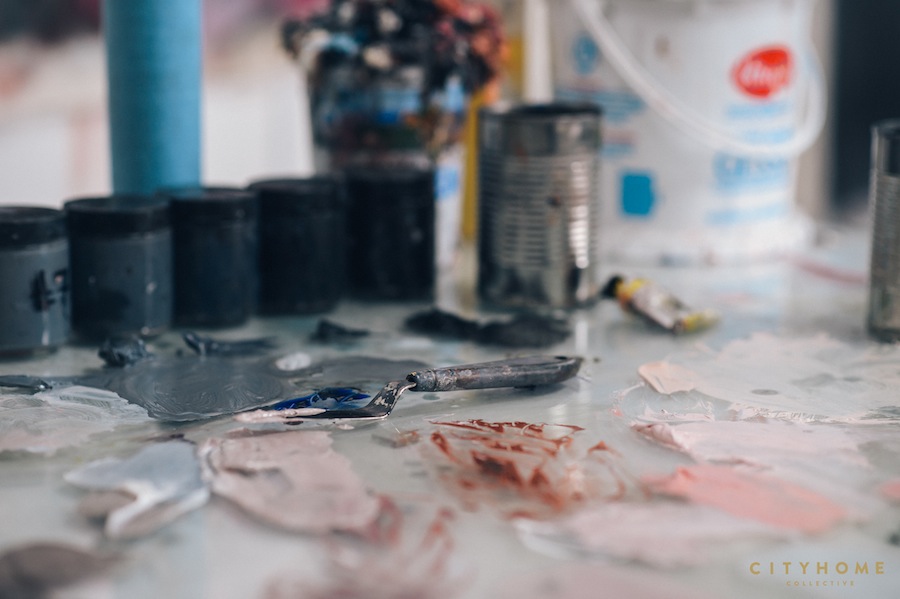
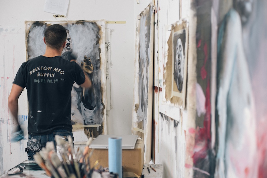
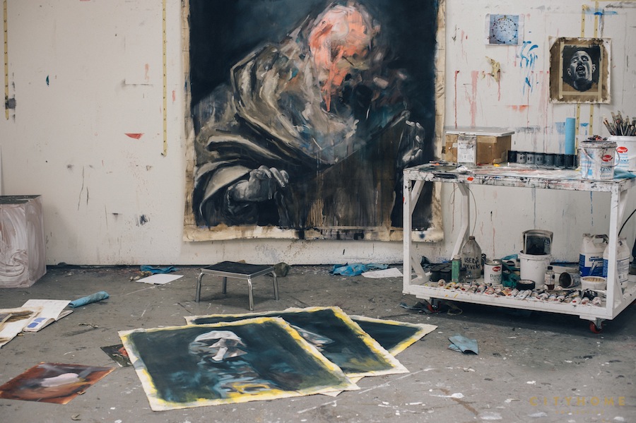
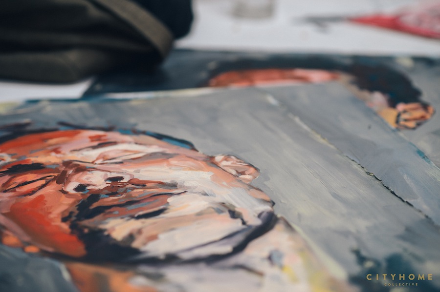
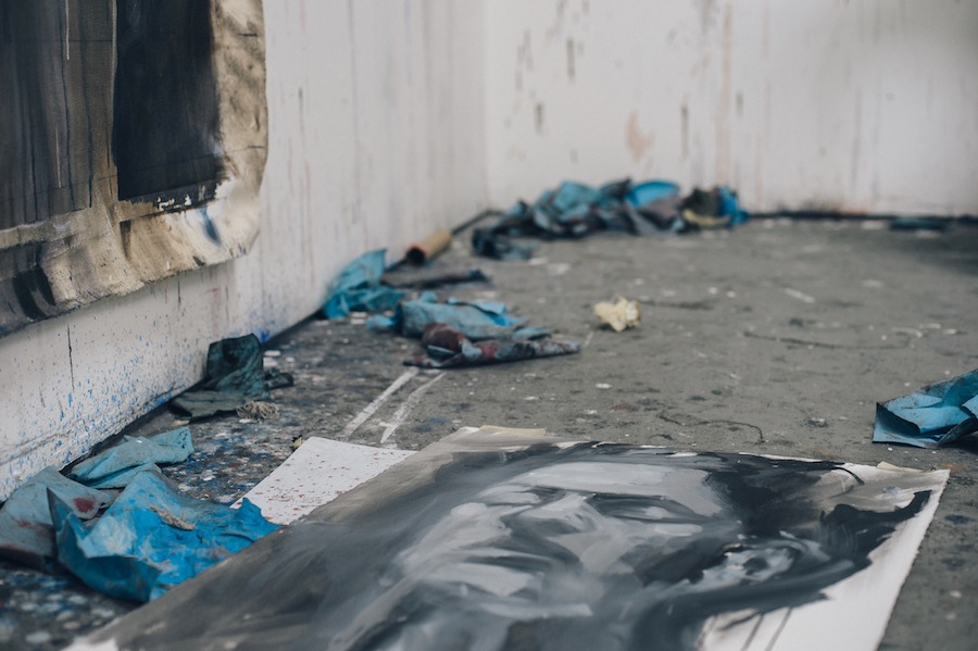
Andrew is a figurative painter who has a way of working with his medium–the subjects start to dissolve into sheer paint and unexpected bursts of color, such that the painting toes the line of being completely about its subject, and yet not about it at all. It’s just the sheer joy of the brushstrokes. There’s a complexity and an agony to watching an image corrode in the same way that Picasso’s disturbance of the picture plane rocked the art world.
It’s thrilling and haunting
What you assume to be steadfast and true begins to dissolve, and it feels a bit like magic to watch his paintings unfold. Andrew and I have discovered a mutual love of discussing all things paint and painters, and I’ve been lucky enough to pay him a few studio visits (I’ve even commissioned him to do a piece for one of my clients)…naturally, it was a treat to ask him a few questions about his arresting work…
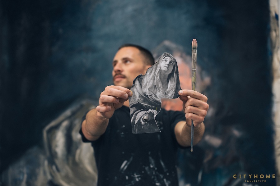
I’m always interested in the moments that convince an artist to become an artist. What’s your earliest memory of being moved by a piece of art? My mom was and is still extremely artistic, so I always had that energy around me growing up; we were always doing some sort of arts-and-crafts project after school and on the weekends. Though I think that crux moment for me came when I was about 13 years old–one weekend, my mom took me to Vancouver and we stayed with her best friend who, at one point, took us to meet artist, Dave Edwards. His studio was in Gastown (the oldest part of the city), full of brick buildings and slightly-dodgy streets. We rode a sketchy freight elevator up to a massive, high-ceiling loft that was absolutely FULL of paintings. There was a smell of solvents and paint and resins that I was totally unfamiliar with, and he had two huge 4×6 etherial, abstract landscapes glazed with roofing tar and propped on the wall. They were beautiful, and they made me want to make art like that. I wanted to have a studio space like that. It’s ingrained in my mind as the first experience of what a real artist looked like…what a real art studio was. Dave and I have become really close friends over the years.
Obvi, your paintings are figurative. But instead of luxuriating in the beauty of the human form when I look at your work, I feel like a voyeur that can’t look away. It’s an exciting and unique relationship you’ve created. Is it intentional, creating an experience for the viewer? I’ve always been interested in a more challenging idea of what is beautiful, and more often than not, this has manifested itself in a way that has been interpreted as somewhat off-putting. I often think of Francis Bacon’s distorted heads and his desire to paint the perfect scream, or Adrian Ghenie’s ostensibly grotesque “Pie Fight” series (of people who have had pies thrown in their face). In my previous work, I often sourced images from facial traumatology textbooks; the images were traumatic, but strangely beautiful, especially when interpreted with oil paint. A professor once told me that to create great work we should “seduce visually and repel conceptually,” which is a really fine line to walk. As for the idea of voyeurism, I feel like it’s something that is implicit in the work, especially since I photograph the models myself and more often than not, they exist alone on the canvas.
You’re a recent transplant to Salt Lake (woot!). Has this affected your work? I definitely think that moving here has affected my work. Moving to another country and climate has been a very big adjustment and a really expansive experience. The word that comes to mind when I think of how my work is changing is “scale”. I have a studio space that is four times the size of that I had when I was working in Montreal. I have 25-foot ceilings in this old warehouse (Captain Captain), so I can easily unroll twelve feet of canvas on my wall and fly at it. This new space has allowed me to really up my game, I’m producing more work than I have ever produced before. I’m also working more hours in the studio than I have before, and I’m challenging myself by working larger. It’s super exciting, considering the possibilities that will present themselves for the next body of work.
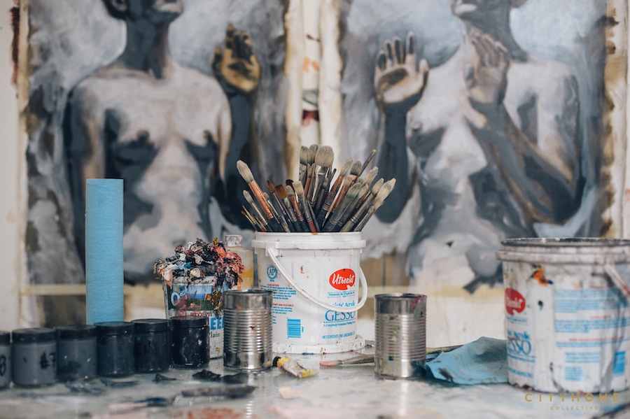
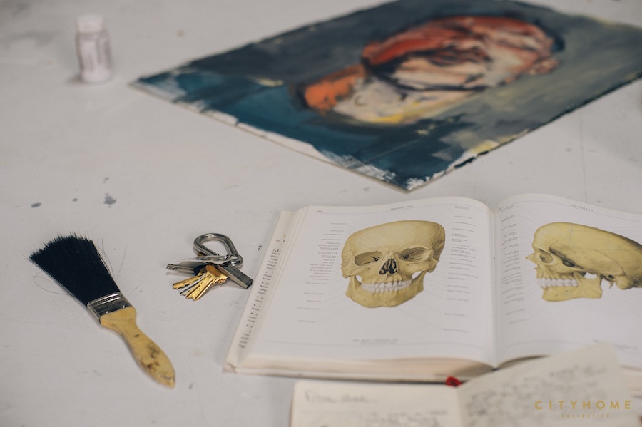
ANDREW MONCRIEF IS SHAKING THINGS UP. AND IT FEELS SO GOOD.
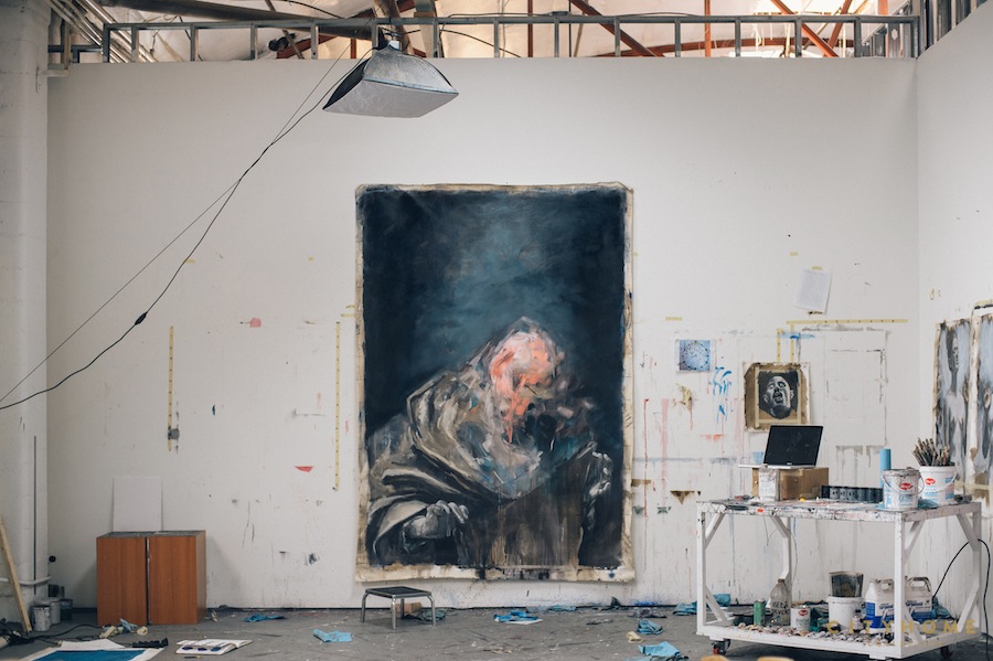
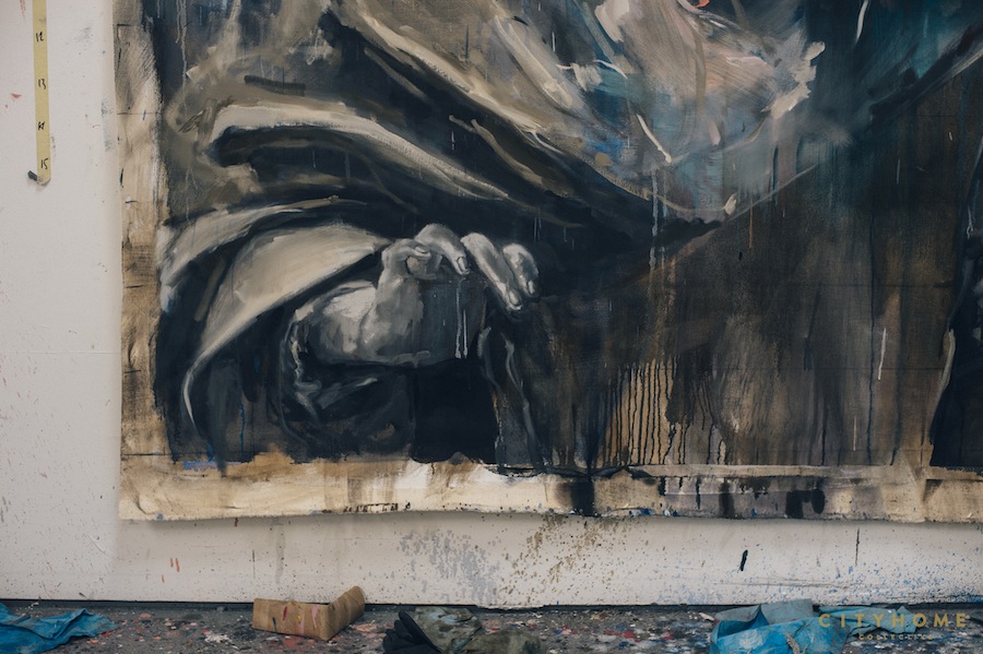
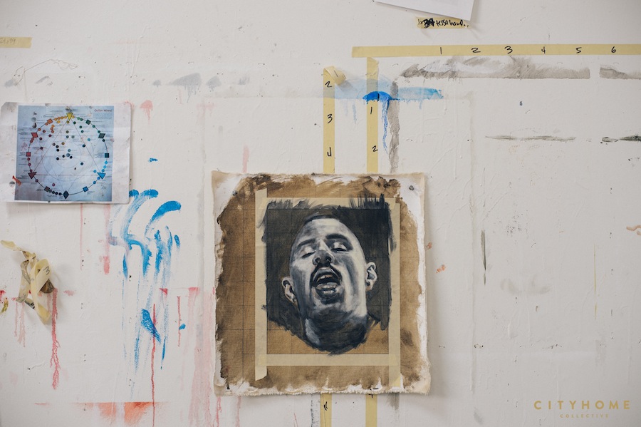
You and I have chatted about this before, but there’s such a cool relationship between representation and a certain materiality of the paint in your work. What excites you about the moment an image breaks down and becomes just paint? What excites me most is exactly that moment you talk about…the moment the painting seems to break apart and simultaneously come together. It’s been my interest for years now, and I haven’t fully figured out how to balance it technically. I try to imagine the brushstrokes as Legos–you build up the painting in pieces and then smash it apart. There’s that moment of impact while the whole thing is exploding to pieces, but it still holds its form. It’s difficult to articulate. It’s solid but disintegrating at the same time, materializing AND dematerializing. It’s an ongoing investigation, for sure. Painting is a slow medium and the ideas only seem to make sense in time, when we can step back and have enough hindsight to see the bigger picture.
What role does color play in your paintings? (Because I love those irreverent pink drips!) I have a contentious relationship with color. I frequently feel as though I can never get it to do what I want it to do…and then somehow it just comes together. I usually have a general idea of what I want the colour scheme of a painting to be, but it quite often changes as the work evolves. I am obsessed with glazing and layering colours and seeing how they interact with one another, of creating optical mixtures of newer, richer colours. I have been looking at a lot of Old Master paintings (Caravaggio, Reubens, DaVinci). They used colour in a very elegant way, with beautiful complementary contrasts…colors that are so rich you want to reach your hand into the painting and touch it. I always want my colour to be something beautiful and seductive…to balance the sometimes graphic subject matter.
I can’t help but notice a certain sense of the spiritual in your newer work. Am I wrong? Do you believe in God? Yes, I’ve definitely been playing with the idea of the spiritual in this newer work. I had a very non-religious upbringing–my parents were adamantly non-religious. I don’t recall ever attending church as a child, and I never really believed in God. It’s something that’s shifting a bit in me. Which is not to say that I believe in God…but I do believe that there is something beyond us, and I know there are spiritual practices (a.k.a. meditation) that can do wonders in helping us all slow down throughout our day. I’m a very visual person, so visual expression has always been a means of understanding. Since we are all existential beings and we all learn in different ways, I think this is just my way of trying to understand my own growth. Historically, religious painting has always served some sort of dogma, and the hand of the artist has inherently had a presence in the works of art. It’s as if we can project ourselves into the painting (I often think of Conversion on the Road to Damascus), and it’s religious but not explicitly at first glance. I guess I’m trying to figure out how to articulate this in my own work. I still can’t quite pin it down–and maybe I never will–but I will keep trying to paint my way through it.

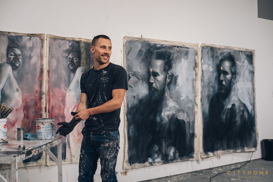
I always define the most inspirational artists as the ones who make me want to make art (you’re one of them, by the by). Which artists make you want to make more art? A lot of artists come time mind, both contemporary and historic, and almost all of whom are figurative. Caravaggio, Valentin De Boulogne, Diego Valesquez, El Greco, DaVinci, Francis Bacon and Lucian Freud, Georg Baselitz. I think it’s super important to look at these Old Masters because their works are hundred of years old but still so relevant. The contemporary artists I adore include Adrian Ghenie, Jenny Saville, John Currin, Nicola Samori, Justin Mortimer, Cecily Brown, Michael Borremans, and Andrew Salgado (who I am lucky enough to know personally and does really amazing work).
If money were no object, what kind of art would you make? Or do you think restrictions make your work better? For me, it’s not so much a question of what kind of work I would be making, but rather a question of what would I be able to learn and from whom. If money were no object, I would attempt to track down each and every one of the living artists I mentioned above and talk them all into letting me apprentice for a couple of months! I would LOVE to work beside each of them, learn from them, and get their feedback on the ways in which I can grow as an artist. As for restrictions, I think they’re important. We all need deadlines, and–paradoxically–working within boundaries often times provides more freedom than when everything is possible.

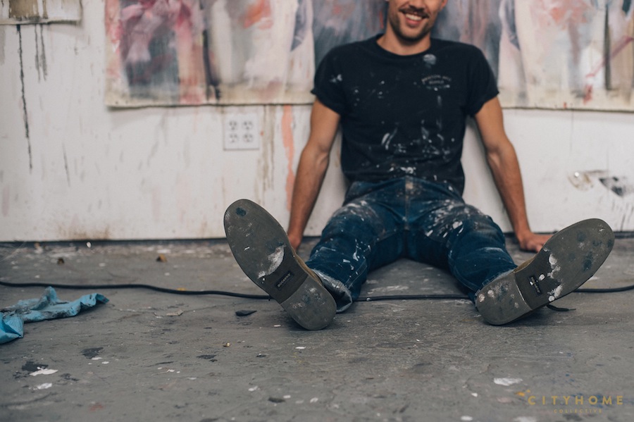
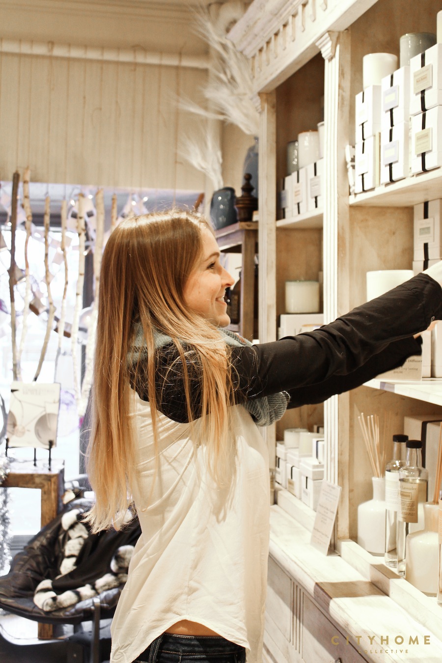
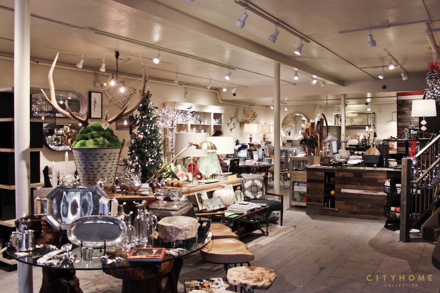
We’re pretty enthusiastic singers of praise for our loftily-perched sister town, Park City. Historically, however, the majority of design in this little ski/Sundance paradise could probably be described by your definition of “cabin in the woods”: clunky beams, mounted heads and varied animal hides, and thick, iron joinery. You get the picture. Enter a spot like Root’d on Main Street and things begin to change. More than one person to walk through the doors of this delightfully-crowded furniture and interior design boutique have described it as a breath of fresh air for P.C.
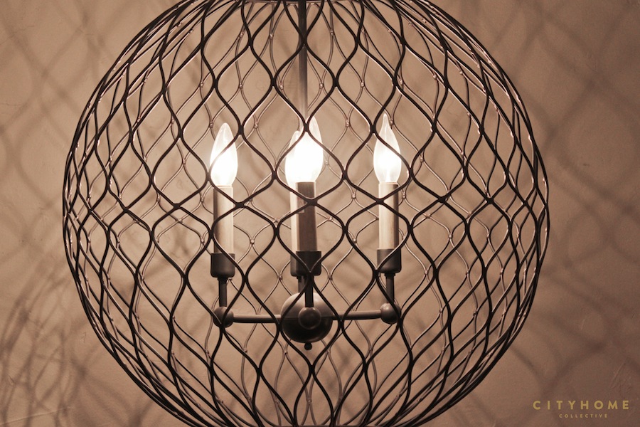
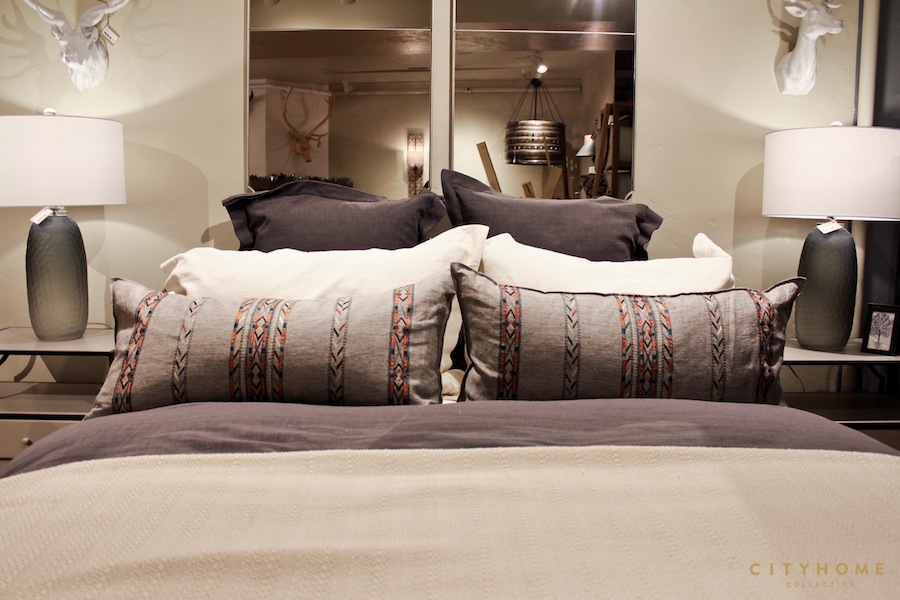
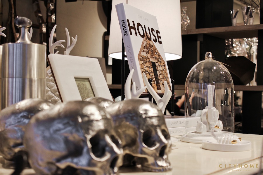
It’s like a candy store for the renovation-minded.
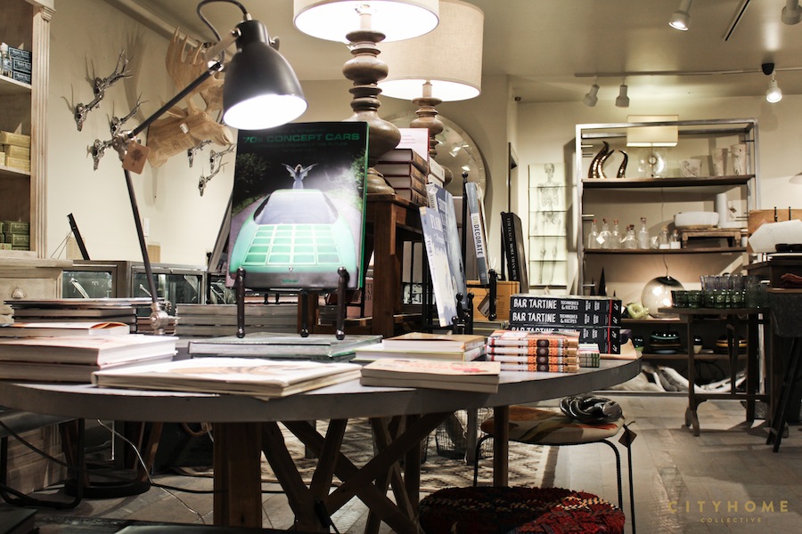
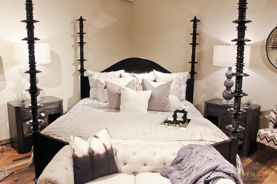
It’s an eclectic but luxurious mix of drool-worthy design elements. Think: quartz-stoppered glass carafes, gilt skulls [that’s called taking a cliché and making it cool], and a wide array of well-sourced furniture, textiles, and jewelry. Owner, Melissa Berry, has a keen eye for the intersection of luxury, quirk, and beauty–a junction at which we find ourselves quite frequently [and quite happily]. The upstairs doubles as a showroom for the Root’d design division; it’s packed with row upon row of fabric swatches, beds, settees, pendants, mirrors, and throws. It’s like a candy store for the renovation-minded. A delicious, delicious candy store.

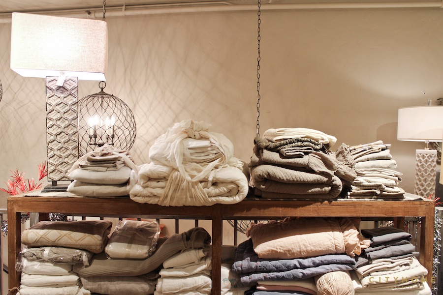
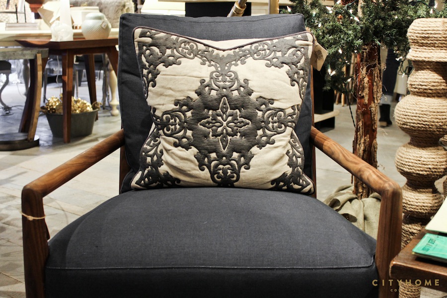

Well done, we say. We’re Root’ding for you.
In short, Root’d is pulling off what any good, privately-owned boutique should: it manages to be a sort of anti-chain. A curation of goods that truly can’t be found anywhere else. It’s an important element to Berry and her colleagues, Hope Chappelle, Molly Duke, and Jade Clements. Keenly aware of Park City’s impending development, and the likely onslaught of chains, a small company with a staff of four feels important. As does the sly dismissal of an aesthetic that’s had its time. Well done, we say. We’re Root’ding for you.
Root’d | 596 Main St., Park City | 435.214.7791