Our COLLECTIVE Place of Worship series aims to acquaint citizens of the city of salt with a few of her most sensational spaces, and--due to little more than circumstance--the grandeur of these structures is often matched by their sheer volume. But make no mistake: square footage alone does not a Place of Worship make. Bigger doesn't necessarily mean better. We know that beauty can come in all sizes, and a smartly-designed small space has a luxury and elegance all its own. This modest principle is something that John and Barbara know well.
To put it bluntly, they've wholeheartedly nailed it.
The two have restored and designed several of the quintessentially-charming homes that have become staples in historic Park City. The duo's spaces are tastefully designed (with equal parts grace and character), and they perfectly illustrate the value of living deliberately understated. Both brilliant designers and entrepreneurs, John Plunkett and Barbara Kuhr were the founding designers of Wired magazine, and have designed graphics for many other exhibitions, including Sundance and TED Talks, with their company, Plunkett+Kuhr Designers. So we're admittedly a little biased when we say that perhaps their most impressive accomplishment to date is their restoration and design of four neighboring homes in our sister city on the hill (right down the street from one of our absolute favorite haunts, The Washington School House Hotel). When speaking to their design philosophy, John says, "Louis Kahn had the ability, through his use of light and space, to make each building feel like a church, and each room feel like a home. This is something we try to reach towards in our work.” To put it bluntly, they've wholeheartedly nailed it. And the results are heavenly.
They're timeless yet visionary, and absolutely worthy of worship.
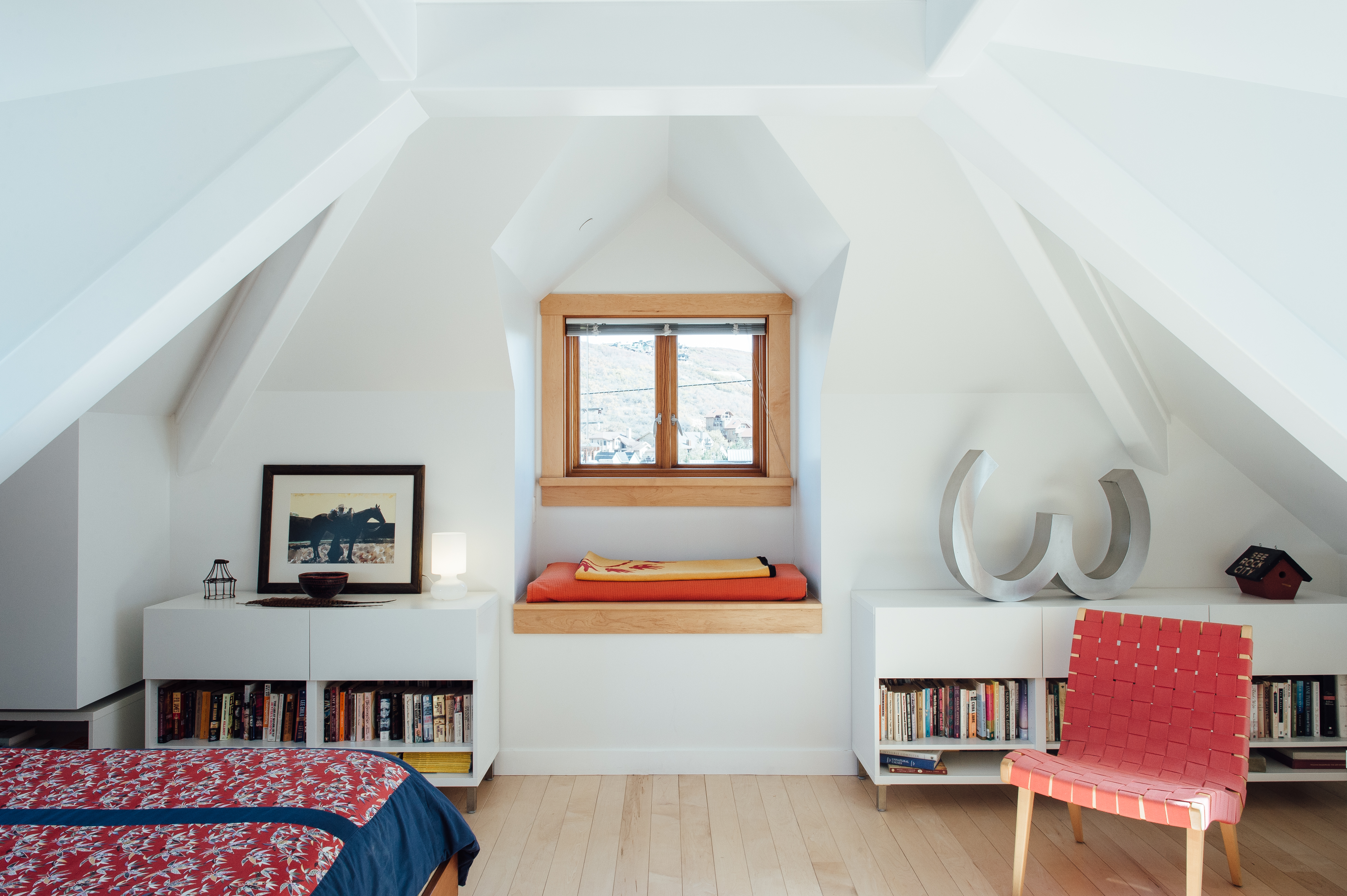
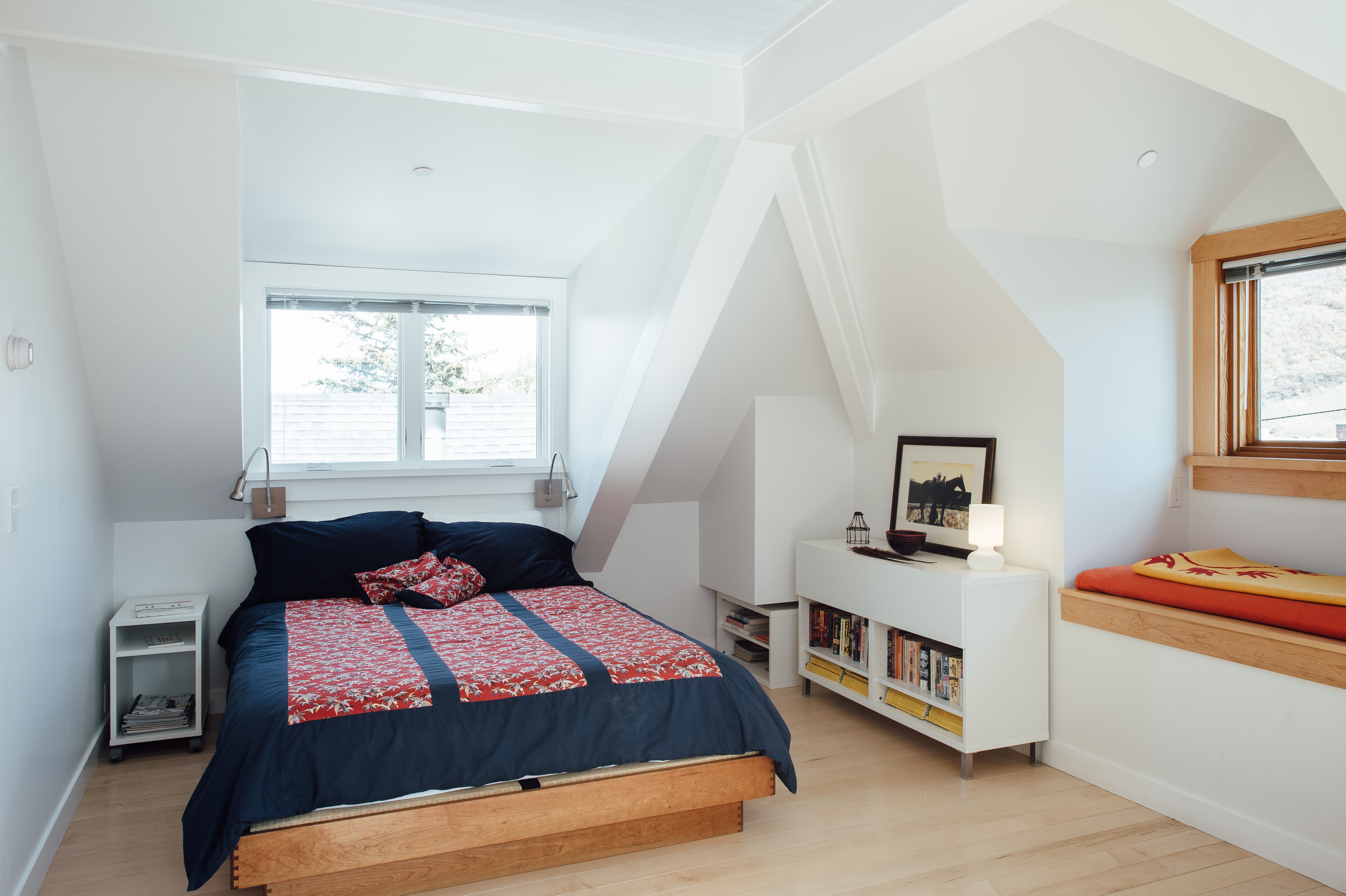
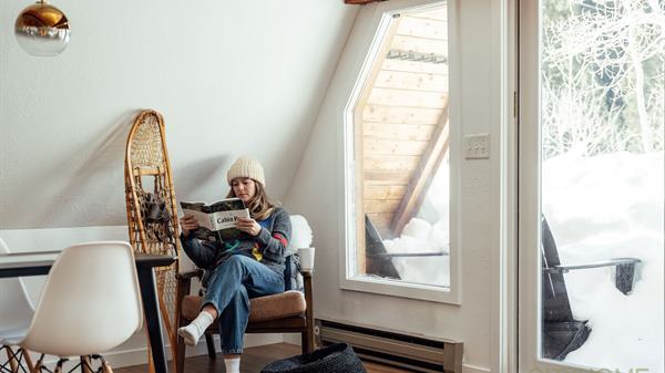
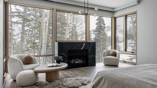
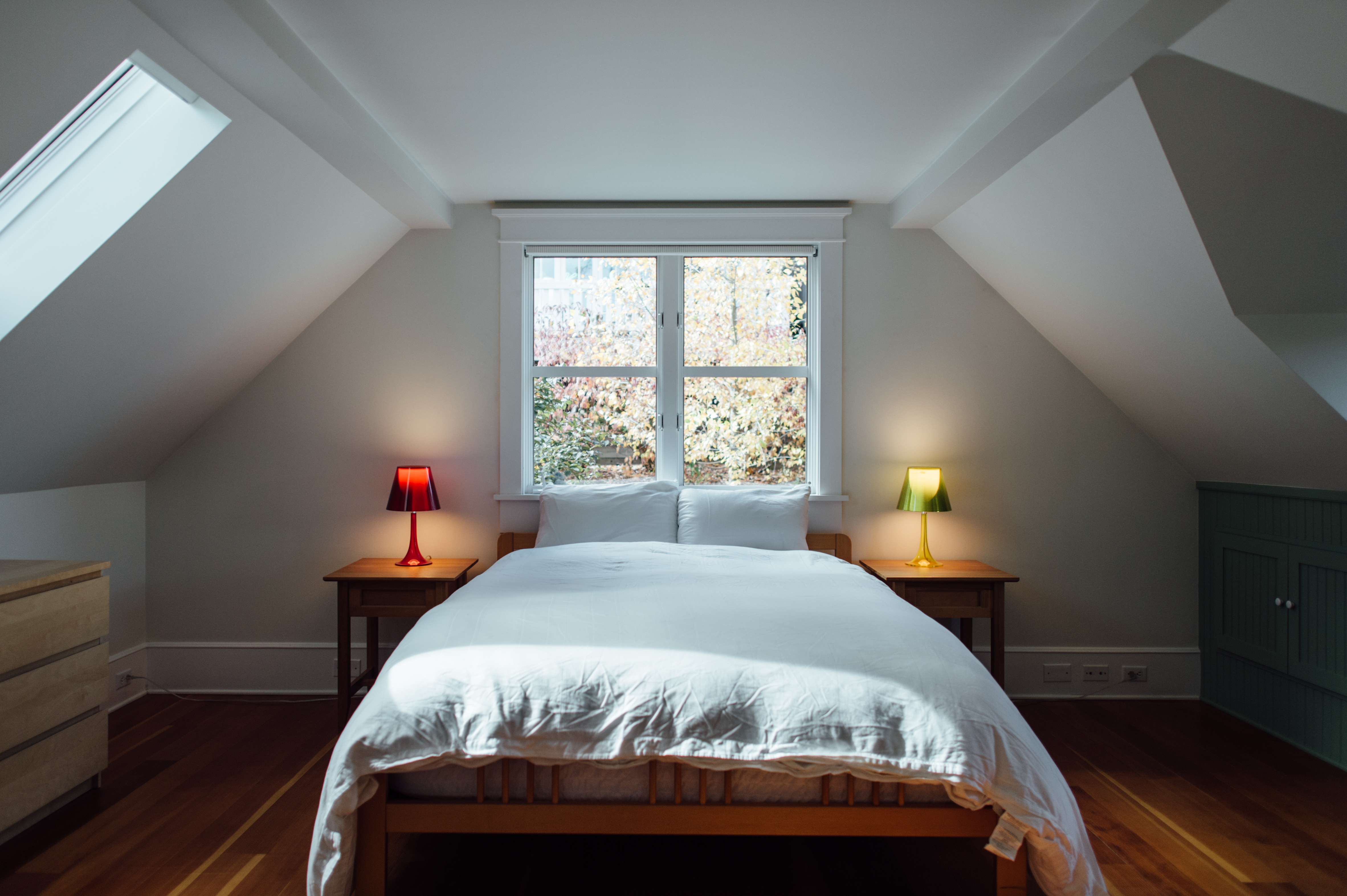
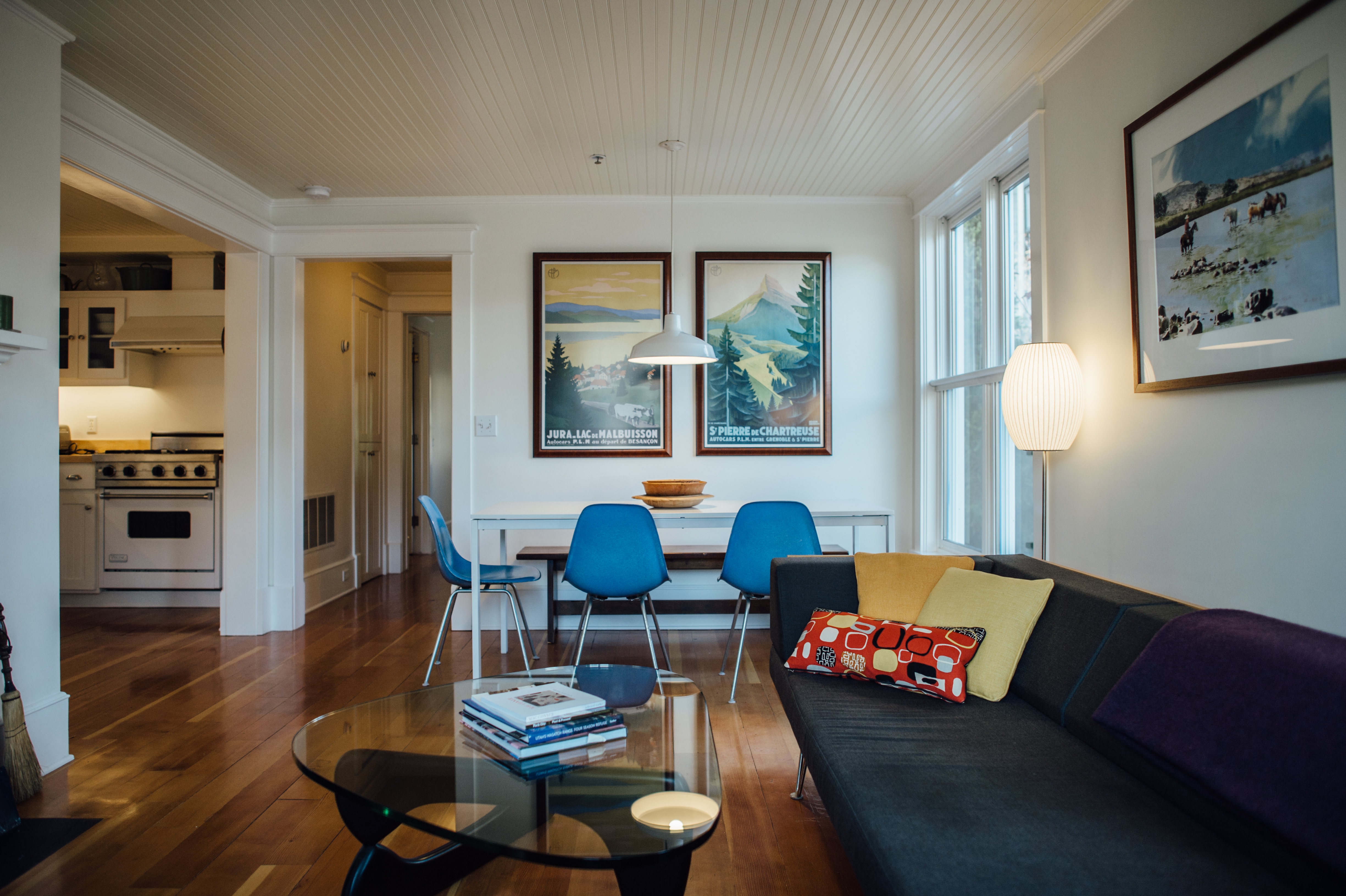
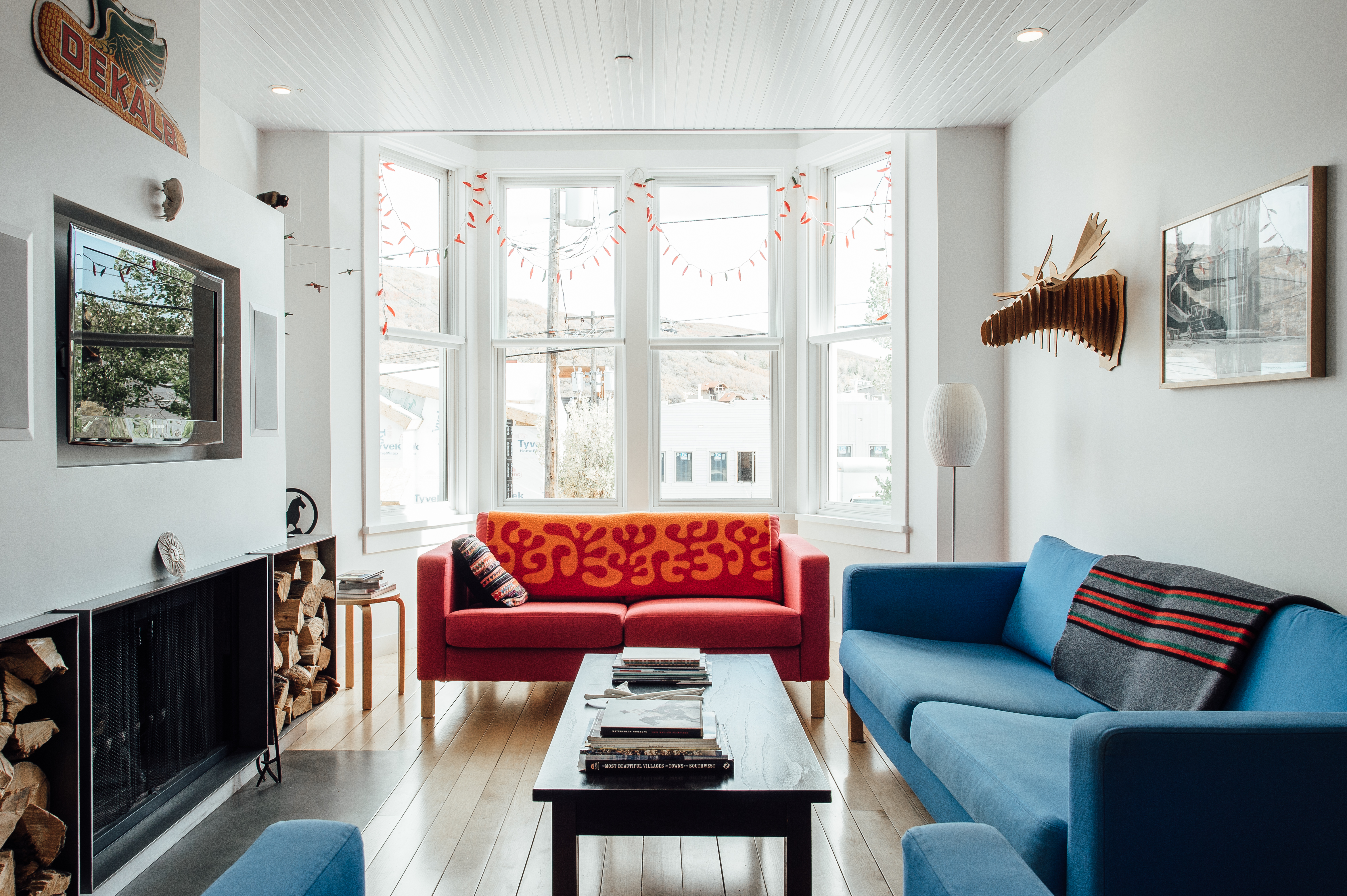
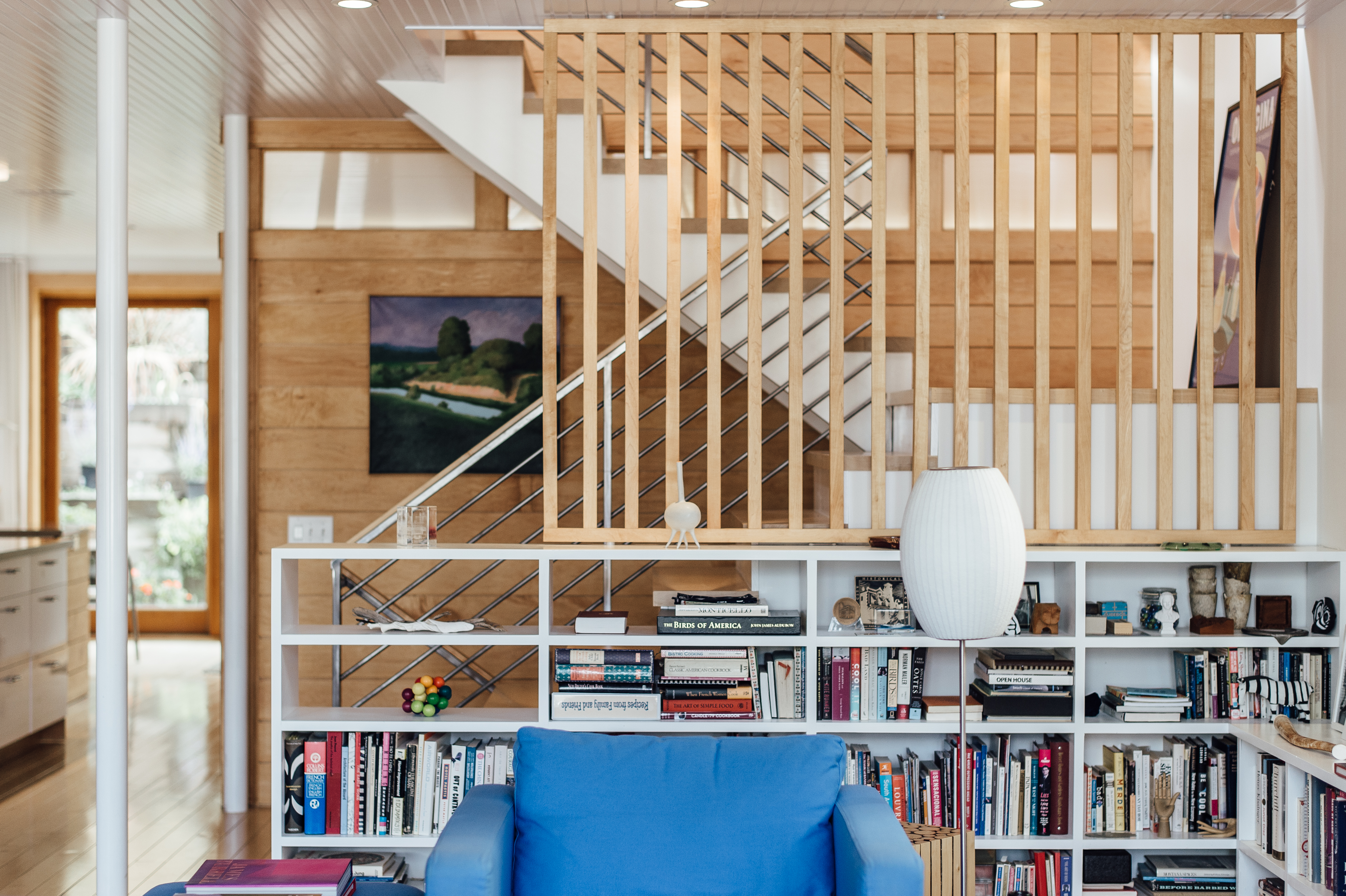
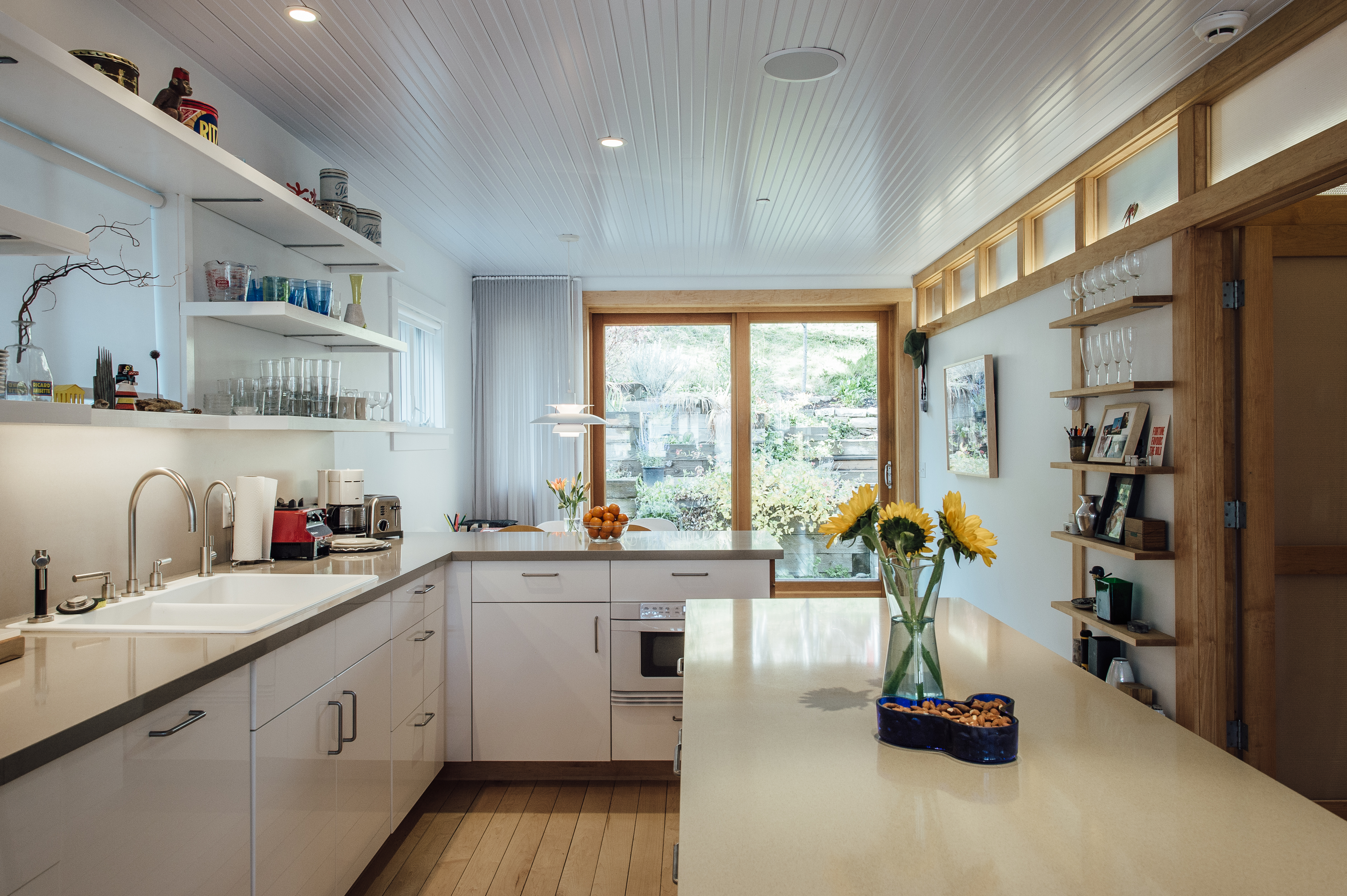
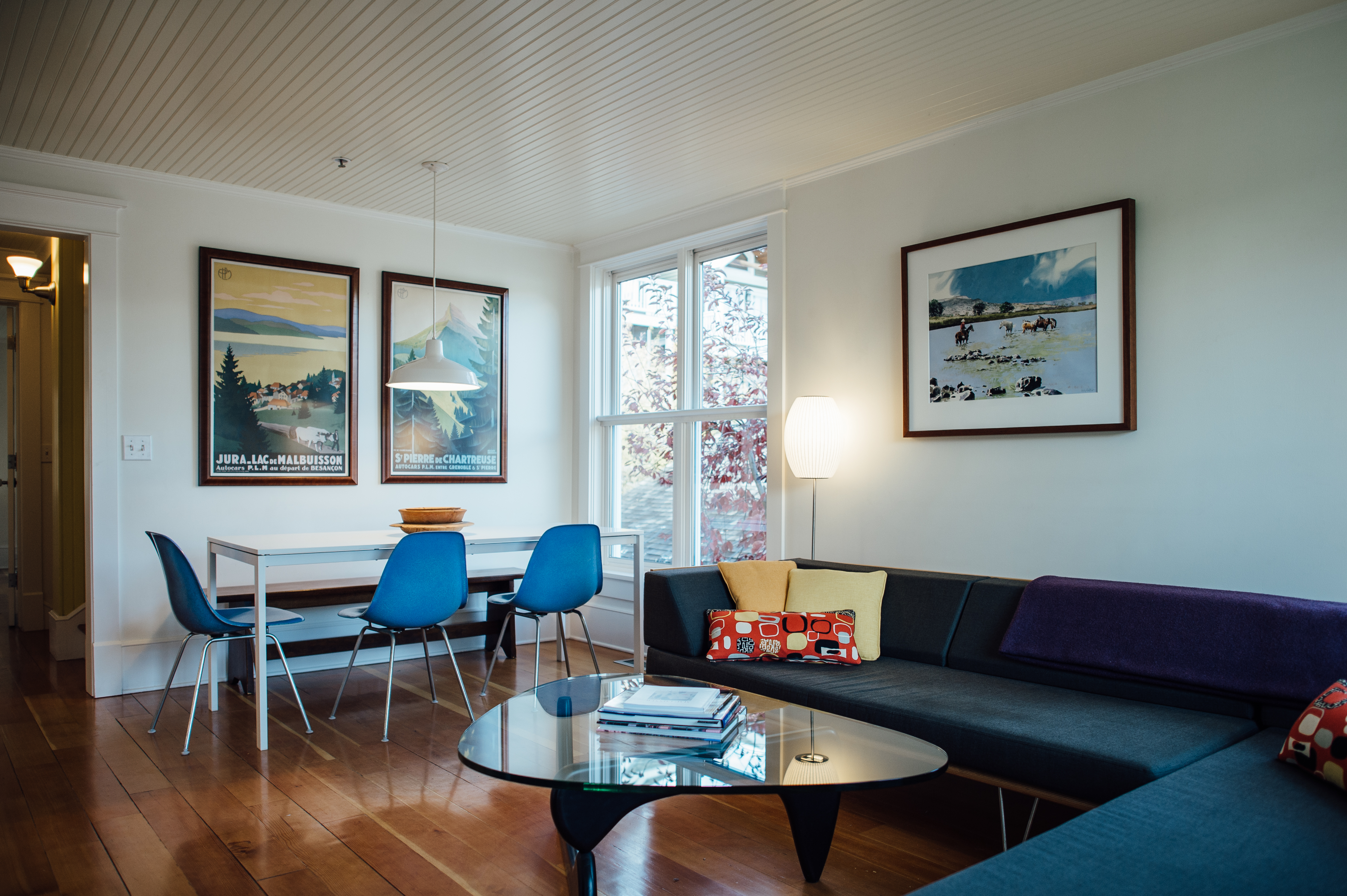
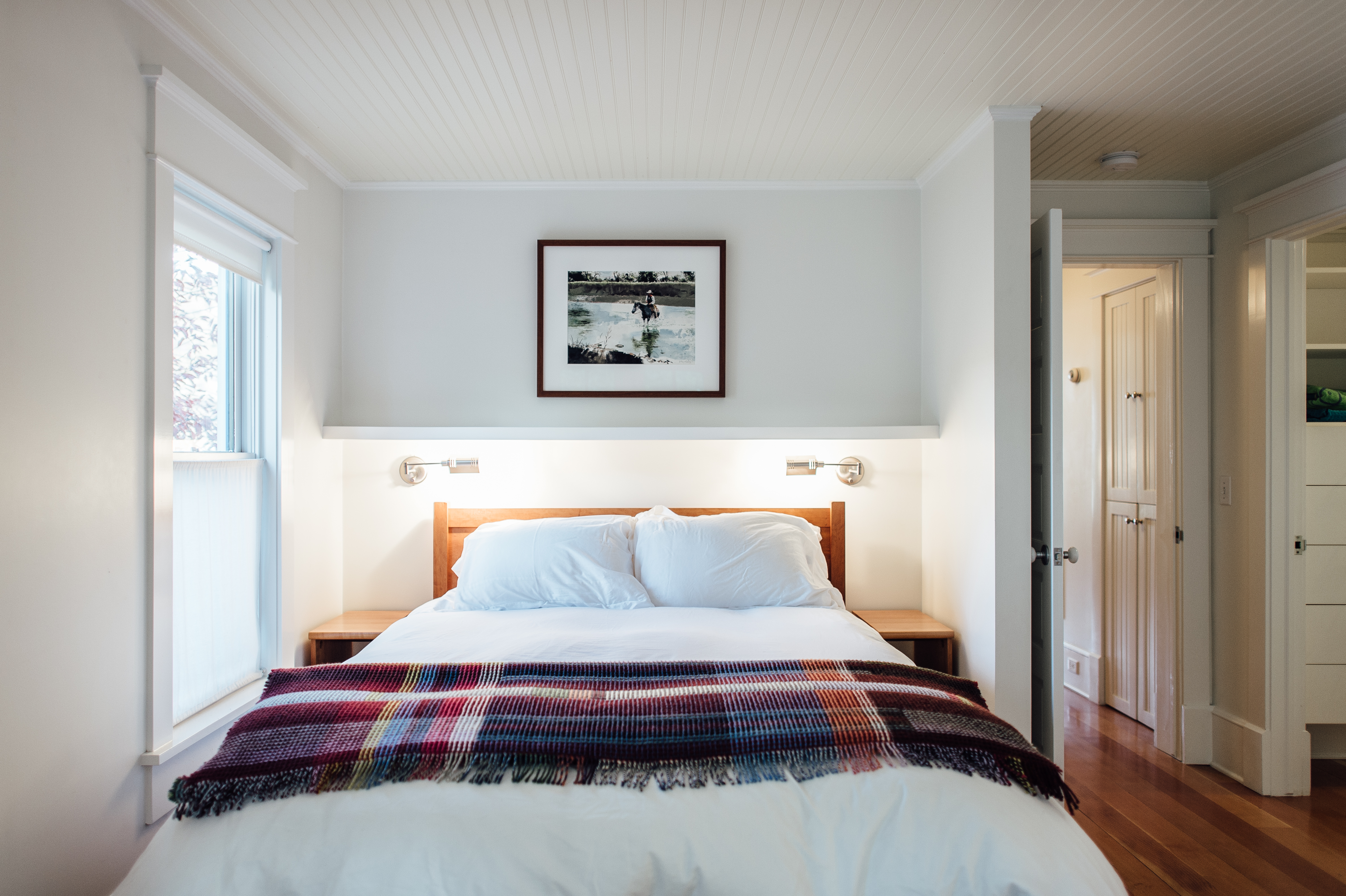
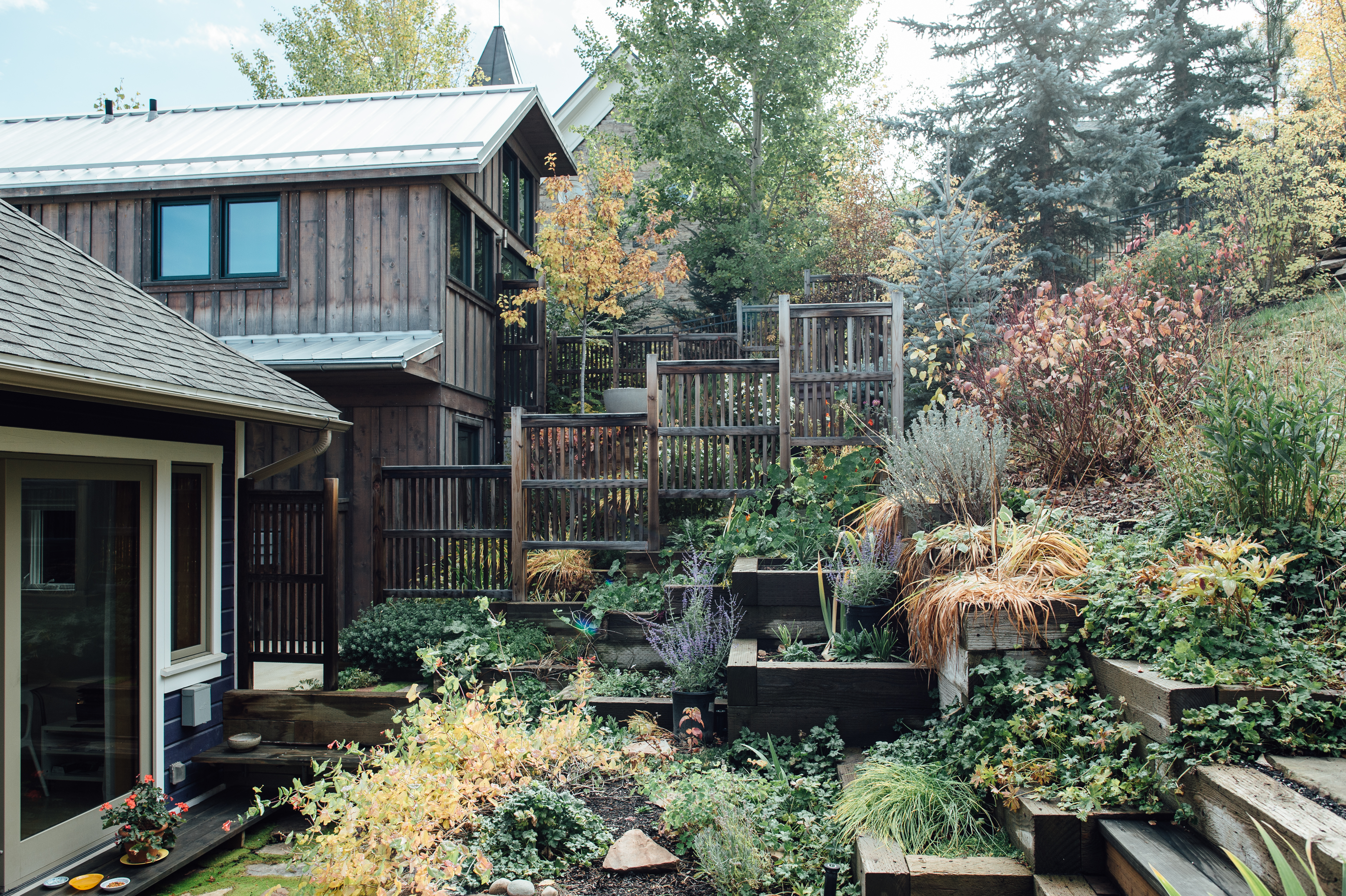
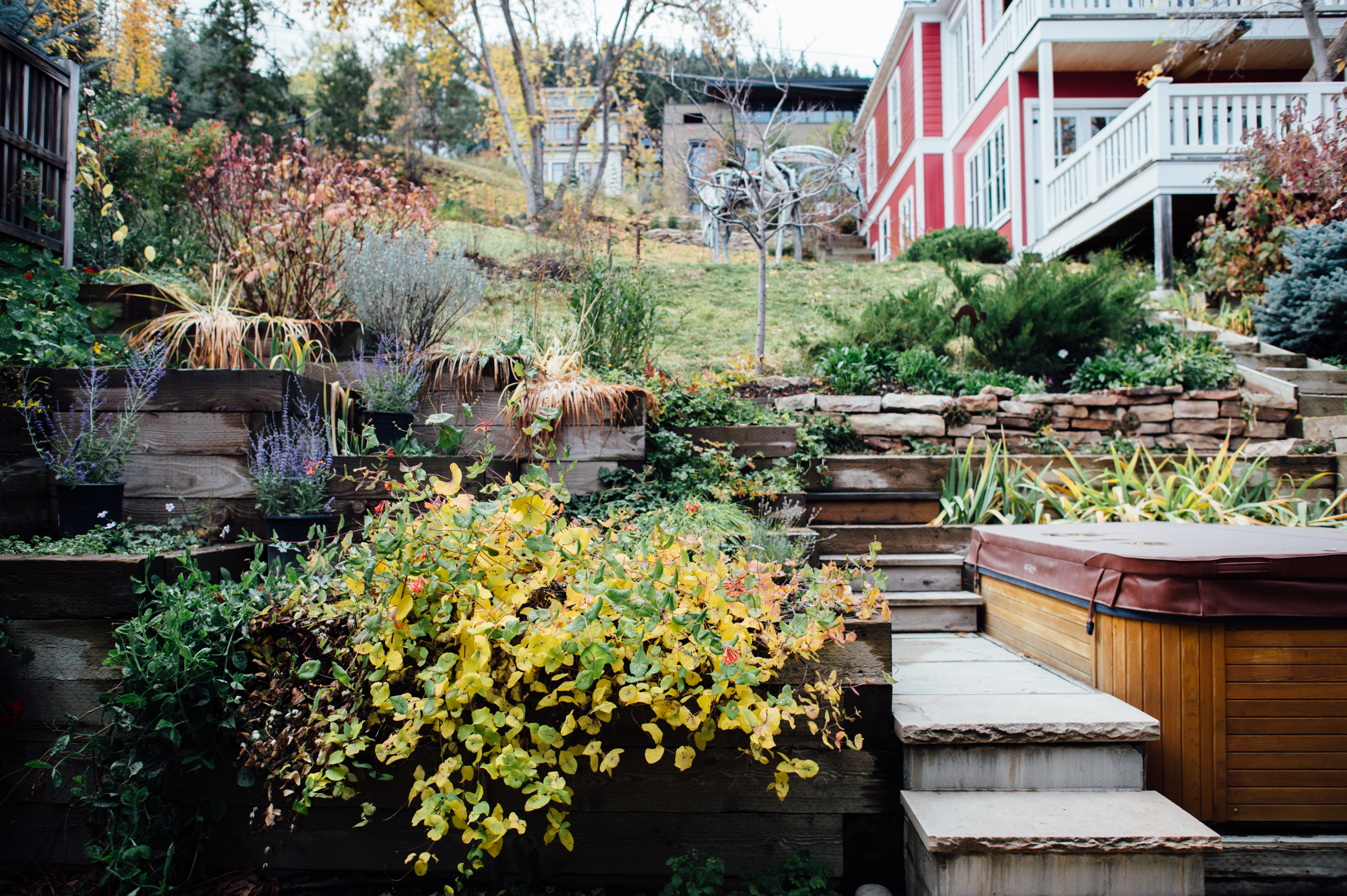
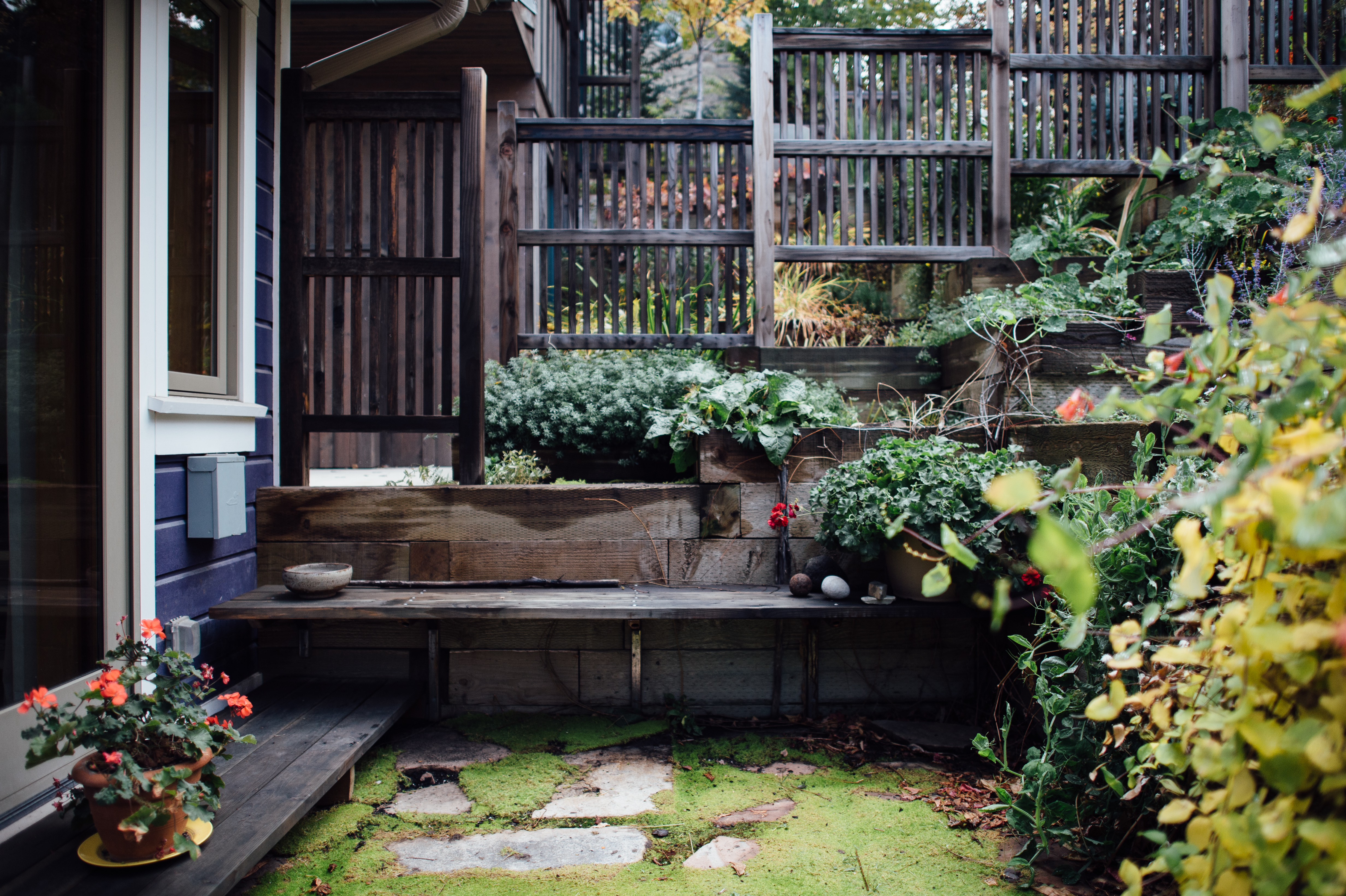
The warm, welcoming feeling in each of the homes is nearly palpable. The bright and open spaces brim with natural sunlight, and they're designed to lead those within from the kitchen to dining area to the backdoor, and out to a cozy backyard space, which is privatized by Asian-style partitions. It's apparent that John and Barbara's brilliance lies in designing for small spaces. There is most certainly a zen-like flow to their designs, and the spaces all seem to connect and relate holistically. Small, custom details, such as using the same type of glass throughout one of the houses, carries the light from room to room effortlessly and fluidly. Each area in each of the homes has a purposes--there is no wasted space here (for example, the bedrooms are more compact and functional, while the common spaces are larger and more open to accommodate gatherings). The square footage may have been minimal to work with, but the duo has expanded the former Victorian-era, mining town interiors into modern, open spaces, and the impact of the existing spaces is supremely larger. And, of course, the relationship between the clean aesthetic of the interiors and the rich, historic facade is flawless and natural. Neither too new nor too old. They're timeless yet visionary, and absolutely worthy of worship. See bits and pieces of three of the four homes below...we think you'll be inclined to agree.
"we replicated the original appearance based on old photos"
What inspired you to renovate these neighboring homes in a famously historic Park City 'hood? When we moved into the first house at 557 Park in 1991, we intended to renovate it but had no plans regarding the neighboring homes. Over time as they became available, we bought and approached each one as a separate design problem (but related to the neighboring homes & backyard).
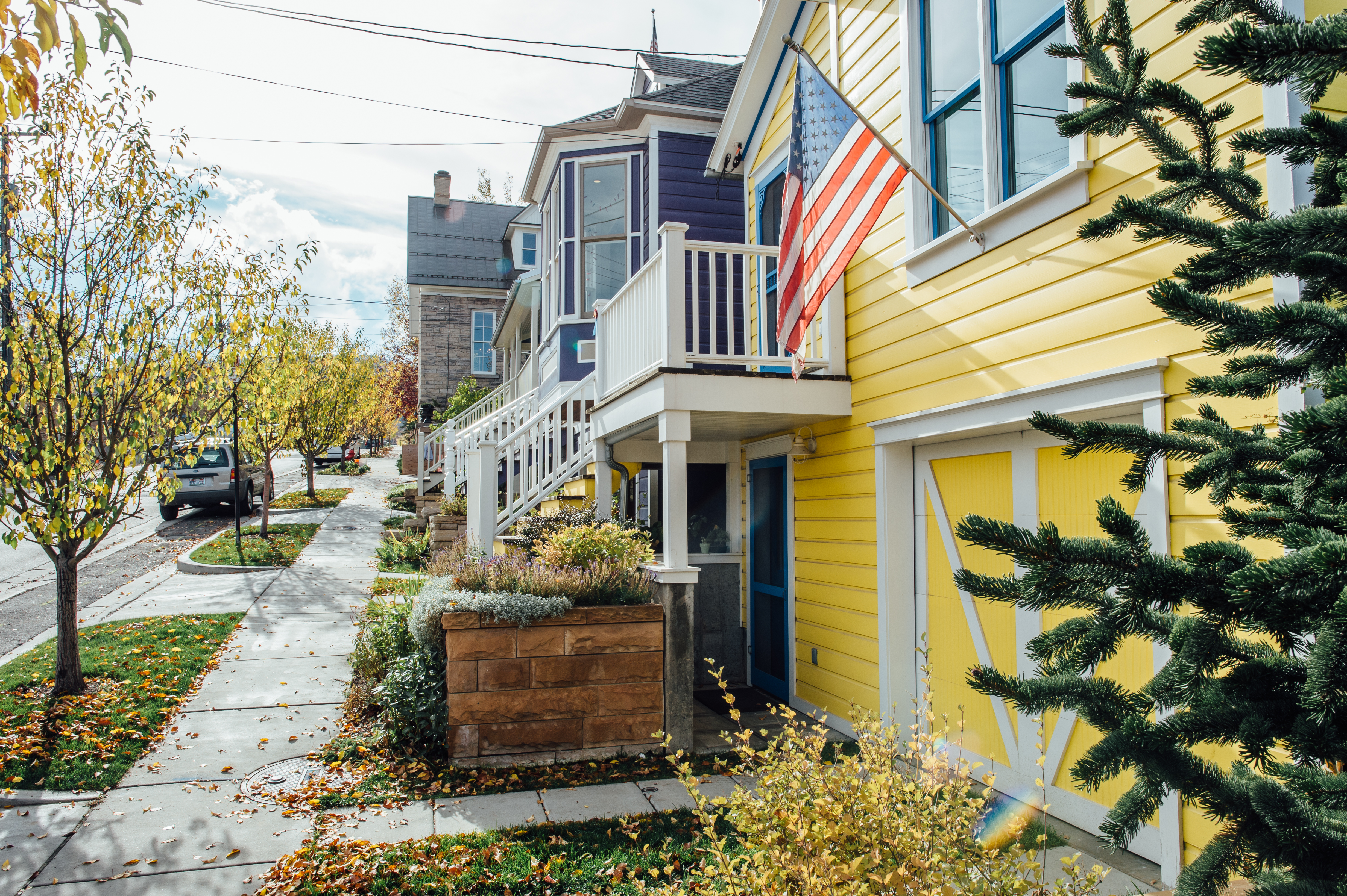
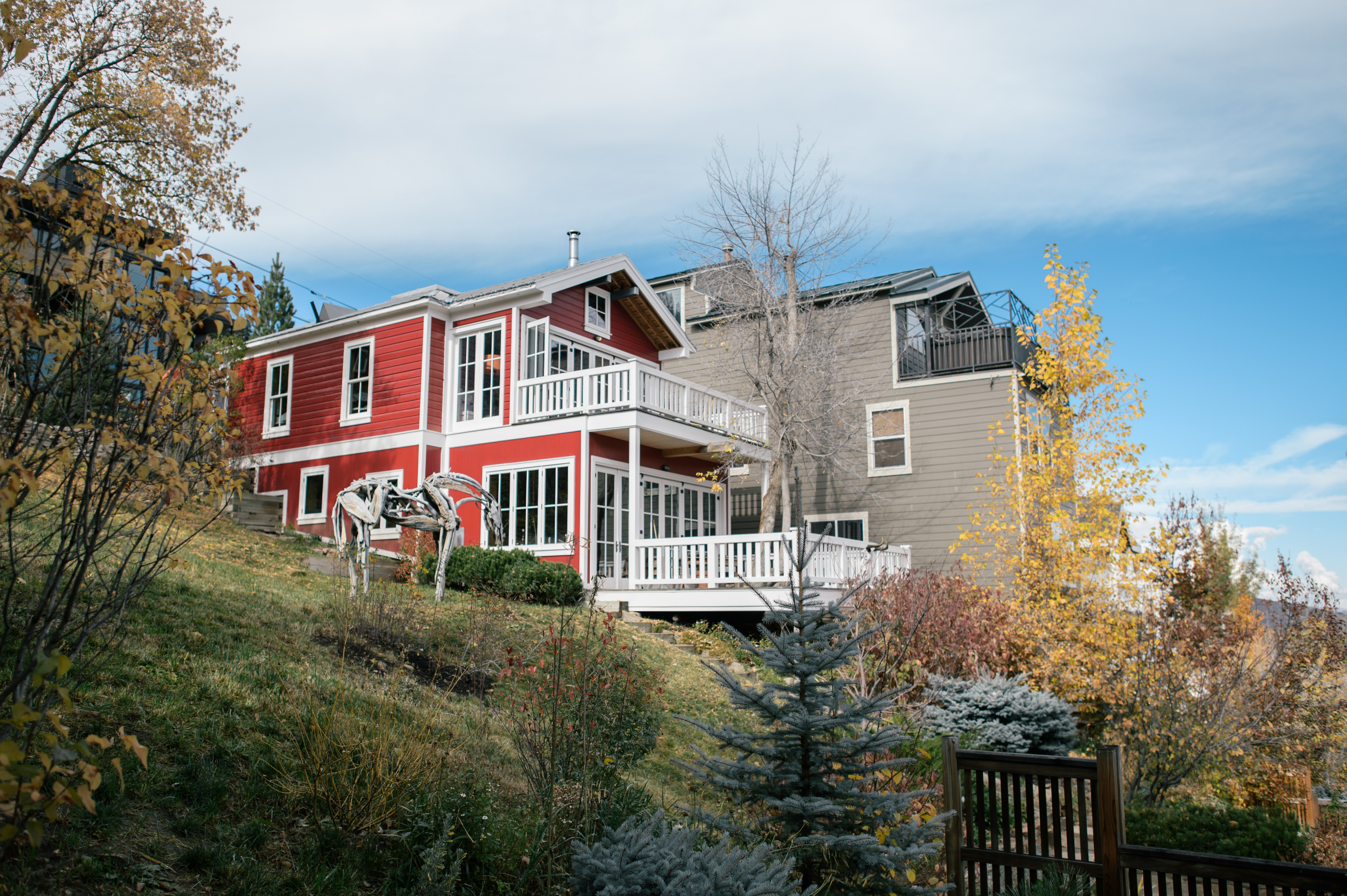
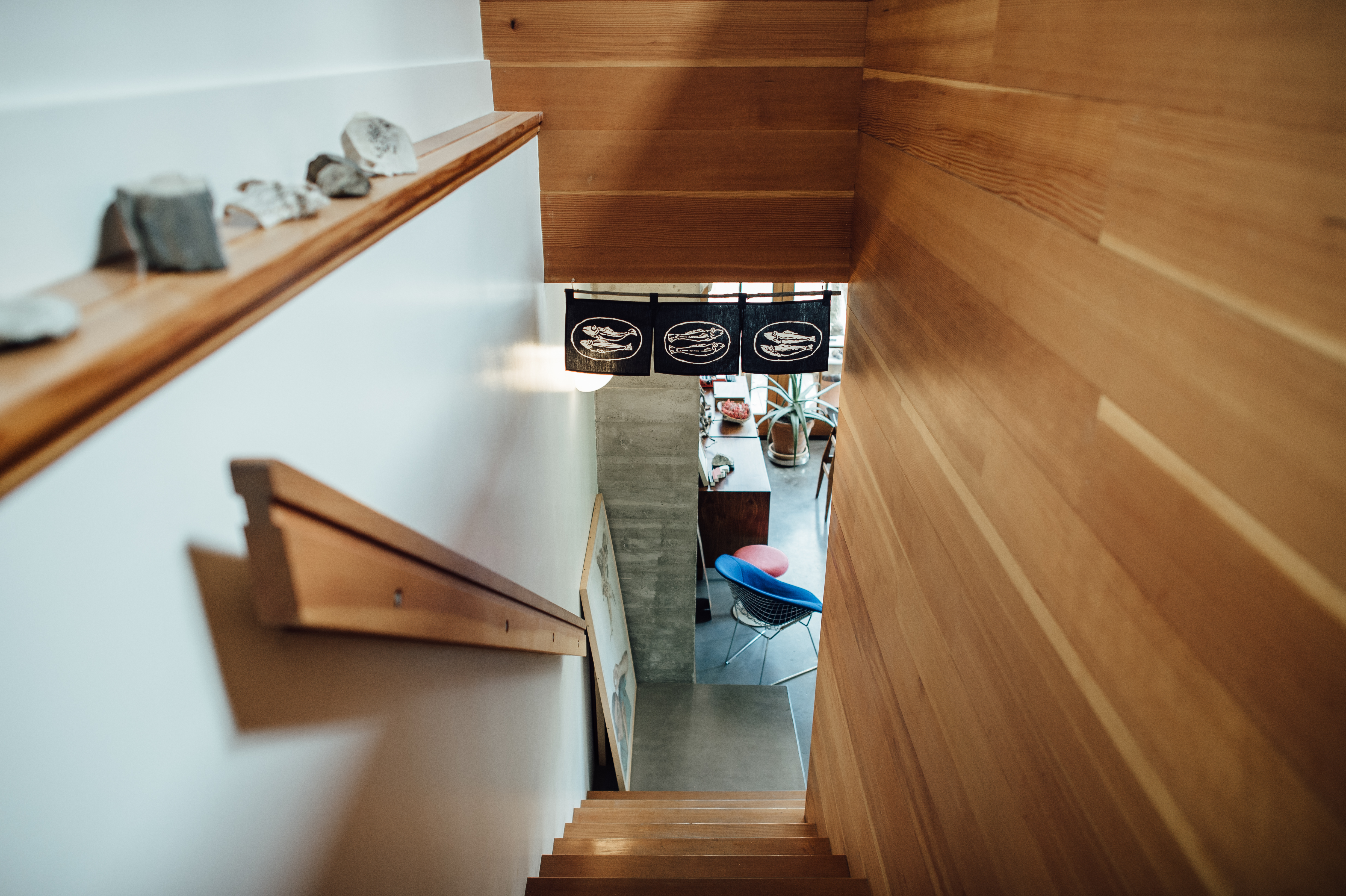
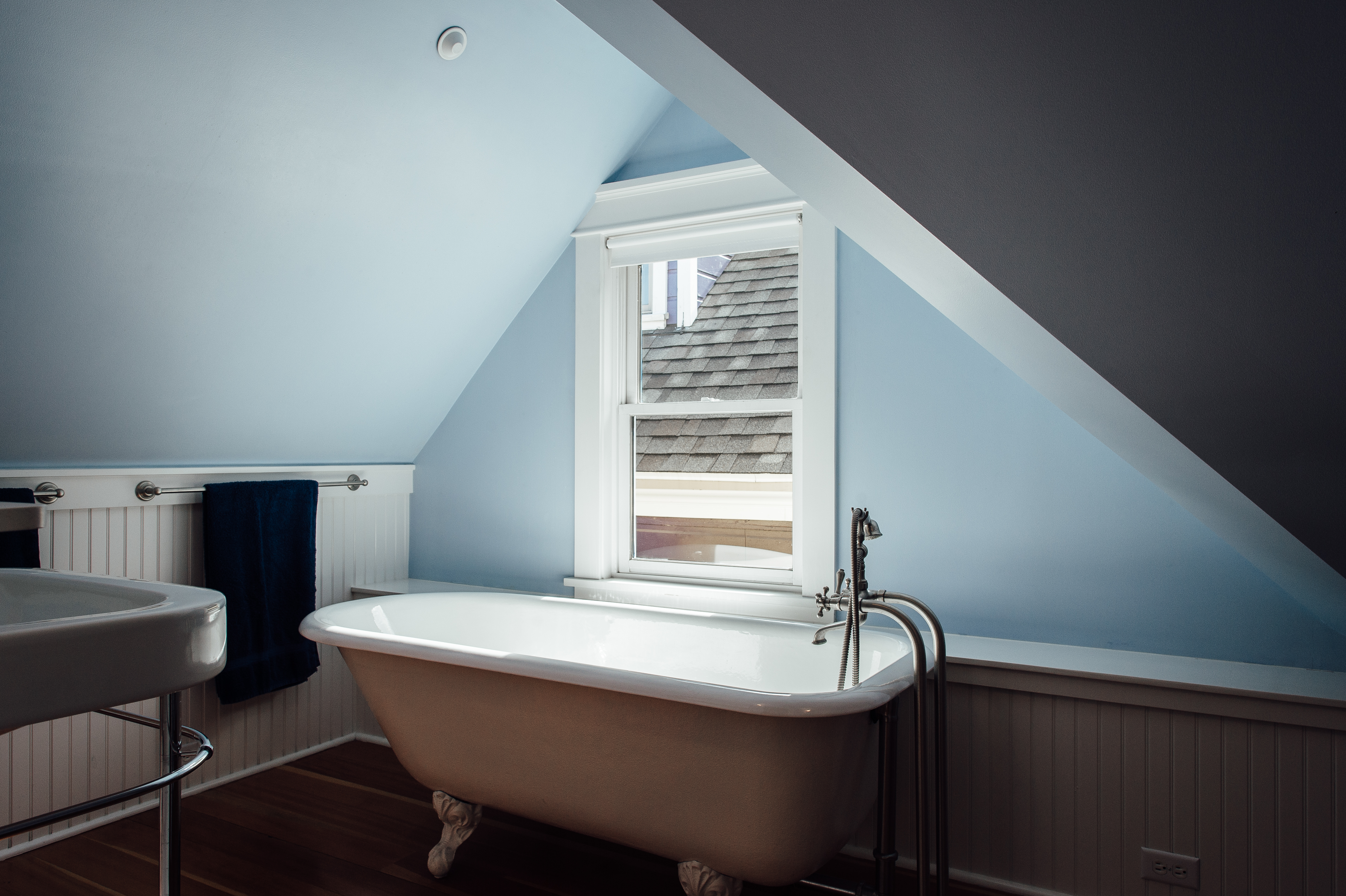
Though the spaces are separate, they seem to all work as parts of one cohesive whole, and the contemporary and historic styles work wonderfully together. What was the design process with each of them? For each of the three homes on Park Ave, the goal was to turn one floor of livable space into three floors, without greatly changing the relationship of their front facades to the street. We did this by taking advantage of the street’s downhill slope, lifting the houses about 20” (or three porch steps) to build full basements with single garages on the downhill side. Then we opened up the attics with steel framing to create bedrooms and baths above, turning the original, one-floor houses into three floors, without greatly changing their connection to the street. On the exteriors, the historic facades had been removed or covered up over time, so we replicated the original appearance based on old photos, which included rebuilding the missing bay window on 557. About 1/3 to 1/4 original siding, with new siding milled to match the profile of the originals (each house is slightly different). All new wooden windows to replicate originals that had been removed, replaced. And for the blue house, we rebuilt the entire bay window that had been removed in the '70s.
"The goal with all these small footprints was to create the illusion of larger spaces."
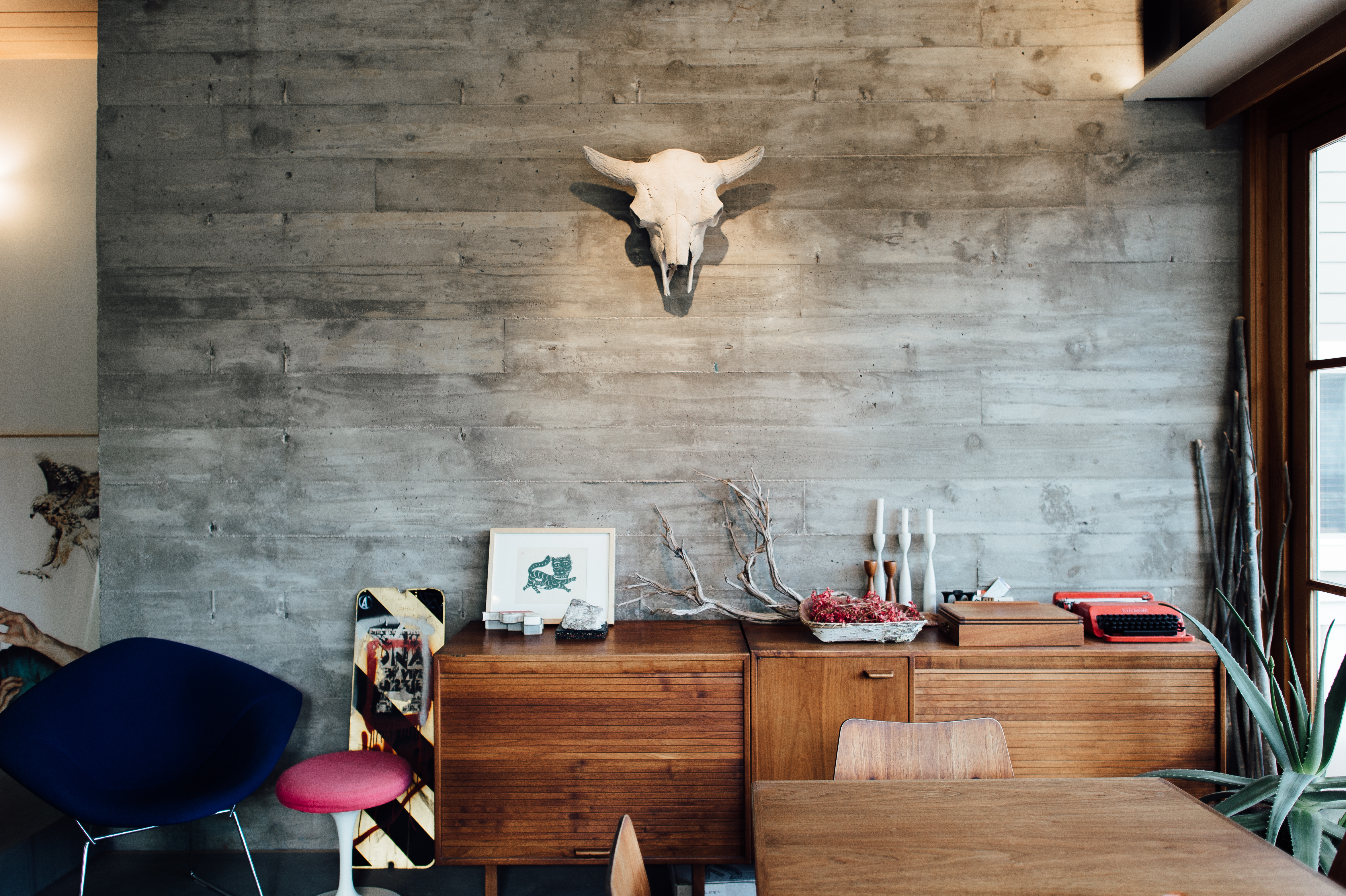
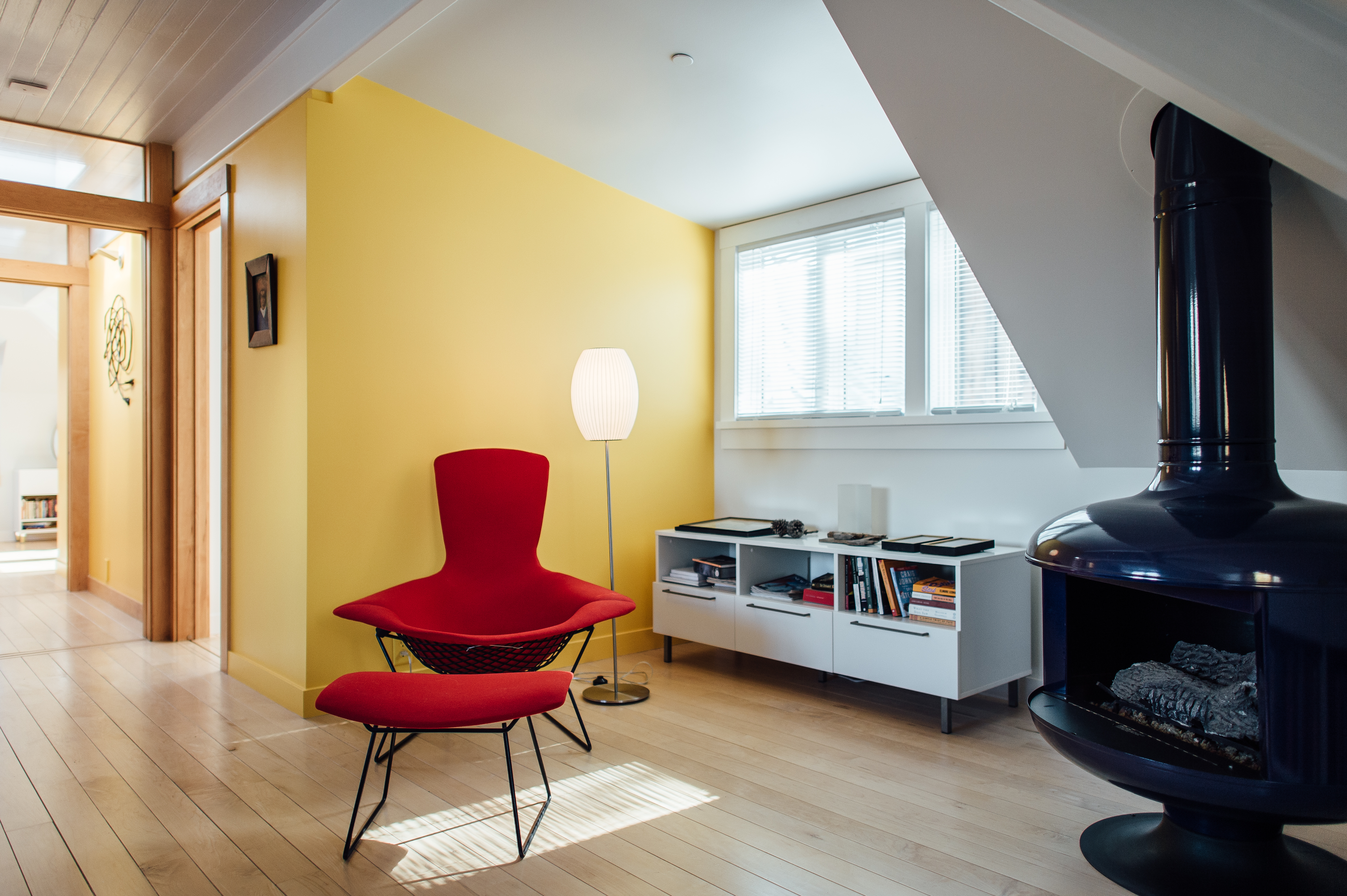
What was your inspiration or creative process behind selecting these unique color palettes? On exteriors: In 1991 the Park City Historic District Design Guidelines had a "recommended color chart" that looked like it came from Nantucket Island. As a result the whole town looked very drab, in ‘tasteful’ grays and browns. We thought this was both historically inaccurate and boring, and that these small, wood, Victorian shacks could feel much more cheerful by using bright color. So in '91 we painted the first house ‘blurple’ (right on the cusp between blue and purple). This concerned some folks in town, but in '98, after we painted the second house bright yellow, we began to see other PC homes following suit. Now, after 25 years, the historic district has become much more like the colorful and cheerful place that it probably was in 1900, although there’s still too many "tasteful" beiges and grays. On interiors: The goal with all these small footprints was to create the illusion of larger spaces. It’s hard to beat white walls as a starting point, but then we applied subtle colors to the bead-board ceilings and bright color accents to certain walls. The finishes make a big difference as well. For example, we use glossier ceiling finishes to reflect the light, but avoided hard or shiny, plasticized finishes on the wood floors and walls. Instead, all the wood is oiled and sanded multiple times just like it was traditionally done. This results in wood walls with a velvety feel, and floors that still feel like wood instead of plastic.
"with each house we’ve experimented with the materials and detailing"
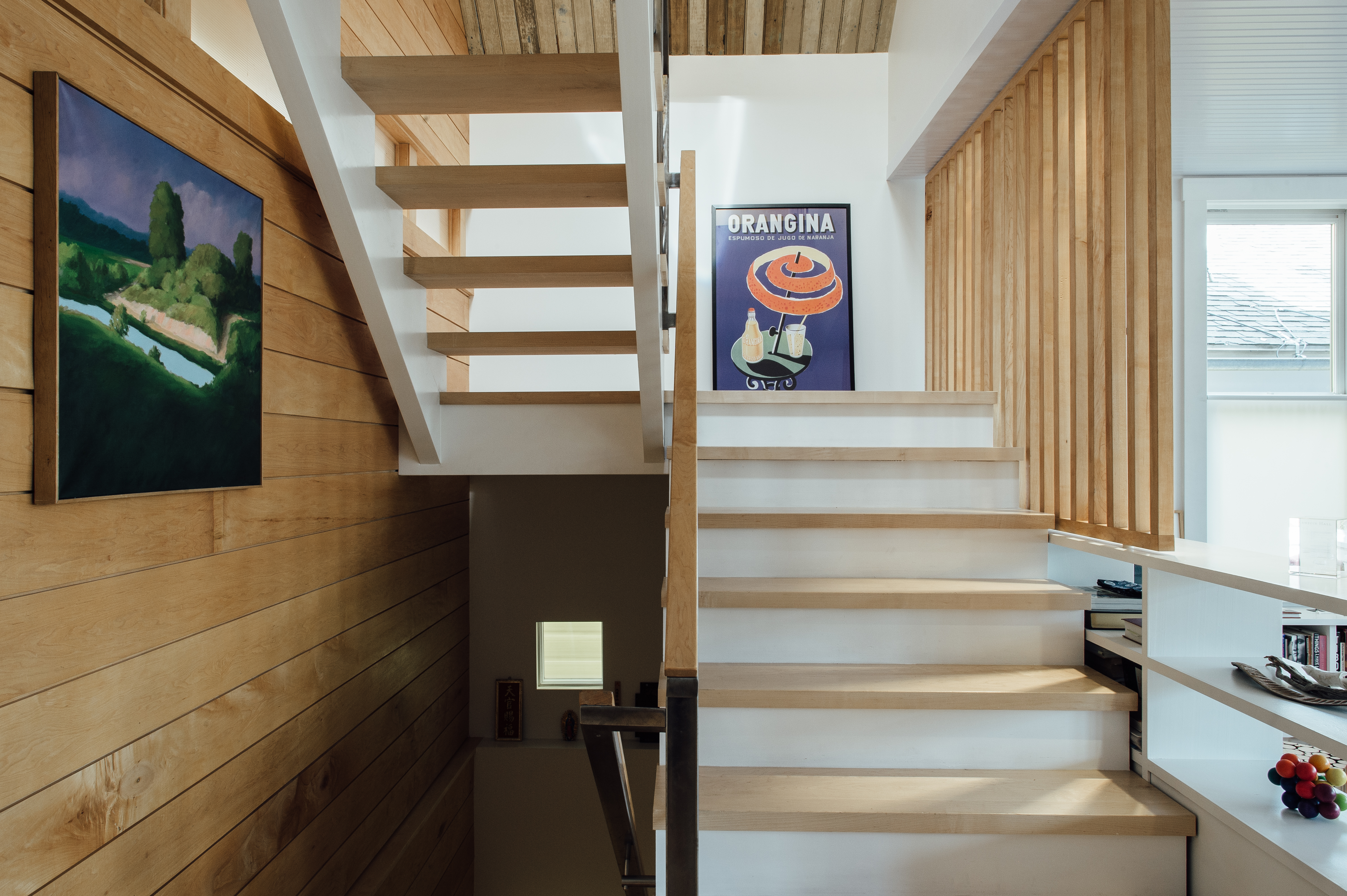
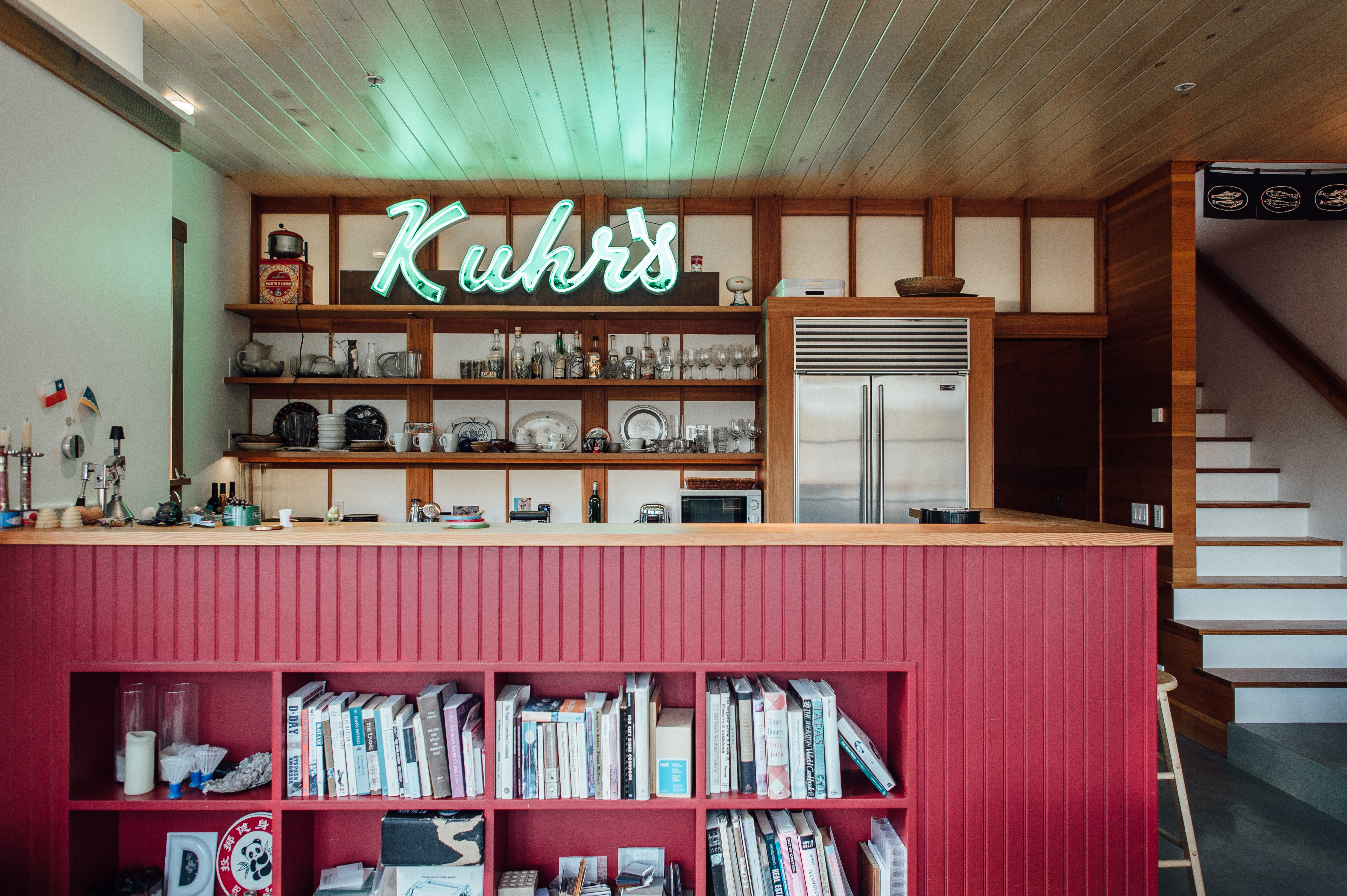
I noticed that the first house you remodeled had more traditional elements in the molding and trim woodwork and then you moved toward more modern detailing in the other houses. Can speak more to those design choices? We gave all the houses modern, open floorplans, and used white walls and line-of-sight window placement to help create the illusion of larger spaces than their actual tiny footprints. But with each house we’ve experimented with the materials and detailing, looking for ways to bridge the aesthetics between the Old (Victorian exteriors) and the New (modern interiors). On the first (Yellow, 1998), we designed traditional interior window trim and moldings to match the Victorian exterior, but used small splashes of bright color as well (a little bit of color goes a long way in small, interior spaces). The flooring is fir throughout. On the second (Red, 2000), we used oiled, vertical-grain heartwood fir throughout, to match the original rough-sawn fir roof structure that we discovered after sand-blasting off a century of black soot. In the new basement we used a smooth concrete floor and a board-formed concrete wall as more modern contrasts (although board-forming is the traditional method and the plank widths echo the exterior siding). We also built a very modern tile/concrete/wood bathroom, and kitchen with honed granite counters. We also brought the red siding into the kitchen, and created a fir and Japanese-glassed clerestory-wall between kitchen and bath. In the third (Blue [or blurple], 2009), we used clear maple heartwood throughout for a lighter look & feel. The floors were sealed to keep them as light & white as possible, but the walls were oiled to a slightly darker shade. The lines of the Victorian glass clerestories on the front porch were then continued inside as modern maple & polycarbonate clerestories on the main floor. In the fourth (Green, 2013) [not pictured], we used white oak throughout for both floors and walls. In most cases we left the wood as light as possible, but in some spaces, for contrast, we oiled the wood to a darker, more traditional color. The streetside interior walls and vestibule in the great room were detailed to match the Victorian exterior, but from that point on the house has a modern vocabulary throughout, including white-painted steel to support the loft, glass stairway and bridge to the new rear addition.
"small is not only beautiful, but also a whole lot more valuable than McMansions."
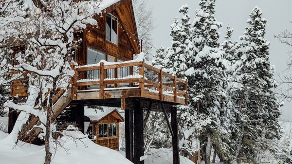
We're officially fans of your work, so are there any equally-amazing projects you can hint at? What’s next in your architectural adventures? We’re currently designing one of the first homes to be built up at Summit Eden, a new and private part of the Powder Mountain resort behind Ogden. We’re excited both because it’s the first completely new home we’ve designed from the ground up (instead of hiding modern homes inside Victorian shells), and it will be a ski-in/ski-out house at 8,800 ft altitude. One of the great things about Summit is that they’re not trying to build the biggest houses possible, or build fake western log-cabins. Instead they require a modern design, the maximum size is 4,000 sq ft, and, best of all, there’s no minimum size. So we plan to build a 2- or 3,000 sq. ft. lodge on a 3/4 acre mountain-top lot. The value is in the beauty of the land and the views, and the quality of the design and construction, not in the old-fashioned idea that value should mainly be measured by the sheer quantity of square footage. We think that small is not only beautiful, but also a whole lot more valuable than McMansions.