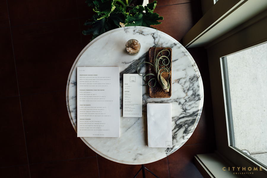
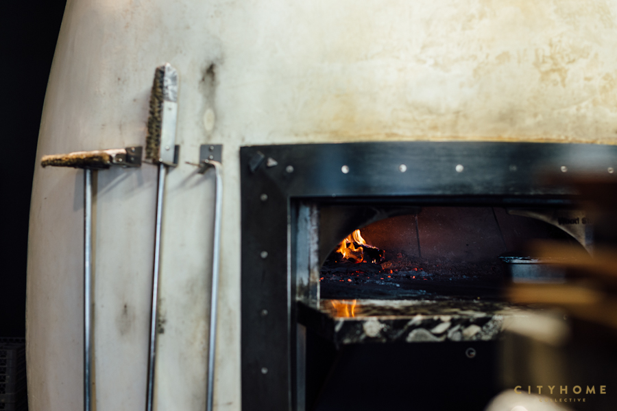
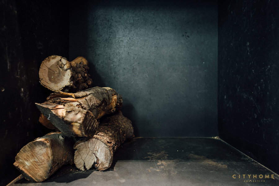
Those even remotely familiar with the Park City food scene know the merits of Handle. The "carefully constructed domain of a top, national chef," Handle consistently serves in every sense of the word, thanks to owners Melissa Gray, Briar Handly, and Meagan Nash. It stands to reason, then, that when the three of them asked us to collaborate on the design of another restaurant, our answer was something to the tune of "a thousand times yes!" A Salt Lake City sister restaurant to Park City's perfection would mean potential daily access to the impeccable service and incomparable menu we've come to expect from Handle. HSL (or, Handle Salt Lake) would be a second endeavor, yes…but entirely independent in her own right. We would be tasked with creating a unique, atmospheric experience--a restaurant that would complement everything we love about Handle, while maintaining its own identity, mood, and feel.
The design of HSL was, in its entirety, a collaborative effort with Melissa Gray (who designed the original in Park City). We each had ideas in mind--differing aesthetic preferences and competing concepts--but there were a couple of things that we agreed on from the start: 1) Our design should be a direct reflection of the food and dining experience created by Briar. Fresh, organic, fluid. The interior needed to enhance the menu, rather than compete with it. And 2) HSL needed to serve as something of a refuge. We wanted to create a little escape, right inside our city. We drew inspiration from trips to Tulum and our own absurdly-stunning Utah landscape, and took cues from Melissa's design in the original. What began as two very different visions for the space became unified throughout the process, and ultimately, we landed on something richer and more authentic than if either party had created it alone.
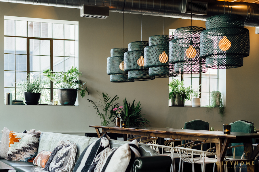
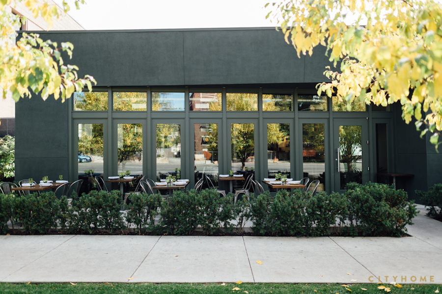
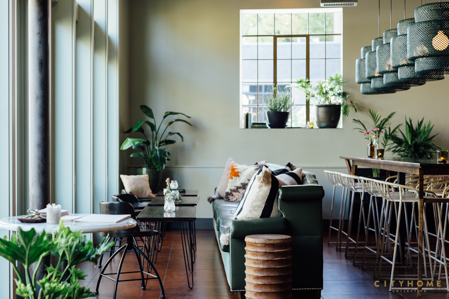
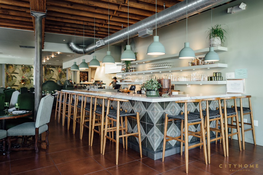
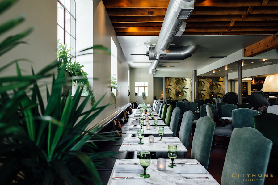
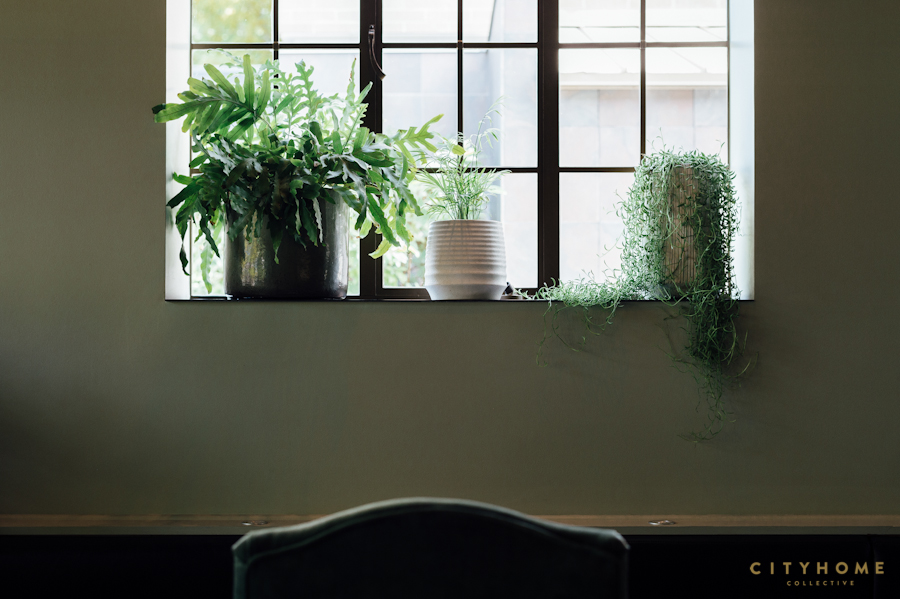
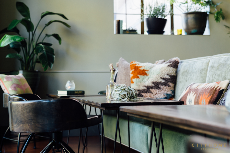
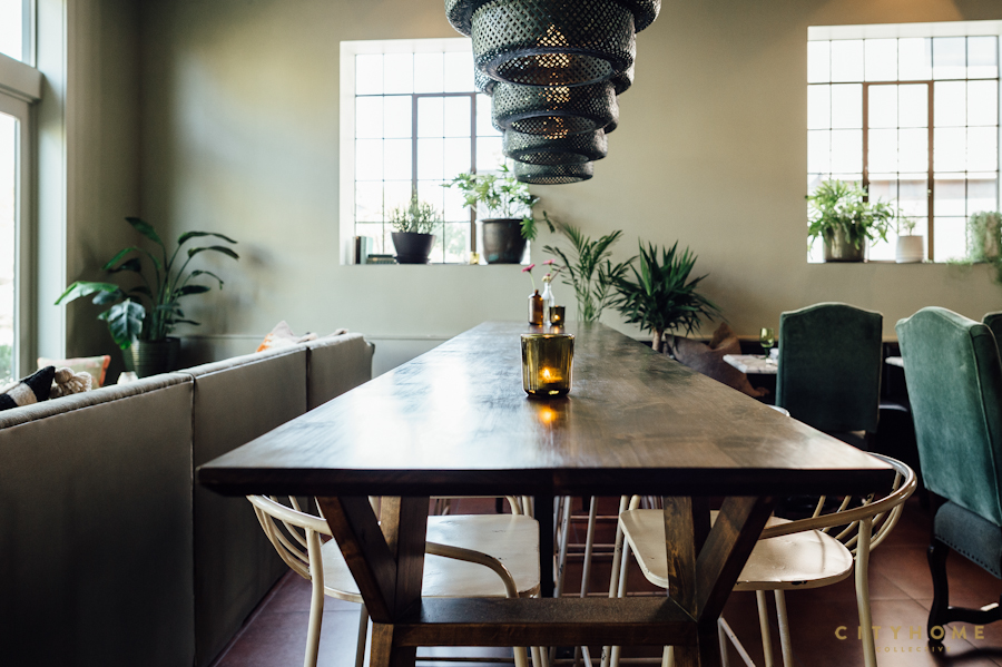
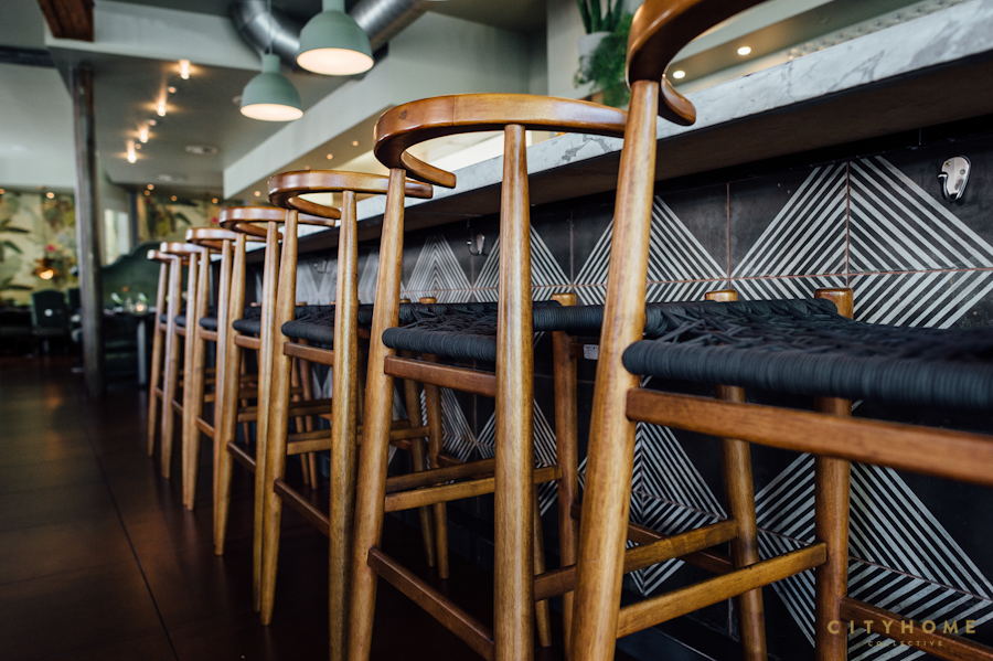
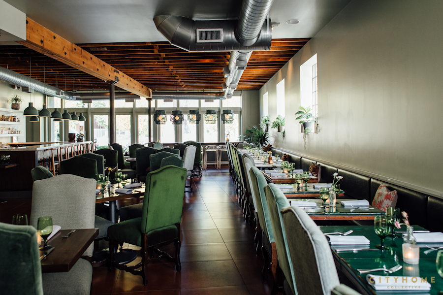
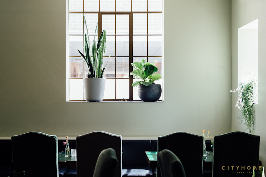
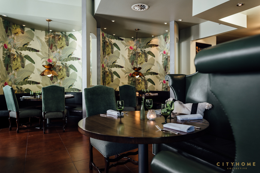
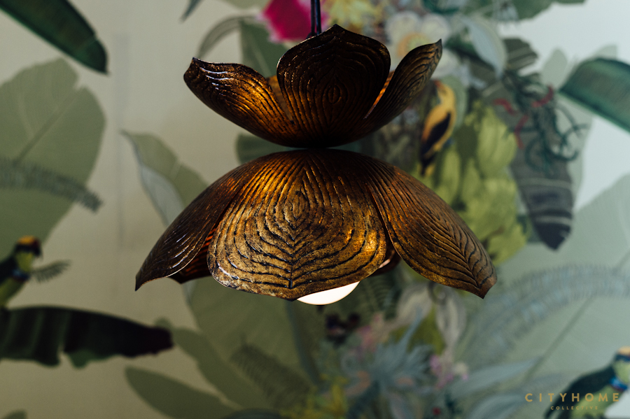
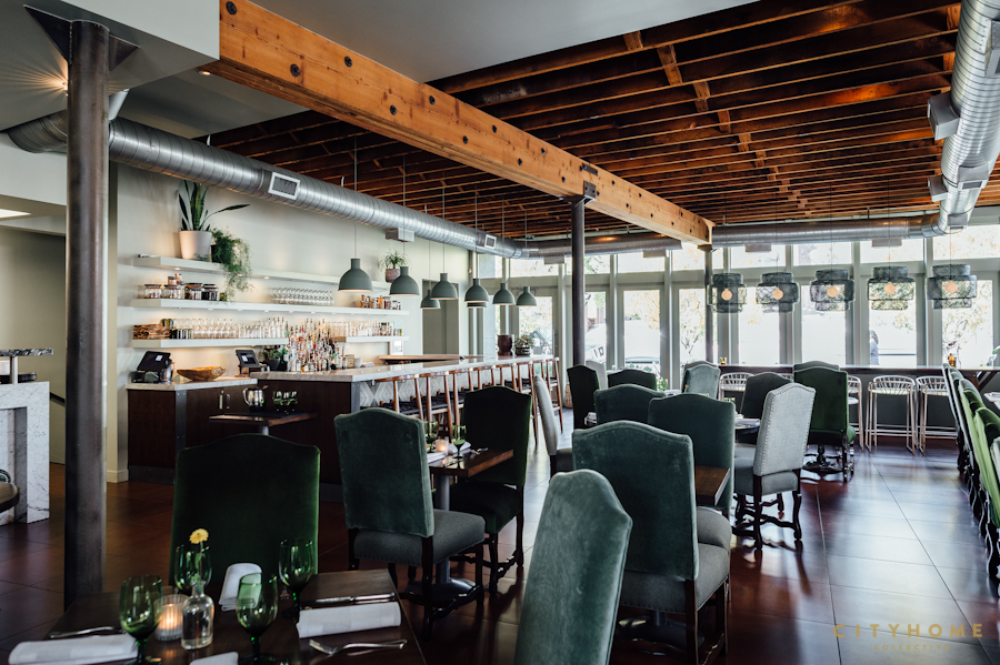
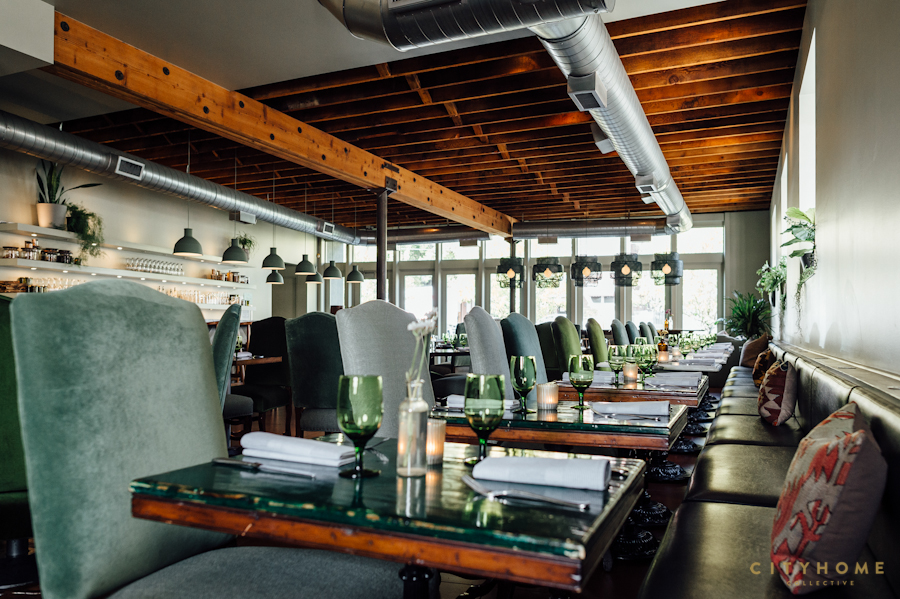
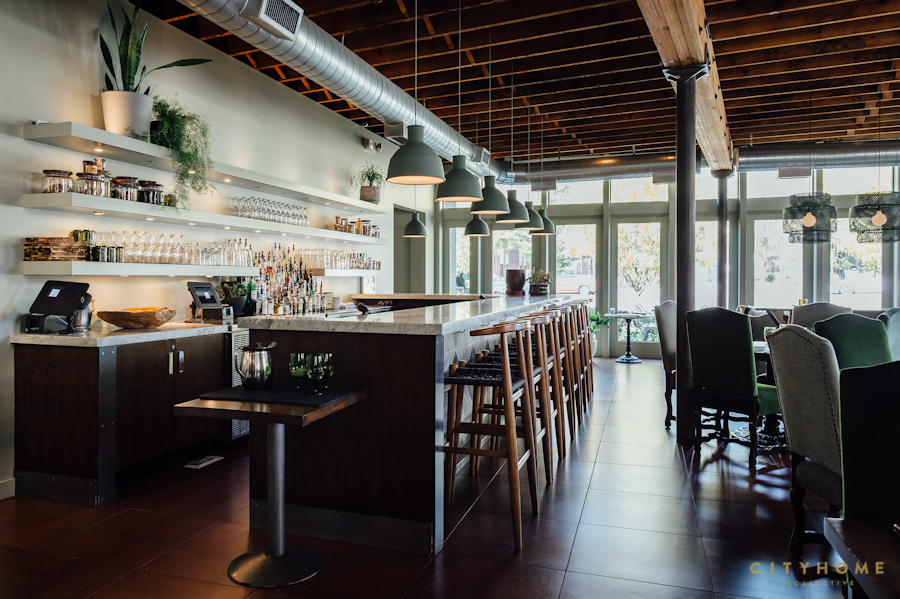
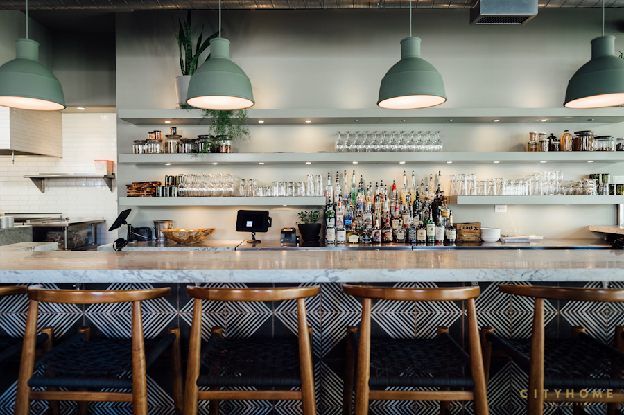
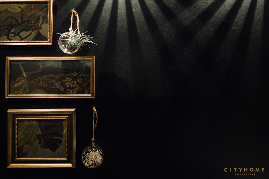
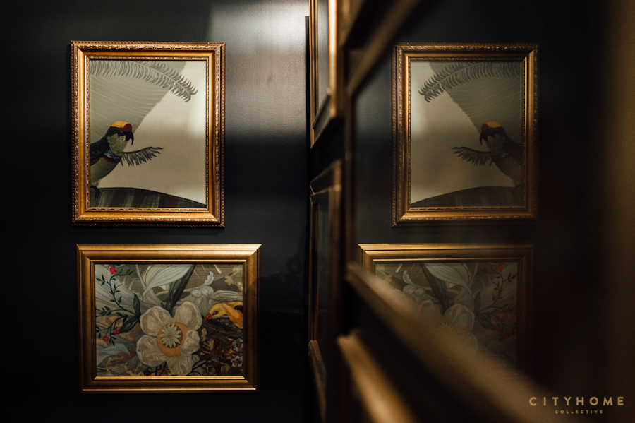
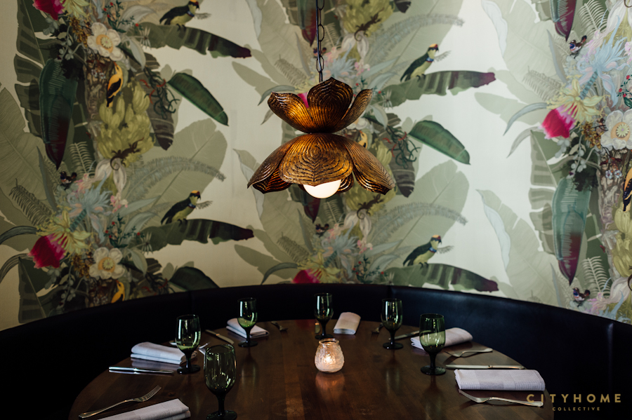
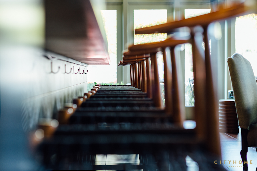
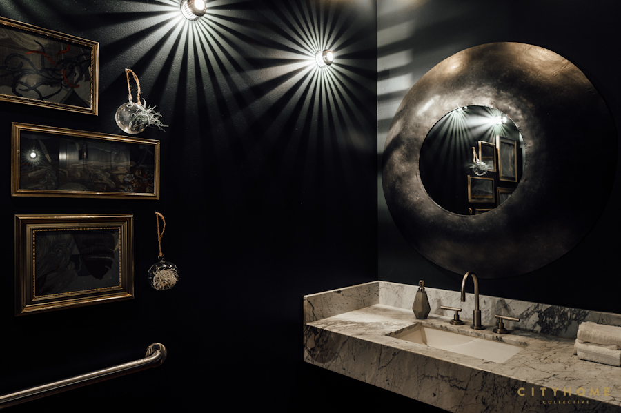
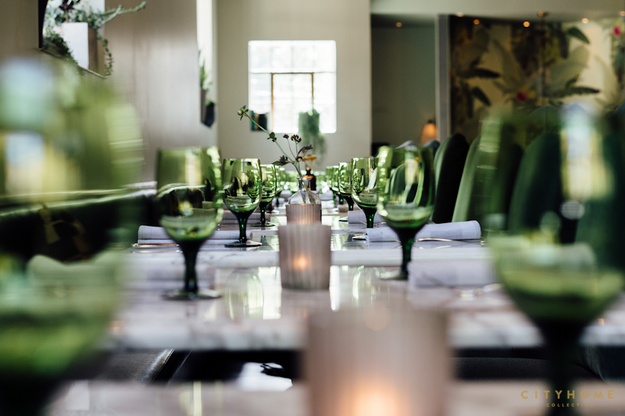
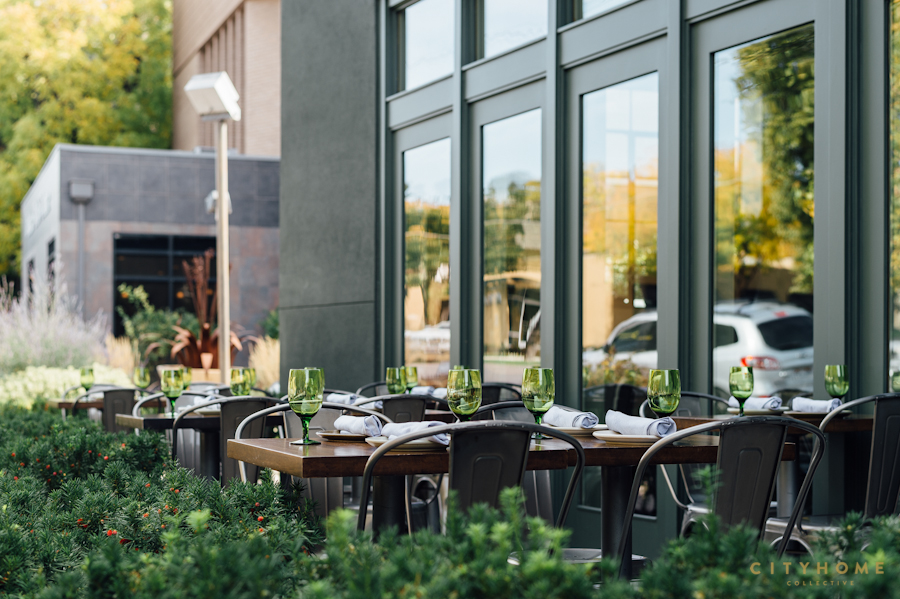
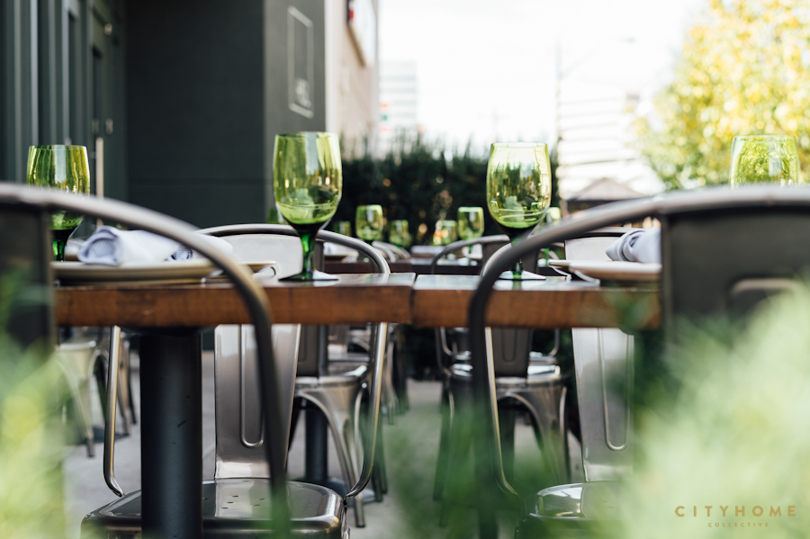
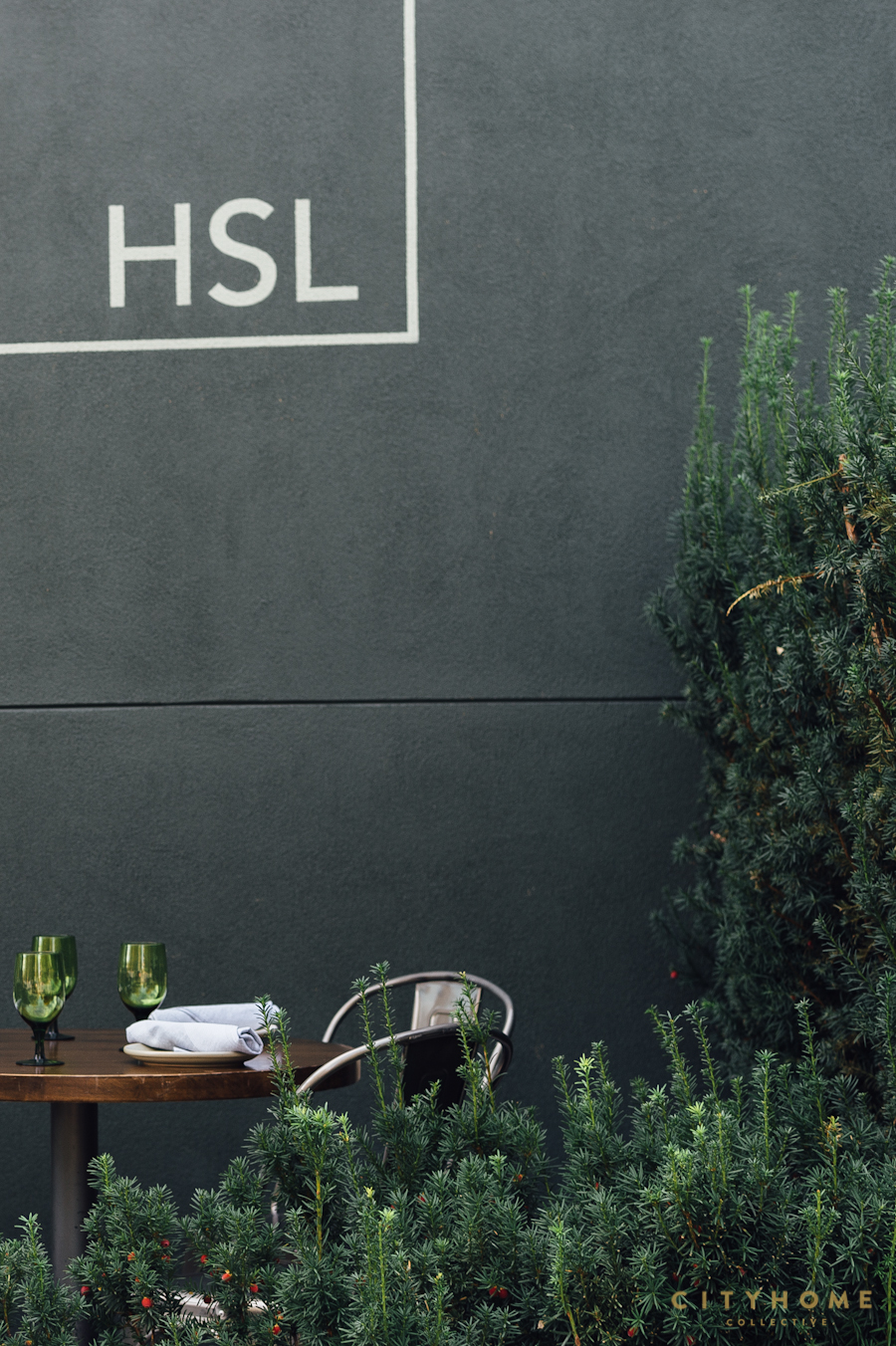
We wanted to utilize a monochromatic palette in order to quiet the noise of varied surfaces and finishes remaining from the previous occupants, but we also wanted to employ some real color. Walls, shelves, and trim were assigned a muted green and became the still canvas on which everything else could be layered. Chairs were reupholstered in varying green velvets and prints, and we added accent lighting throughout (again, in hues of green). The two, large booths at the back of the space were wallpapered--palm leaves and pops of bright flowers, set off by brass lotus pendants--with the excess setting the same, artful tone in the restrooms. And while we kept the original bar, we reinvented it by adding a geometric, patterned tile to the facade and lining it with minimal but warm, woven-seat bar stools. For the exterior, we took an understated approach--deep, rich green and subtle signage.
We [somewhat] selfishly design for how we like to dine, and that experience takes many forms. Sometimes, it's with a group of colleagues or family. Sometimes it's an intimate evening for two, and sometimes it's just you, a glass of wine, and a book. We tried to create a space that would accommodate each experience perfectly. What was once a dining room full of circular booths became a multifunctional space with a lounge area, a custom high-top communal table (by Project Sunday), re-arrangeable two-tops, and a few cozy booths. We simplified. We enhanced. At night, the structure fades into the dark and the large windows light up with the warmth inside. And without any loud announcements, HSL makes a powerful statement.
